| Author | Thread |
|
|
09/05/2011 10:24:04 AM |
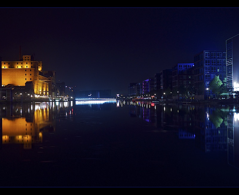
ist das der Duisburger Innenhafen?
Wirklich sehr schöne Spiegelungen, sehr schöne Farben. Sehr "saubere" Arbeit. Und ich mag den dezent gesetzten Rahmen. Aber leider ist tatsächlich zu viel Schwarz im Vordergrund, Schade!
|
|
 Photographer found comment helpful. Photographer found comment helpful. |
Comments Made During the Challenge  |
|
|
09/03/2011 05:20:03 AM |
|
Very colorful expose i like how the building are reflecting from the water ..well done |
|
| Photographer found comment helpful. |
|
|
09/01/2011 05:47:56 AM |
|
Yellow in blue...wonderful pov and crystal clear reflection 10. |
|
| Photographer found comment helpful. |
|
|
08/30/2011 02:52:51 PM |
|
I am mulling over the need to eschew ROT convention; I like the color but there is a lot of black at the bottom. |
|
| Photographer found comment helpful. |
|
|
08/29/2011 07:42:28 PM |
|
Very interesting! The Bridge not only crosses the water body, but also connects the warm left to the cool right :) The nice tone divide and the still reflections work very well. I would've cropped a little bit off the top and bottom - it's too much negative space I think. |
|
| Photographer found comment helpful. |
|
|
08/29/2011 05:31:54 PM |
|
Glass smooth water always adds to a photo with gently sweeping reflections - this one doesn't seem to work as well as others without more lighting on the buildings to the right. So much detail is there, but just out of reach. |
|
| Photographer found comment helpful. |
|
|
08/29/2011 08:12:02 AM |
I really like this image. Nice work.
There are two things I think I would have done slightly different. Small things. But then again I have a tendency of being too liberal with my slider bars so don't necessarily take my word for it.
First, I really like the dividing border colour. The light blue. It's a really nice touch. But why didn't you do the same with the black part of the border? A darker blue I think might have supported the image more. There's hardly a speck of black in your image, and the border sets itself apart in sharp contrast against the rest of the image... and not in a good way to my eyes.
I might also have lowered the curves towards the darker end. But I could see that making the image over-dark, so I can understand why it mightn't have been done.
Really nice image again. 7 |
|
| Photographer found comment helpful. |
Home -
Challenges -
Community -
League -
Photos -
Cameras -
Lenses -
Learn -
Help -
Terms of Use -
Privacy -
Top ^
DPChallenge, and website content and design, Copyright © 2001-2026 Challenging Technologies, LLC.
All digital photo copyrights belong to the photographers and may not be used without permission.
Current Server Time: 07/17/2026 11:37:09 AM EDT.