| Image |
Comment |
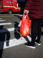
| 03/03/2019 11:11:58 AM |
from the hipby instepsComment: I think every element is important here. Aside from the shades of red, the shadows have impact compositionally and contextually. And I like the echoed circles from the fruit in the bag, to the bag itself, to the shadow of subject's head, to the manhole cover, to the fire truck wheel. They're unifying elements that might work only on a subconscious level until noticed or pointed out. Terrific! Message edited by author 2019-03-03 11:13:00. |
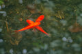
| 03/03/2019 11:06:46 AM |
Palm Tree by GinaRothfelsComment: I'd agree with you that the tonal range is fairly flat, although well-exposed for shadow and highlight. Since I'm also working with mininal B&W for this SC, I'm quickly learning that what I see in the viewfinder and/or camera EVF is often not a good representation of what I'll see on the computer.
This is even true for the set-up I'm using which previews the B&W and tonal setting in the EVF. Lot's to learn. Glad I landed on this theme! |
 Photographer found comment helpful. Photographer found comment helpful. |
| 03/03/2019 10:58:44 AM |
multi-exposure1by MargaretNetComment: The layered exposures evoke the sense of a bad dream or a premontion of something being out of whack. It conveys surprising emotion to me. I, too, would be curious to see some experimentation with masks to isolate areas minus the effect. Very interesting image! |
| Photographer found comment helpful. |
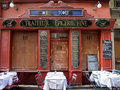
| 03/03/2019 10:54:24 AM |
chez-nousby mariucaComment: Your approach this SC is going to keep me salivating all month!. I love the interplay of hand-written boards, formal serif all-caps fonts, and the whimiscal lettering of "chez nous." A graphic design nightmare... a restaurant to dream about. |
| Photographer found comment helpful. |
| 03/03/2019 10:50:14 AM |
|
| Photographer found comment helpful. |
| 03/03/2019 10:48:17 AM |
Seville Orangesby GermaineComment: Orange and copper. A fascinating color combination where each one informs/enhances/modifies the other. Nice! |
| Photographer found comment helpful. |
| 03/03/2019 10:38:56 AM |
daffodilby JuliBocComment: Strong composition with a well-selected Snapseed preset. I really like the background through the screen. AND... been a snapseed user for a long time and had no idea you could layer and mask! Gotta try it! |
| Photographer found comment helpful. |
| 03/03/2019 10:34:10 AM |
she smilesby rozComment: Just full of dog adorableness! Fun processing! |
| Photographer found comment helpful. |
| 03/03/2019 10:32:35 AM |
Tribute to Charlieby MargaretNetComment: Cool composite. I initially focused (appropriately) on the circular section, not realizing at first that there were several pieces to the image. Nicely done. |
| Photographer found comment helpful. |
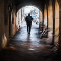
| 03/03/2019 10:30:46 AM |
|
| Photographer found comment helpful. |
Home -
Challenges -
Community -
League -
Photos -
Cameras -
Lenses -
Learn -
Help -
Terms of Use -
Privacy -
Top ^
DPChallenge, and website content and design, Copyright © 2001-2026 Challenging Technologies, LLC.
All digital photo copyrights belong to the photographers and may not be used without permission.
Current Server Time: 05/06/2026 09:57:33 PM EDT.