| Image |
Comment |
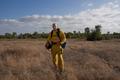
| 09/12/2005 09:00:43 AM |
Fire Markby BryantComment: As a general rule for people portraits, closer is better. The surroundings don't add anything to the portrait. |
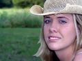
| 09/12/2005 08:59:55 AM |
Sandraby tfarrell23Comment: harsh light, overprocessed to the point that it looks like a drawing. Great pose though. |
| 09/12/2005 04:51:24 AM |
|
 Photographer found comment helpful. Photographer found comment helpful. |
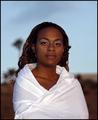
| 09/12/2005 04:49:46 AM |
Rachaelby neenee1999Comment: Magenta colour cast, seen very well in the white of the eyes. |
| Photographer found comment helpful. |
| 09/12/2005 03:16:28 AM |
Peaceby RudyC310Comment: Too much space on top. A closer composition or tighter crop would have been better. |
| 09/12/2005 03:15:16 AM |
|
| Photographer found comment helpful. |
| 09/12/2005 03:10:13 AM |
Dainty Gem by SonifoComment: Looking at all the entries here, I would bet this is in the top 10. My pick for a ribbon. Very Monet feel to it! |
| Photographer found comment helpful. |
| 08/31/2005 05:55:32 PM |
|
| Photographer found comment helpful. |
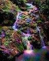
| 08/30/2005 12:39:26 PM |
Rainbow Fallsby SJCarterComment: Hmmm, not sure I like the purple/grren/blue spots...just me LOL. Great location though. |
| Photographer found comment helpful. |
| 08/29/2005 11:16:35 AM |
|
| Photographer found comment helpful. |
Home -
Challenges -
Community -
League -
Photos -
Cameras -
Lenses -
Learn -
Help -
Terms of Use -
Privacy -
Top ^
DPChallenge, and website content and design, Copyright © 2001-2026 Challenging Technologies, LLC.
All digital photo copyrights belong to the photographers and may not be used without permission.
Current Server Time: 07/23/2026 02:18:33 AM EDT.