| Image |
Comment |
| 07/01/2004 01:29:28 PM |
|
 Photographer found comment helpful. Photographer found comment helpful. |
| 07/01/2004 01:27:36 PM |
Katherineby kncoughlinComment: Interesting pose! I'm not sure I quite like the blown highlights. |
| 07/01/2004 01:17:23 PM |
The Brideby albeckComment: Slight colour cast, the veil is not quite white. The shoulder looks weird, kinda out of place, almost looks dislocated. She could still keep the same pose but with the shoulder down. |
| Photographer found comment helpful. |
| 07/01/2004 12:57:13 PM |
|
| 06/29/2004 09:47:51 PM |
My Brother Daveby bobdaveantComment: Pretty good pose. The lighting needs to be more subdued, as it is now it is a tad too harsh. |
| Photographer found comment helpful. |
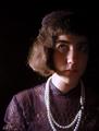
| 06/29/2004 09:47:05 PM |
Margaretby melismaticaComment: The necklace looks out of place and quite distracting, the eyes should have been more bright. In portraits the eyes are what should attract attention first. |
| 06/29/2004 09:23:13 PM |
Captain George Highlighted.by graphicfunkComment: Harsh light, lots of blown highlights, reflections on the forehead, cheeks arms, t-shirt...Nice pose but I think a reflector to bounce the flash on would have made it better. In formal portraits lighting is critical, it makes or breaks the photo. |
| 06/29/2004 07:41:22 PM |
|
| Photographer found comment helpful. |
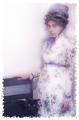
| 06/29/2004 07:40:37 PM |
Gizelleby MalokataComment: The lighting seems off, white balance doesn;t seem right. Your eye is drawn to the bright white dress distracting you from looking at the face. |
| 06/29/2004 07:34:35 PM |
|
| Photographer found comment helpful. |
Home -
Challenges -
Community -
League -
Photos -
Cameras -
Lenses -
Learn -
Help -
Terms of Use -
Privacy -
Top ^
DPChallenge, and website content and design, Copyright © 2001-2026 Challenging Technologies, LLC.
All digital photo copyrights belong to the photographers and may not be used without permission.
Current Server Time: 07/21/2026 10:13:59 PM EDT.