| Image |
Comment |
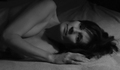
| 01/29/2007 05:27:56 PM |
Stone Therapyby Dirt_DiverComment: Nice image, but a bit flat, washed out and badly cropped. Better lighting, and a sharper image would make a great stock photo. |
 Photographer found comment helpful. Photographer found comment helpful. |
| 01/29/2007 05:26:36 PM |
Nude IV Abstractby ralfwComment: Nice curves and colours here. I think this could be made more interesting with more directional lighting to emphasize more shadows in the model. With the current even lighting it looks very flat and un detailed. |
| Photographer found comment helpful. |
| 01/29/2007 05:24:46 PM |
Confinedby levyj413Comment: The lighting is a bit too bright on the shoulder causing a large blown out area. Image seems a bit processed and not quite in focus. |
| Photographer found comment helpful. |
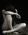
| 01/29/2007 05:18:56 PM |
Soft Silhouetteby ivale28Comment: I think this image can be greatly improved with some post processing. In B&W and with more contrast by tweaking the levels it doesn't look as flat & washed out. Of course if this was your intention then leave it how it is. Very nice curves and great lighting. |
| Photographer found comment helpful. |
| 01/29/2007 05:15:38 PM |
untitledby sallyjo1Comment: On second looks I am not so fond of this image. The lighting is not bad, but the pose is very stiff and the crop is cutting off a thumb & part of the back & too close to the knee. Also the image looks unfocused, grainey and too small. |
| Photographer found comment helpful. |
| 01/29/2007 05:08:32 PM |
Moonstruckby rscorpComment: When I look at this I see someone who is wanting to post an image but doesn't want anyone to see who it is. Lighting exposure and crop are all quite good, I just think the image would be better wit a letter in the hand to show sorrow, or something to give a reason for this pose. |
| Photographer found comment helpful. |
| 01/29/2007 05:04:56 PM |
Vulnerableby bubeltrubelComment: I think the lighting here is too flat and uninteresting. smaller light source from the side or even a little behind the model then more contrast in post processing can make a stronger image. Crop is spot on. |
| Photographer found comment helpful. |
| 01/29/2007 05:02:33 PM |
wraped upby directionsforpestComment: I think this image will loose points as the arm is blown out with too much light, and it is unsharp and blurry. |
| 01/29/2007 05:00:05 PM |
Daybreakby JutildaComment: Nice soft lighting to create a nice moody image. I think if the hair wasn't laying out to the right it would make the head shape better. The crop is good. Maybe a little higher above the shoulder would have been better. |
| Photographer found comment helpful. |
| 01/29/2007 04:55:50 PM |
angel boyby sigrun_thComment: Cute , but a bit too high key for me. I can't see the difference between his back and the background. If I look really hard, I think I can see some wings on his back. Maybe my monitor is too bright, or yours is too dark.. or both. |
| Photographer found comment helpful. |
Home -
Challenges -
Community -
League -
Photos -
Cameras -
Lenses -
Learn -
Help -
Terms of Use -
Privacy -
Top ^
DPChallenge, and website content and design, Copyright © 2001-2026 Challenging Technologies, LLC.
All digital photo copyrights belong to the photographers and may not be used without permission.
Current Server Time: 05/08/2026 07:30:03 AM EDT.