| Image |
Comment |
| 10/14/2002 08:22:00 PM |
|
| 10/14/2002 01:57:00 AM |
|
| 10/14/2002 01:35:00 AM |
When in Rome...by Mrs. POTUSComment: WOOHOOO! Gorgeous photo. Nice job! Seems a little off balance with the statue centered and the heavy buildings on the right but oh well. ~indigo007 |
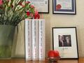
| 10/14/2002 01:08:00 AM |
Collection Item #12by DrJOnesComment: Don't like the green cast. She looks like the incredible hulk. Cool pic otherwise. Uhhhh, the green wasn't supposed to suggest envy was it? I'm a little unclear on exactly what sin you're going for, but it looks sinful to me :o) |
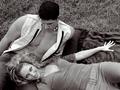
| 10/14/2002 02:49:00 AM |
Seductionby AleciaComment: This shot really stands out in the challenge. It's a clear shot of beautiful people. What's not to love? I like the way you posed them, and I like that she's looking at the cam. B&W works for this. Nice lighting. *sigh* If she gets tired I'd be happy to take her place :o) ~indi |
 Photographer found comment helpful. Photographer found comment helpful. |
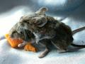
| 10/14/2002 12:38:00 AM |
Untitledby camelotnorthComment: LMAO at this since I saw the thumbnail. Are they pets? Nice of them to hold the pose for you! ~indigo997 |
| 10/07/2002 09:23:00 PM |
Break the cycle: Recycle!by chakkobboComment: Nice lighting! I like the strong color of the flower, but it seems a little too overpowering. I would love to see this using blue glass bottles and a lighter bg. It seems a little drab and masculine as is. Very good technically. 7 ~indigo997 |
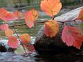
| 10/07/2002 09:32:00 PM |
Nature's Wasteby jpooleComment: Beautiful picture. I love the peaceful serenity it suggests. Great lighting and exposure. 7 ~indigo997 |
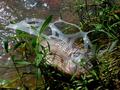
| 10/08/2002 02:11:00 PM |
Garbage: It Doesn't Just Look Bad...by JeBComment: Tough lighting situation. I like the composition. It isn't a very attractive shot, but it fits the challenge and is good technically. I also like the title :o) ~indi |
| Photographer found comment helpful. |
| 10/09/2002 11:50:00 PM |
R2-D2by lionelmComment: I really like the colors in the bg. I wish it wasn't so bright back there so they would be stronger (less faded looking). This is a cute idea and title. It's sort of a boring challenge all around, but at least this pic is rather pleasing to look at instead of being gross. The can seems a little too close to the bottom and right edge of the frame. Good saturation in the grass, bad glare on the can lid. Overall, better than most in the challenge. ~indi |
| Photographer found comment helpful. |
Home -
Challenges -
Community -
League -
Photos -
Cameras -
Lenses -
Learn -
Help -
Terms of Use -
Privacy -
Top ^
DPChallenge, and website content and design, Copyright © 2001-2026 Challenging Technologies, LLC.
All digital photo copyrights belong to the photographers and may not be used without permission.
Current Server Time: 07/18/2026 05:49:04 AM EDT.