| Image |
Comment |
| 02/03/2003 02:24:01 PM |
Just another Roseby jab119Comment: Yup. Very cliche. Well done. I like the water droplets. Not crazy about the grey surrounding it. I think it would work better with a tad more lighting - esp in the top right. 8 |
| 02/03/2003 02:21:27 PM |
Profile of a car.by MarklaneComment: Yet another shot that might work better in the perspective challenge. I love the perspective here. Could maybe give a tad more room on the left of the frame. Lighting also seems a little too dark or underexposed. 8 |
 Photographer found comment helpful. Photographer found comment helpful. |
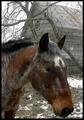
| 02/03/2003 02:19:45 PM |
A Horse is a Horseby erin_m02Comment: This is a beautiful shot. It has that old photo feel to it. I like how the bg is so desaturated. Great choice of an overdone subject IMO. I'm on the fence about giving it a 10 just because I think the nose is too close to the edge of the frame. Great exposure too. |
| Photographer found comment helpful. |
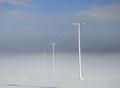
| 02/03/2003 02:17:53 PM |
A Cliché Perspective?by r_sandlerComment: This would work better in next weeks' members challenge probably. I have to give it a 9 instead of a 10 just because I don't really think of powerlines as being in the top ranks of overdone photography subjects. Very cool photo! |
| Photographer found comment helpful. |
| 02/03/2003 02:06:23 PM |
Wish You Were Here....by kretsComment: Just beautiful. You might PS out the extra branches on the left after the challenge. You might also be able to select everything but the black trees and ground to make it a tad lighter. The top of the trees doesnt stand out as well as it could IMO. Excellent silhouettes. Very nice colors and composition. |
| Photographer found comment helpful. |
| 02/03/2003 04:06:15 AM |
Cute as a Bugs Earby SonifoComment: My favorite shot of the challenge. This is just the cutest photo. Excellent job! It's so clear and the b&w works perfectly. Nice lighting. I'm not sure about the slobber though :-P 10 for sure |
| Photographer found comment helpful. |
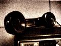
| 02/03/2003 03:53:58 AM |
Hello?by tiffComment: I've seen several shots in this challenge w/ this crosshatch "look". Would you mind telling me how it is done? Very artsy shot. I like it tho I'm not sure that telephones are exactly an overdone photo subject. |
| 02/03/2003 03:48:08 AM |
Waiting for Romanceby Harz_JoergComment: This is such a cute idea and setup. Adorable dog. The quality is just lacking. He's out of focus. The lighting is good but I wouldn't crop so close to his chin on the bottom. I also don't think you need the frame. |
| Photographer found comment helpful. |
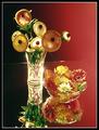
| 02/03/2003 12:17:22 AM |
"Flora & Florida"by KickDrum5150Comment: Very creative. I really like the way the light fades from right to left. The edge of the mirror doesn't really bother me. I even dont mind seeing the corner of it. The bowl of flowers is really cool. I think that it and its reflection would be a neat shot on their own. If you're gonna show the vase of fruit flowers then I'd rather see the whole reflection or have it cropped differently. The super bright reflection is distracting. Overall it has more of a painting feel than a photograph, and it's a cool take on the topic. |
| 01/31/2003 02:48:24 AM |
Just Humansby MonaComment: Decent score. The comments obviously liked this shot so I'll try to be more critical.
I like the colors in this shot. Outside of the challenge, I'm just not sure I'd find this photo very appealing on its own. The signs are cute. What is the diagonal black line along the bottom? It looks like a bad crop. There are some very strong vertical lines w/ the posts, fence, and tree and some strong horizontals along the water. Then you have some diagonals with the walk and a few shadows. It all seems a bit busy and too geometric for an outdoor shot. Maybe giving the lines a bit more room would've helped. They just don't intersect or lead anywhere. The main subject sign seems crammed up in that corner almost - very close to the edge of the frame on two sides. Of course, I don't know what the surroundings were like so suggesting better compositions is hard.
What I really like about this shot are the dog sign on the right, the fence beside it, the lighting on the fence, and the green grass. Perhaps you could have composed the shot to focus more on those elements and not even try to include that other small sign. There's just so much going on as it is - too many places to look.
I think it might be cute to have a dog on a leash tied to the dog sign (esp if they'd just lie down and look sad) and just get rid of most of the rest of the photo.
Tough lighting situation to expose for. I think you did a good job with it. |
| Photographer found comment helpful. |
Home -
Challenges -
Community -
League -
Photos -
Cameras -
Lenses -
Learn -
Help -
Terms of Use -
Privacy -
Top ^
DPChallenge, and website content and design, Copyright © 2001-2026 Challenging Technologies, LLC.
All digital photo copyrights belong to the photographers and may not be used without permission.
Current Server Time: 07/17/2026 06:58:49 PM EDT.