| Author | Thread |
|
|
01/31/2003 02:48:24 AM |
Decent score. The comments obviously liked this shot so I'll try to be more critical.
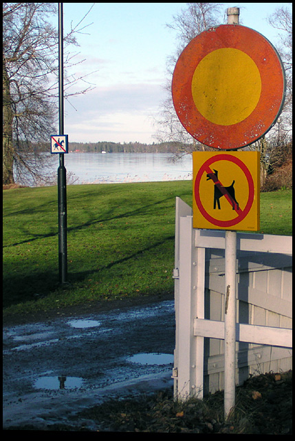
I like the colors in this shot. Outside of the challenge, I'm just not sure I'd find this photo very appealing on its own. The signs are cute. What is the diagonal black line along the bottom? It looks like a bad crop. There are some very strong vertical lines w/ the posts, fence, and tree and some strong horizontals along the water. Then you have some diagonals with the walk and a few shadows. It all seems a bit busy and too geometric for an outdoor shot. Maybe giving the lines a bit more room would've helped. They just don't intersect or lead anywhere. The main subject sign seems crammed up in that corner almost - very close to the edge of the frame on two sides. Of course, I don't know what the surroundings were like so suggesting better compositions is hard.
What I really like about this shot are the dog sign on the right, the fence beside it, the lighting on the fence, and the green grass. Perhaps you could have composed the shot to focus more on those elements and not even try to include that other small sign. There's just so much going on as it is - too many places to look.
I think it might be cute to have a dog on a leash tied to the dog sign (esp if they'd just lie down and look sad) and just get rid of most of the rest of the photo.
Tough lighting situation to expose for. I think you did a good job with it. |
|
 Photographer found comment helpful. Photographer found comment helpful. |
Comments Made During the Challenge  |
|
|
01/26/2003 09:46:56 PM |
|
HAHA. no horses. Darn! Great colours and composition and sharpness. jgillard8 |
|
| Photographer found comment helpful. |
|
|
01/26/2003 06:26:16 PM |
|
really good colors. Composition seems off balance, nice " clean" image. |
|
| Photographer found comment helpful. |
|
|
01/26/2003 12:32:47 PM |
|
| Photographer found comment helpful. |
|
|
01/24/2003 09:16:58 PM |
|
| Photographer found comment helpful. |
|
|
01/23/2003 08:23:28 AM |
|
Interesting shot. No cars, no dogs and no horses. Are walkers allowed down there? Nice capture, I like it. |
|
| Photographer found comment helpful. |
|
|
01/22/2003 09:58:22 PM |
|
Great colour and composition. |
|
| Photographer found comment helpful. |
|
|
01/22/2003 12:16:28 PM |
|
| Photographer found comment helpful. |
|
|
01/20/2003 11:51:10 PM |
|
Cool signs! I liked how crisp the focus was onthe forward signs, but the no horse sign, I would have liked to se a bit more in focus, for the rest I like the blur. My attention is drawn to the other sign for it also tells part of the story here, that is why I would like to see it a bit crisper. The colors are great, just wished the sky would have cooperated that day and given a deeper blue. 8. |
|
| Photographer found comment helpful. |
|
|
01/20/2003 01:07:21 PM |
|
Good placement. Good lighting. Photo is level. You did a great job. |
|
| Photographer found comment helpful. |
|
|
01/20/2003 10:41:25 AM |
|
maybe squirrels or cats!!! |
|
| Photographer found comment helpful. |
Home -
Challenges -
Community -
League -
Photos -
Cameras -
Lenses -
Learn -
Help -
Terms of Use -
Privacy -
Top ^
DPChallenge, and website content and design, Copyright © 2001-2026 Challenging Technologies, LLC.
All digital photo copyrights belong to the photographers and may not be used without permission.
Current Server Time: 06/29/2026 12:57:40 AM EDT.