|
|
|
Showing 271 - 280 of ~991 |
| Image |
Comment |
| 02/09/2003 02:52:18 AM | Windows of Opportunityby CreativeFlyPhotoComment: HEY! As far as taking a shot of the want ads goes... this is great. As far as taking a great window shot though... Call me old fashioned, but I kind of thought this one was pretty straightforward. :P It's a little hard to look at b/c of the dof and the bright red circles. This looks a little like a stock art shot or something you'd see in a corporate report. There is a market for it. Technically it's good ... just can't compete with some of the artistic shots as far as the popular vote goes.
Here are some thoughts from annida who's helping me out with a few critiques:
An interesting interpretation of the challenge! I think it didn't do well mainly because it seemed like it was mostly off the point of the challenge, but I can understand where you were coming from.
I like the way you can read the text really well on the ones which you've circle.. I just wish that you could have done it without the red circles!
I wonder if that's possible? I like the blur of the letters which you're not supposed to read; although a bit is distracting with the fact that you can read it.
It kind of hurts my eyes sitting here and staring at it, which isn't a really bad thing, it just makes me wanna strain my eyes to read more of it.
Maybe a different angle, or focusing on the one advertisement on the left which is the one which is the most in focus. I would have also tried to make the rest of the newspaper a touch darker to frame the advert.
It is a good idea, and I think it would really work with a bit more revision!
|
| 02/09/2003 02:35:39 AM | A Tajirian Squareby jwitt33Comment: This shot obviously has a fairly limited audience that'll understand it. I didn't get it at all. I still don't see how it's square and I think the topic was pretty clear on that. Technically it's pretty good tho I would crop off the cars on the left and make it a vertical shot. It obviously didn't deserve such a low score, but I'm sure that's just a reflection of how seriously ppl take the topic. They're pretty strict.
This is a tag team critique so here are some thoughts from annida:
A unique view of the challenge! I thought this was a fairly funny shot, but a lot of people thought you had to actually have a physical square in the challenge for it to be met. Do not worry, I get your humor and appreciate it!
Now, what could you do to make this shot better? I would have cropped out the background, and just had the two metallic poles, and maybe I think I would have cut off just under his nose, and just above his eyebrows, so you had the eyes and nose looking off to the right. Maybe even making the crop square would have been fun, just to have that ONE physically square element the picture was missing.
I would have lightened the picture a bit, maybe made it Black and White. Good luck in future challenges! |
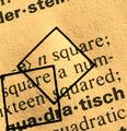
| 02/09/2003 02:10:56 AM | -e> n square;by kiwinessComment: Well, that's interesting! First thought is that I'd crop off the words at the top and make it more of a square crop. The lighting seems a bit strong if you're going for an old feel. It's almost too bright instead of looking faded. I like the texture of the paper. Adding the squares is SO much better than just taking a shot of the words, but it's still a bit bland to me. The juxtaposition of the geometry and english is kinda cool, but there's not a lot more going for it. Good execution. On topic.
and some thoughts from annida:
Very cool idea. I like it a lot. One of the things you could have done was to make the picture actually square, just to add to the squareness of it. It's a lovely abstract, and the lighting on it is very appropriate in my opinion. I think a border wouldn't have gone amiss, to frame the squareness as well. Did you try it with just one of the little squares? I like the one in the middle a lot more than the one on the side. Good work, lovely abstract! |  Photographer found comment helpful. Photographer found comment helpful. |
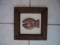
| 02/09/2003 02:01:39 AM | Squariumby bmarquezComment: with a little help from annida:
I like the idea of this picture very much. The subject is appealing, and definitely fits the challenge of square. What I think you could have done to improve the composition was to a) either put a fabric behind the frame, so it's not on the tile, or b) cropped the picture so that it was actually around the frame, which would result with a square photo as well. I think a bit more lighting on the subject would have been good as well. Maybe you could have tried a duotone, since the colouring is almost there already, and made the contrast more, with some sharpening and use of curves. I think this is a very good attempt, and I hope to see more from you in the future! |
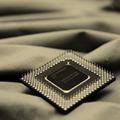
| 02/09/2003 01:10:50 AM | Oldby dadas115Comment: Oh YAY! I liked this shot a lot. I gave it a 7. I think it's just one of the most attractive tech shots I've seen. The folded cloth creates such nice lines and shadows. I love the color tone you added. Biggest complaing - I'd like to see more focus on the front of the chip. It isn't bad having the focus in the middle but I'd prefer having the front half in focus. I like the perspective a lot. I just don't have any more suggestions b/c I think this is a really good shot. A new take on an overdone and boring subject. Very clear and crisp (where is is in focus). Nice lighting. Might be nice to be a little brighter, but that would give a different mood. It's square and it's a good shot. What else do they want?? I just don't get these voters sometimes. |
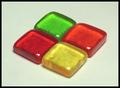
| 02/09/2003 12:34:28 AM | Jolly Rancher Round-Upby calailleComment: HELLO! I like this subject. YUM. I like that you put the 4 together and took it from an angle. Need more practice with the studio set up tho (don't we all) just to perfect a few things. The lighting could be a little better. These are pretty reflective subjects so I'm not sure if you can eliminate those hot glare spots or not, but I'd try. It might help to have more light, but make sure that it's all diffused with something like some hanging cloth. The bg looks kind of dingy grey instead of white. A clear white would be nice (really make the colors pop), but I think another color would also work. Sometimes colored backgrounds are easier than getting a true white.
I like the arrangement, but you could also try framing it as a square if you took it at an angle that created a straighter diamond. Focus is good. People obviously liked this subject. Good score. I thought this was a tough topic, but you came up with a creative way to do it. Nice work. |
| 02/08/2003 10:52:13 PM | Square Signby joshComment: For a minute there, I thought I'd pulled a pic from the sign challenge :) I had a lot of trouble finding anything square and ended up creating something. There just aren't many square things around, but you found one! Nice work. Unfortunately, I don't think it's the most exciting or interesting subject for a photograph. I do like the composition - how you have it centered with equal amounts on either side. I really like the shadows and grass in the bg. Nice use of dof. I'm not sure what created the little bit of shadow at the bottom left corner of the sign, but it's a little distracting. Overall, this is very good technically. Good focus and exposure. I really like the texture of the rusted metal. I think you can take good pictures. Now that you've got that out of the way you can focus on creativity and come up with some shots to wow everyone. |
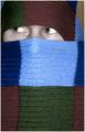
| 02/08/2003 03:50:07 PM | Pikaboo!by ParentxComment: This is cute, but I thought you spelled it peeeeeeeeeeeeek-a-boo :o)
I like the colors and the idea. I think this is one shot where you could center the face horizontally - it doesn't look right so close to the left side of the frame. I have to agree about the skin color. You need some color adjustment to make it warmer and more alive. Lighting is good. Focus is good. I'd prefer having half of the bottom row of squares cropped, but that's just me. I don't really think the little border helps any so I'd remove it. Overall, this fits the challenge, is creative, doesn't need a lot of technical help. I don't think it should be sub 5 by any means, but I guess that's a reflection of the voters' taste more than anything. I bet that if you had used a girl with some mascara on or a little kid then it might've helped some with the score. If you want people to focus on the eyes then they better be really outstanding (no offense) :) Good Luck in the next challenge. | | Photographer found comment helpful. |
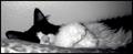
| 02/07/2003 01:22:44 AM | Caught Nappingby AnnidaComment: This needs quite a bit of technical help. The crop and composition are pretty good. The wall behind the kitty is too shiny. Perhaps you could tack up a little fabric or something less reflective. The lighting overall is too dark, but there are (what appears to be) flash burns on the paws and bottom left corner. If you had even, diffused lighting then the soft focus wouldn't be that big a problem to me. I just can't see the kitty's eyes. | | Photographer found comment helpful. |
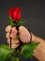
| 02/07/2003 01:09:36 AM | . . . There Be Thornsby SeekerComment: OK. That is just nasty. I can understand journalistm photography and product photography and wedding photography but what exactly is this? ;P It is technically sound. A few too many leaves maybe and the blood looks too dark and thick. It fits the challenge (tho my idea of the challenge was to take a really good shot of a common subject so that you appreciate it more rather than coming up with something different). I'm just not sure what you would do with this photo outside of dpc. If your goal is just to practice technically then you succeeded. If you're trying to make pleasing picture then I think you might wanna forget the gore. If you just wanna push the envelope then you might need something that's a little more emotionally charged. |
|
Showing 271 - 280 of ~991 |
Home -
Challenges -
Community -
League -
Photos -
Cameras -
Lenses -
Learn -
Help -
Terms of Use -
Privacy -
Top ^
DPChallenge, and website content and design, Copyright © 2001-2026 Challenging Technologies, LLC.
All digital photo copyrights belong to the photographers and may not be used without permission.
Current Server Time: 07/17/2026 11:07:50 AM EDT.
|