|
|
|
Showing 251 - 260 of ~991 |
| Image |
Comment |
| 02/16/2003 09:13:26 PM | Winter Houseby MattWComment: OK. This is one of those shots that I'd like an explanation for. Exactly what were you thinking when you submitted this? I wanna know what it is that made you take the picture and why you chose it to submit. If you want to continue submitting shots then please take this as a learning experience.
The challenge was to pick a topic that is photographed way too much (kids, pets, flowers) and take your best shot of it. IMO, this shot doesn't meet the challenge. That alone will drop your score quite a bit. Secondly, I can't really see that much thought went into the shot. It seems like you just pointed the camera and shot. The trees are in the way of the house, but the house isn't very interesting a subject to begin with. There's really not much to look at in this photo. You've also cropped it way too close on the sides and bottom.
The focus is also soft - maybe it was too dark to be taking a picture without a tripod and you shook it some - and the it seems dark and underexposed.
Overall, I think this picture just doesn't have much going for it and probably deserved the score it got. |
| 02/16/2003 09:02:33 PM | Earthquakes in Icelandby IceRockComment: WOW! I don't look at the member challenges that closely since I can't vote on them. I must've missed this one. I love the lines and colors. It looks like a painting. I really don't understand the low score - especially from members. I thought they were supposed to have better taste and appreciate more artistic photographs. I guess it's those "does not meet challenge" votes dragging you down. Without the comment, it is really hard to guess what the connection is to the challenge.
First thing I would change though is that blue shadow on two sides. It just isn't needed, and looks bad IMO.
I like this close-up sort of crop of the interesting lines and texture, but I'd like to see a version showing more of the rock (at the top). Was this cropped out of a larger shot? Show more of the surrounding and it'll be less abstract - might do better on dpc anyway.
I love it though. Beautiful color. |
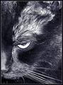
| 02/16/2003 08:44:19 PM | DON'T touch my catnip ball..... or else....by kosmikkreeperComment: KITTY! Hope you keep this one locked up on Halloween.
I like the composition a lot. My first thought was that it needs some Rogaine. The hair is really thin above the eye and the harsh lighting w/ the b&w makes it really stand out. For that reason, I'd crop just above the eye probably (I also don't like seeing the beginning of the ear). I dunno if the light is just bright or if you have too much contrast, but it's on the verge of being sort of abstract.
Tough challenge for cat shots. I think the shot is good. Good focus for such a close-up especially, but it doesn't stand out from the other cat shots. Decent score. No major problems with the shot. Fits the challenge, but the competition was rough. |  Photographer found comment helpful. Photographer found comment helpful. |
| 02/16/2003 08:32:57 PM | Pocket Changeby wargloryComment: HELLO!
My first impression of this is that it would fit the cliche challenge just as well. A macro of coins - good practice for a photographer, but not all that interesting usually (especially when it's a straight on shot of side-by-side coins).
Technically. Focus is good. Lighting seems a bit harsh - reflective surfaces need a lot of diffused light. Coloring is good.
I think it's a little weird to have the sides cropped like they are w/ room above and below.
I like the new dollar coins. I wish they'd just take the dollars out of circulation so we'd be forced to use them. The banks don't even have them when I ask.
Overall, decent shot that could use better lighting. Good score - esp for a subject without a lot of emotional pull. It does fit the challenge and is fairly good quality-wise tho. |
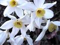
| 02/16/2003 08:25:21 PM | Beauty In Winterby ErastisComment: HEY! I like your choice of subject. A very pretty cliche.
The first thing that I notice on this shot is the quality. I don't know anything about your camera so maybe it's just low resolution which you can't help much. There's a lot of noise.
Secondly I notice that it doesn't look very clear and crisp, but the dof is pretty good b/c the bg is blurred nicely. The whites are slightly overexposed in places, and the colors need some correcting so that the white is more white than grey. I think flowers like this would pop better against a solid background - you could always just hold a posterboard or some fabric behind it.
I'm not too crazy about the composition b/c there's a big empty area on the bottom right and the top left flower is cut off. If you could possibly arrange it so that they're all facing forward and filling the complete frame - I think the repetition would be cool.
Overall, a decent shot that needs a little compositional help. I think the main problem tho is just the quality issue. |
| 02/13/2003 12:02:41 AM | Cliche: "Life is like a box of chocolates. You never know what you're gonna' get."by BitzComment: I think this is an excellent score considering it isn't exactly a photographic cliche. Bet you're wishing you could submit this to the Valentines challenge though.
I'd actually like to see a shot of just that vase and rose for cliche. The red shadow is great and the shot of green helps your eye move within the frame. I really like the composition. Lighting is very good. Could possibly have some fill on the partially eaten pieces to prevent the dark shadows and make them easier to see (the coconut is especially dark), but it's not a biggie.
I think this is a good example of the use of a diagonal alignment to move the eye across the shot as well as an example of how subjects in odd numbers are more pleasing than even. The vase, box, and candy grouping make this a much stronger shot than it would be with only two of those.
It's a very clean shot with nice focus and colors. Using the posterboard and natural light was a good choice. Nice job with the exposure and white balance. The red, white, and browns make it a very sophisticated and classic photo, but the half eaten pieces throw in a bit of fun and keep it from being too boring.
Nice job. Nice score. Keep it up. | | Photographer found comment helpful. |
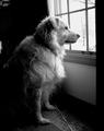
| 02/12/2003 06:43:37 PM | A new world just beyond the glassby Cjorgy2oo4Comment: HEY!
I love your dog, but I'll try to still look at the photograph critically. ;P
This looks like one of those capture shots where you don't really have a lot of time to think about what you're doing so I would give you some slack in voting. However, if you want to know how to really perfect the shot, you might have to have someone stand outside and hold the dog's attention. This would give you more time to notice things like the distracting cord on the floor.
You also seem to have soft focus. A higher f number would help. That shutter speed is fast enough that camera shake shouldn't be a problem so I'm not really sure why it isn't sharper.
The fur is also a little overexposed. With such a difference between light and dark in one shot, you're going to have areas that are over or under exposed, but the dog shouldn't be one of them. Those areas of fur that have all the highlights blown out (along the top of the head and on the chest) are what you needed to expose for. It would also help if you could make more light in the room behind her so that the difference between light and dark isn't so great. However, I sort of like how she fades into the black.
Composition is good, but cropping could be better. You can do any shape you want so just drag a box around until all the distractions are gone. I'd crop off the top until that lit area in the left corner is gone, and then crop off the left side until that white area is gone.
I'm not really sure about the b&w since I don't have anything to compare it to. I sort of like the b&w, but I would also like to see the color of the dog. Maybe you can play around with saturation and channel levels for different variations.
You obviously have an eye for making good shots. Of course this appeals to dog lovers more than anyone else. Now you just need to focus on perfecting the technical aspects. I think that the score is a reflection on the focus,cropping, and exposure issues.
Keep on shooting! |
| 02/12/2003 06:23:53 PM | Gerberaby kris.cmComment: Hello! *sigh* this is just so cliche ;P Nice work!
Technically, this is good. As was mentioned, the composition/cropping could be a little better. I would crop some of the black off the top if nothing else. Having it centered doesn't bother me all that much though since it is such a symmetric flower. The focus looks good to me and you've avoided noise which is really good at iso200 with all that black.
As for the black background... I'm not really sure if it was the best choice or not. I do like how it draws out the black in the center of the flower. It just gives the shot a completely different feel than perhaps a light, pastel bg would. It makes the color really jump out. I think that the lighting probably contributes, and I'm not sure if you did any saturation changes or not. This color is just almost too bold IMO. I'd rather see a lighter background because it would make the flower seem softer and not so "in your face". Of course it's just a difference in taste rather than a right/wrong issue.
This reminds me of some poster-sized pop art that I've seen. It's really very simple and straightforward - emphasizing simple shapes and bold color. In that sense it is a strong, successful image. I personally just like flower shots that are a little softer and more complex - maybe showing more negative space or a vase or another flower or an angle that isn't straight on. However, this pictures reminds me a lot of the third place rose shot so it obviously has its own appeal. Even the close crop on the bottom is the same.
All in all, it's a good picture that I really can't find fault with. This was just a very competitive challenge in general and especially for flower shots. |
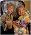
| 02/11/2003 10:00:06 PM | Cute Clichesby DougPazComment: Hey! I tried to comment on most of the kid shots during the challenge so I'm not really sure what more to say so... This is a really cute picture. It's really close to looking like a professional, studio shot. The chair is nice. I would move it so that it is against a solid background. The coloring is good, and the lighting is nice and warm. It could be a little brighter though. Their faces are just so cute but would look better without all the shadows. You might also want more even light rather than having natural light on one side and a lamp on the other. The toys are a personal decision. If it makes it more personal (if these are their favorite toys and will be the ones they always remember) then keep them in. You should also frame/crop it differently so that you aren't cutting anything off. I don't know if you were at an angle or what, but the top of the chair is off to the left a lot. Just back off some and use a tripod. Then you can always crop out more when you process them. This is a very cute shot of a wonderful age. Having good shots of your kids is really one of the most important things you can do with your camera anyway. I think you should try this one again just to get it perfect. |
| 02/11/2003 03:01:40 AM | Peek-A-Booby teachme53Comment: Dejavu... This is the third shot titled "peekaboo" that I have done in a week!
First of all, looking at your photo & info I notice a couple of things. You definitely need better lighting. You don't have to have professional lights, but set up a bunch of soft lamps and diffused lighting. Lots of people (me included) use worklamps from Home Depot to help with this. Once you get more lighting you can get a faster shutter. 1/60 is the minimum for avoiding camera shake, but with a moving chid you really need something faster. You also need a higher aperture to get sharper focus. Somewhere between 5 and 6 is usually good for this sort of thing. A really small f number (like 2 or 3) is good for portraits when you have a background to blur, but that wasn't a problem here. That's one thing you have going for you - no distracting bg.
The composition is pretty good tho you might not crop quite so much off the top of her head. Main problem is that it looks so dark/underexposed and a little blurry. If you've been in the forums lately you'll know that people are pretty tough on kid shots. Sometimes I think that most of those people just haven't tried taking a good shot of a moving child ;P
This is somewhere between a snapshot and a studio shot. I think you are considering things (like background and composition) and just have a few technical issues to overcome. You have the cute factor working, but focus is SO SO important in portraits. The eyes are open and looking at the camera so they HAVE to be in focus. I know that's tough with a moving child, but using a high f number helps a lot. Good luck with this cute model! Don't get too discouraged with entering kid shots. Once you get the hang of it, they can be far more rewarding than many other things. Besides, what's really more important... a good shot of a child or a good score from a bunch of strangers? |
|
Showing 251 - 260 of ~991 |
Home -
Challenges -
Community -
League -
Photos -
Cameras -
Lenses -
Learn -
Help -
Terms of Use -
Privacy -
Top ^
DPChallenge, and website content and design, Copyright © 2001-2026 Challenging Technologies, LLC.
All digital photo copyrights belong to the photographers and may not be used without permission.
Current Server Time: 07/17/2026 07:30:46 AM EDT.
|