| Image |
Comment |
| 04/16/2003 01:15:39 AM |
Spring Colorsby DustinComment: Oh! You're one of those members that I've been wondering about. There seem to be a few who almost always have school shots, and I've wondered if maybe you're sharing a school camera or something.
Anyway, this fits the challenge.
First impression is WOW. This is bright! It's sort of too bright and brash. The dof really helps the flower stand out.. but it stands out enough. Maybe too much saturation. I think you needed someone to shade the sun so that it isnt in direct light. Exposure is actually decent for such bright light though. I like the angle.
If possible, post the aperture and shutter speed with your entries. It helps others learn and helps with critiques.
It also seems like maybe you had soft focus and then oversharpened. Something about the edges is just a bit weird.
ANYWAY, decent shot with a few technical problems. Good color. Keep learning! |
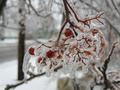
| 04/16/2003 12:53:04 AM |
Color Under Iceby KimInNBComment: I have to think that this would've scored higher in the weather challenge. There is some color in the shot, but it isn't a very strong element. The photo is a bit drab - which reflects the weather nicely but doesn't help with the colors. I actually like the dof, but the branch still blends in with the bg a bit too much. Maybe you could have used a slightly different angle and avoided the dark, thick branches and telephone pole as they are the most distracting. The black blob in the upper left corner is also a bit bothersome. You might have also tried some fill flash or having someone shine some light on it to help it stand out even more.
Decent shot.. not the best challenge for it though. Blur a bright colored posterboard behind it and it'd fit the challenge and stand out better. |
 Photographer found comment helpful. Photographer found comment helpful. |
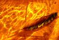
| 04/16/2003 12:44:59 AM |
inside the flameby pioggiaComment: First of all, you really should include aperture, iso, and shutter speed when you submit. It helps critiquers as well as those who like your shot and want to know you you did it. Comments are also really nice, but I usually add those after the challenge so that I can respond to comments in the process.
This is a great shot. It really stood out in voting. I think that the score is very good - especially in a color challenge. The color IS an important element but this isn't a typical color shot. Actually, outside of the challenge I would think that it is almost too bright. I'm not sure if there are any adjustments that can be done now to make it a little easier to look at (probably some PS work that wouldn't have been legal in the challenge). The feather just doesn't stand out as much as I would like. It is secondary to all of the bright light on the water which may have been your intention.
I love the texture and composition. Having something under the feather is a nice addition IMO, but might be cooler if it had some scripty, handwritten looking writing on it.
Great shot. Nice score. Keep it up! |
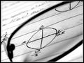
| 04/16/2003 12:37:03 AM |
What's Pi doing in Radian?by AaronComment: Interesting. I like this shot for its technical/graphic aspects more than the artistic/aesthetic. The black and white is nice. So is the composition, lighting, and contrast. I would also prefer the focus to be a little more even - without the shadowy area on the bottom half of the lens. Nice diagonal.
This was a tough topic, and I think that the voters really appreciated creativity just because they had such a hard time coming up with any ideas themselves. Technically, this is good and probably should've scored a bit higher. I think that the idea is as important as the ability. Your ability is good which puts you in about the same spot as a lot of us... just waiting on creativity to strike :) |
| Photographer found comment helpful. |
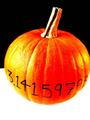
| 04/16/2003 12:30:53 AM |
Pumpkin Piby rooComment: Hey!
I like the colors! I almost thought this was another color shot.
The black and white really make the orange standout. However, I think there might be a little too much contrast. I think that the color alone would be enough to make the pumpkin "pop" without making it quite so bright. I don't think the lighting was bad... it's just too much contrast. I also think it would be better to have an even amount of space on either side of the pumpkin. It's a bit weird that the right side is cropped.
Cute picture. Good idea. Just a few technical glitches. Still, a score above 5 aint bad! |
| 04/16/2003 12:22:58 AM |
Salomon Skisby DCThiessenComment: Hey!
Well, that's some color! Challenge met.
As far as composition goes... I would have no idea what this photo is of without the title. Therefore, it isn't really a good product shot.. it's more of an abstract macro. I do like the diagonals and the layering going on.
Somehow it just seems too bright. Maybe it was overexposed or just really reflective. The focus also seems a little soft (or else it's just the glare making it seem that way).
I find this photo a little hard to look at because the colors are just so "in your face".
I have to agree with the previous comment about it being a decent challenge shot but not necessarily a good photo outside of the challenge. I don't think that it would score very high on photosig or another site that just ranks photos on their merit without a topic.
It's not bad.. I don't have a lot of suggestions... it just doesn't stand out enough to be memorable in 300 shots. |
| Photographer found comment helpful. |
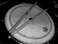
| 04/16/2003 12:16:29 AM |
sobered snareby mjc155Comment: One word of advice, if you care about the score then you have to be very careful to meet the challenge in a very obvious way. If you mainly want to just get annoying comments and show an alternate interpretation, then go right ahead. More power to you. Much as we might dislike it, this is a bit of a popularity contest for our pictures. You have to learn to appeal to a wide audience in order to get high scores.
I only subtract one point for not meeting the challenge, but LOTS of voters will automatically drop you to a 3 for it. Then they'd drop another point for having soft focus and a composition that isn't as strong as it could be. I think that's how you ended up with such a low score.
The description for this challenge said that you should make color the most important element of your photo. I'm usually pretty open minded about these things, but no matter how I look at this photo, I don't think of color as an important element because there is no color. Even if you took a shot and desaturated everything except one small item, using the selective color to make the subject stand out would have met the challenge IMO.
As far as the picture goes outside of the challenge... I think that the lighting is a bit too dark - there could be a greater tonal range or more contrast between the light and dark. Focus IS soft. It was probably because you were too close to the subject for your camera, and the aperture is way too small to allow any leeway. I think the subject is good, (not for this challenge) but you need a different way of shooting it. Having the bottom part cut off by the frame just doesn't work. You might be able to do a close-up from a lower angle that uses shallow dof... creating a diagonal that leads into the background with the drumsticks. I'm not sure... even shooting directly from above so that it is more symmetric and geometric would work better for me.
Don't get too frustrated with the score. It's all a learning experience. |
| 04/13/2003 05:48:29 PM |
Red leafby xertionComment: Hey!This is a pretty decent score - especially considering how well your other picture did last week.
I really like leaf pictures. It's spring here so most of ours are green now. I like the color and texture in yours. Detail and clarity are really nice.
I guess I agree with the others about the backlight. The only way I can think of to avoid it easily would be to use a lightbox, but I think that the black background looks much better than white would. The geometric circle juxtaposes with the organic outline of the leaf rather nicely. So... I'm not really sure how you could've shot it better. I wish some of those commenters would've made suggestions on how to avoid showing the light source while still keeping a black bakground.
You also did a nice job with the exposure. The area where the veins come together in the leaf looks a bit fuzzy, but focus overall is good.
Overall, it doesn't really have any major problems IMO. It just isn't a standout macro. (congrats on the ribbon btw) |
| Photographer found comment helpful. |
| 04/07/2003 01:49:06 PM |
|
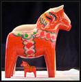
| 04/07/2003 03:02:46 AM |
Dala Horseby MonaComment: Hej! Cool. I have a red and a blue. Putting the sizes together like this really helps the composition. The lighting could be a little softer - did you diffuse it with something? The focus also seems a tad soft, and I think you could've just left the third one out of the shot since it doesn't really show and isn't colorful anyway. |
| Photographer found comment helpful. |
Home -
Challenges -
Community -
League -
Photos -
Cameras -
Lenses -
Learn -
Help -
Terms of Use -
Privacy -
Top ^
DPChallenge, and website content and design, Copyright © 2001-2026 Challenging Technologies, LLC.
All digital photo copyrights belong to the photographers and may not be used without permission.
Current Server Time: 07/17/2026 05:06:49 AM EDT.