| Image |
Comment |
| 05/13/2003 01:26:51 AM |
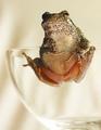
Young-Girlby terry139Comment: Lighting is a bit too dark. Too bad this is a glass challenge instead of a portrait challenge. It really is a nice shot. |
| 05/07/2003 01:37:44 AM |
Sticky Fingersby connieComment: tad oversharpened maybe . with all that texture it's easy to do. very cute and original tho |
| 05/07/2003 12:40:40 AM |
|
 Photographer found comment helpful. Photographer found comment helpful. |
| 05/07/2003 12:13:24 AM |
Blues in the Nightby crabappl3Comment: Dunno if you could desaturate a certain channel to get rid of that green in the middle, but it bugs me a little. I love the lighting along the bottom. Great clarity for such low light. Beautiful. |
| Photographer found comment helpful. |
| 05/05/2003 11:56:54 PM |
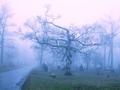
Deliveranceby RefocusedComment: the blacks look grey. adjust the black level some and tilt a little counterclockwise |
| 05/05/2003 11:15:00 PM |
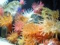
village of anemoneby kenboComment: Well. Considering that lots of ppl didn't even think that these were animals (and probably didn't look close enough to see the crab), that's a pretty decent score.
Nice color. Lighting seems a bit harsh. The sand is really hard to expose for, and the detail is a bit burned out in places. I also think it would've helped to exclude the white anemone b/c they are just too bright and overexposed. Someone already mentioned the glare on the glass. I think you could adjust levels a tad so that the background area is a true black and maybe add a bit more contrast.
Overall it doesn't seem like there was a lot of thought in the composition. It's sort of busy. Maybe you could focus on one area more and not cropped out part of the crab. |
| 05/05/2003 11:07:02 PM |
|
| Photographer found comment helpful. |
| 05/05/2003 11:03:38 PM |
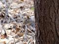
Sciurus carolinensisby mullany1957Comment: This is really cute, and I know how hard those guys are to catch on camera.
Compositionally, I think it might work better if you hadn't put the subject smack in the center of the shot. I think the tree is nicer then the bg so I'd probably crop off some on the left and some off the bottom. Getting rid of some of the extra space all around will help the viewer see the subject more easily.
I do like how you used dof to blur the bg and make it less noticeable, but it's just too bright. The squirrel doesn't really stand out well enough against it. Just imagine how well he'd stand out if you could replace all that brown with lush green grass. Not legal for dpc.. but nothing is stopping you now :)
Focus and detail are great though.
You might want to work on the titles b/c some ppl think they're pretty important. Supposedly, they don't help your score, but I do think that bad ones can hurt you. This isn't bad but just boring. |
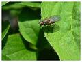
| 05/05/2003 10:39:10 PM |
Small World, Big Gap #1by KINGComment: 53rd? I would expect higher. This is a good shot and a nice score. I think it might have hurt that it is of an insect rather than a more traditional animal. It's a great macro.
I really like how you used dof to isolate the fly from the lower leaves and suggest distance.
The lighting is bright, but you did a good job with exposure. Nice detail and focus on the subject. Maybe you could crop some off the right side so that the fly isn't so centered. The color is nice. Maybe another frame would be nice - some burgundy and black? |
| Photographer found comment helpful. |
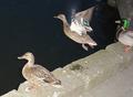
| 05/05/2003 10:30:38 PM |
One day I'll fly awayby pesinnComment: Hey! Lots of Icelandic folks around here lately.
I think the biggest problem with this shot is the flash burn. It's really obvious that you used a flash, and it just looks very unprofessional and too much like a snapshot. The duck also has red-eye.
Taking night shots of moving subjects is pretty near impossible unless you have some real lights set up to make it look more natural. Some cameras will allow you to adjust the flash output so that it isn't as strong and doesn't "burn" the subject. They just look too washed out in this shot. Other than the overexposure of the ducks, the water should also be darker which can be adjusted with levels in post processing.
Next time I'd suggest showing your shot to a few ppl to get some feedback before posting. Just be sure to do it early enough so that you'll have time to reshoot. The subjects and composition aren't that bad if you had taken it in the evening with better light. |
| Photographer found comment helpful. |
Home -
Challenges -
Community -
League -
Photos -
Cameras -
Lenses -
Learn -
Help -
Terms of Use -
Privacy -
Top ^
DPChallenge, and website content and design, Copyright © 2001-2026 Challenging Technologies, LLC.
All digital photo copyrights belong to the photographers and may not be used without permission.
Current Server Time: 07/16/2026 05:57:47 PM EDT.