| Image |
Comment |
| 02/24/2010 11:22:45 AM |
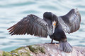
a n i m aby rooumComment: I gave this a 9, I thought it was creative and fun. You will see this shot over at Posthumous Ribbons, Part IV |
 Photographer found comment helpful. Photographer found comment helpful. |
| 02/24/2010 11:18:41 AM |
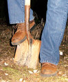
Seeking Treasuresby pedrobopComment: First Impression: Is that it seems oddly framed. It feels to me as though there are 3, or at least 2 main subjects competing for my attention.
Composition: As stated it seems to have competing focal points, perhaps lowering the f-stop to throw focus on just one area and blur the rest may suit this shot better. I also do not care for the crop on the bottom right. Maybe leave more of the subject in or none of it.
Lighting: Seems pretty decent. Perhaps a bit more diffused light would soften the slight glare on the right side.
For the Challenge: I think this meets the challenge well. It is a macro shot and It isn’t easy to tell what it is of so great job there. It finished probably right around where it should, I think most voters thought it was a good shot but just lacked a wow factor. It just wasn’t memorable. If I had voted on this I would likely have voted it a 5 or 6.
Overall this shot was done ok and has some good and bad technical issues. Keep up the work and keep experimenting and have fun.
|
| Photographer found comment helpful. |
| 02/24/2010 07:32:57 AM |
|
| Photographer found comment helpful. |
| 02/24/2010 07:29:17 AM |
|
| Photographer found comment helpful. |
| 02/24/2010 07:28:13 AM |
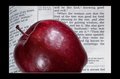
In the garden of Edenby dragonwarlord98Comment: Cool concept but I'm not sure on the comp. I think I would have liked to see more of the Bible in the frame. Also the black border is a bit too large imho. |
| Photographer found comment helpful. |
| 02/24/2010 07:16:10 AM |
|
| 02/24/2010 07:14:24 AM |
The Break by donjamesComment: Nice shot. I would of liked a bit more detail on the face though. |
| Photographer found comment helpful. |
| 02/24/2010 07:13:12 AM |
Sweet memories of my Wifeby Mark1966Comment: I think this was a good idea and really has potential to be a great shot. I love how you kept the shadows as part of the photo. The problems I see are that the main subject doesn't seem in focus, maybe using a higher f-stop would help that. Also the background is very dull. I simple white poster board woould help to add contrast and make it pop a bit more. |
| 02/24/2010 07:09:10 AM |
|
| Photographer found comment helpful. |
| 02/24/2010 07:07:31 AM |
Water Shadowby ElisiumComment: I like the idea of the shadow but I think your biggest problem here is going to be the size. You really should make use of the 800 pixels allowed. This is just too small to be able to judge it well and I think a lot of voters are going to hit you with 1's and 2's quickly just because of the size. This may help except the link was when the max was 640 and it is now 800 but that is the only difference. Hope this helps and good luck. |
Home -
Challenges -
Community -
League -
Photos -
Cameras -
Lenses -
Learn -
Help -
Terms of Use -
Privacy -
Top ^
DPChallenge, and website content and design, Copyright © 2001-2026 Challenging Technologies, LLC.
All digital photo copyrights belong to the photographers and may not be used without permission.
Current Server Time: 06/21/2026 12:24:28 PM EDT.