| Image |
Comment |
| 12/11/2003 02:54:15 PM |
What we take for granted...by fishstix_666Comment: The fence is blurry, especially on the right. If you want everything sharp, you should use apertures like f/16 or f/22 - I have just learnt it -, it helps you get everything in focus. |
| 12/11/2003 02:49:17 PM |
Simple pleasuresby litboltiComment: Focus could be improved, the texts seem to be blurry and the bottom of the equipment as well. You should have focused to the Nintendo text if you were to follow your title. |
 Photographer found comment helpful. Photographer found comment helpful. |
| 12/11/2003 02:42:56 PM |
linesby hughieComment: Maybe a bit too simple for me, and too much negative space here (I mean, your main subject could be a bit bigger). After voting is over, please, tell me what this is exactly. :-) |
| 12/11/2003 02:02:36 PM |
total chaosby darklord13Comment: Colours are a bit flat and the photo (your model) could be sharper. Lighting is a bit too harsh on your model's face and right hand. I guess the horizont is not horizontal because of the chaos here. :-) |
| 12/11/2003 12:48:03 PM |
roof lineby deceptiveComment: These colours are simply great together, and I love the red edge of the roof going in the diagonal. Roof pattern gives a very nice element to the photo and I really can\'t deceide whether this is a roof or stones of a road - well, yes, your title helps me. :-) Take 10 from me!
P.S. What about a one-pixel-wide border between the photo and the white border? Just an idea. |
| Photographer found comment helpful. |
| 12/11/2003 12:37:58 PM |
Cupby thelselComment: Seems like a hi-key photo to me. :-) I like it very much, composition, negative space and absolutely lack of anything complicated. B&W works well, maybe focus would have been a bit sharper on the top of the mug. |
| Photographer found comment helpful. |
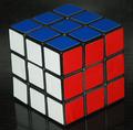
| 12/11/2003 12:34:57 PM |
simple or complex???by notonlineComment: Well, well, well, a Rubic-cube, I like it! :-) Colours and shapes are simple, maybe I would have chosen a darker level in PhotoShop and crop is too tight on the bottom, otherwise a good pic and I like it. :-) |
| Photographer found comment helpful. |
| 12/11/2003 12:04:03 PM |
No LEAFby BilianaComment: This is excellent! One of my favourites during this challenge. I like the shape, the waterdrops, the unique idea about the lack of the leaf. Easy to understand without the title, and B&W is super for it! And, after all, it's of course a 10 from me! :-) |
| 12/11/2003 11:56:02 AM |
Simply Loveby WildflowerJoyComment: I love the composition very much here, and the colours are brilliant, too! I love simple bonquets. :-) Maybe you could have left a few millimeters more space above and the flowers could be a bit sharper, too, but I enjoy this photo, I used to collect dry flowers years ago. |
| Photographer found comment helpful. |
| 12/11/2003 11:48:02 AM |
simple wonderby grigrigirlComment: This is a simple emotion, you are right, and I like it. :-) B&W is great for this photo, I love the eyes. For my taste, crop is too tight on the top, anyway. |
| Photographer found comment helpful. |
Home -
Challenges -
Community -
League -
Photos -
Cameras -
Lenses -
Learn -
Help -
Terms of Use -
Privacy -
Top ^
DPChallenge, and website content and design, Copyright © 2001-2026 Challenging Technologies, LLC.
All digital photo copyrights belong to the photographers and may not be used without permission.
Current Server Time: 07/18/2026 03:41:56 AM EDT.