| Image |
Comment |
| 12/11/2003 03:51:28 PM |
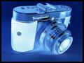
Voigtlanderby bubonoceleComment: I love the bluey negative photo effect here very much! Composition is great, lighting is perfect. This reminds me to my Zenit TTL camera. After yhe voting, please tell me, how did you make this effect! :-) |
| 12/11/2003 03:32:11 PM |
|
 Photographer found comment helpful. Photographer found comment helpful. |
| 12/11/2003 03:27:59 PM |
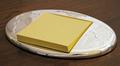
My Father's Cupby space amoebaComment: Provocative one, breaking the rule of thirds, but I like it this way. :-) Colours are very fine together and I think your border helps your photo constructively. The handle breaks the symmetric composition and I love this effect, too! |
| Photographer found comment helpful. |
| 12/11/2003 03:25:02 PM |
Simple But Usefulby melkingComment: This is simple! :-) I like the transparent pins have the same colour like the background. How did you do that? Was it something in the lighting or have you adjusted white-balance? Beautiful, sharp and simple macro photo, congrats! |
| Photographer found comment helpful. |
| 12/11/2003 03:22:22 PM |
Consider the Lilyby banmornComment: Wonderful composition, beautiful simple colours here. :-) Although I would like to see the rest of the flower on the left, I love this shot a much! :-) |
| Photographer found comment helpful. |
| 12/11/2003 03:17:01 PM |
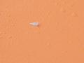
orangeby neoplasticsniperComment: I am not sure about the waterdrops, for my personal taste a more homogenic background would be more fine. I also would have followed the rule of thirds when placing your feather. Just a little bit to te left. It could be bigger as well, too. White and orange are nice together. |
| 12/11/2003 03:13:32 PM |
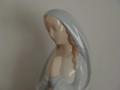
Prayer.......enough saidby TruegshtComment: The photo is a bit blurry, and I think lighting is not enough as the whole photo gets a greyish tone. I wouldn't have centered Her, I would have composed her more to the right, She could have enough negative space in front of Her for Her thoughts and prayers. A bit fining on the lighting could have made you avoid gleams on the statue. The idea is nice, and pastell tones are good for the photo's simplicity, too. |
| Photographer found comment helpful. |
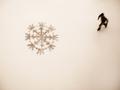
| 12/11/2003 03:09:04 PM |
Winter Pastimeby goodtempoComment: Simple, indeed, I like the snowflake-shape a much. :-) Could be in the left bottom corner so the skater and it would give the diagonal to the photo. I guess you wanted to go for rules of thirds, but sometimes it's good to break the rules. :-) I would see the skater more sharper, too, maybe a quicker shutter would have helped you. I like that his movement has a direction to the bottom left corner, this is why I would have composed the snowflake there. Just an opinion. |
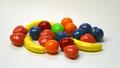
| 12/11/2003 03:05:27 PM |
Runtsby spectre013Comment: Simple shapes, but a bit many colours for my personal taste. You could have used a bit more depth of fields, the objects in the back could be sharper as they are part of your main subject(s). |
| Photographer found comment helpful. |
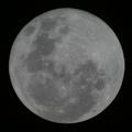
| 12/11/2003 02:59:44 PM |
Simple Moonby KevinRiggsComment: This is one of the best moon shots I have ever seen! :-) Nice for simplicity, would fit shapes as well. I guess it's a lo-key photo, isn't it? :-) I like it very much! |
Home -
Challenges -
Community -
League -
Photos -
Cameras -
Lenses -
Learn -
Help -
Terms of Use -
Privacy -
Top ^
DPChallenge, and website content and design, Copyright © 2001-2026 Challenging Technologies, LLC.
All digital photo copyrights belong to the photographers and may not be used without permission.
Current Server Time: 07/17/2026 06:58:58 PM EDT.