| Image |
Comment |
| 12/26/2003 04:20:30 PM |
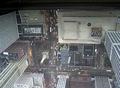
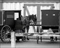
Edged Lifeby jonathandoddsComment: I like the roofs making a leading line. Otherwise I have the feeling you just looked out your window and pushed the button. Good idea, I just miss something, I dunno. |
 Photographer found comment helpful. Photographer found comment helpful. |
| 12/26/2003 04:18:51 PM |
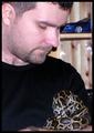
Untitledby holyjoComment: I am not sure whether this is grainy or just looks this way. I would have used a bit more diffused lighting here. Othewise a nice macro shot. :-) |
| Photographer found comment helpful. |
| 12/26/2003 04:16:54 PM |
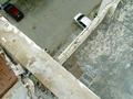
Edge of Roof - Edge of Sanityby flip89Comment: I would have rotated it 180 degrees, this way I have an unnatural feeling of looking down from a roof. :-) Good idea, the dark part of the top is a bit distracting, I would have inclded just a tiny stripe to show the roof itself. |
| Photographer found comment helpful. |
| 12/26/2003 04:14:57 PM |
Layersby SkamalComment: Composition is a bit busy for me, and I can't really find a main subject on your photo... The idea is good, just needs a better performance. |
| Photographer found comment helpful. |
| 12/26/2003 04:13:08 PM |
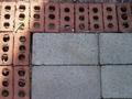
Bordering walkway !by tolovemoonComment: Good idea that the bricks make a frame for your photo. Anyway I would have rotated it a few degrees CCW, because it's not straight especially on the top. Lighting... well, truly it's only the edge that's lighted. :-) Interesting. A mistake that came out well because of the title of the challenge. :-) |
| Photographer found comment helpful. |
| 12/26/2003 04:09:50 PM |
Chrissy Eveby amwabComment: Photo is too small and I can't really catch the "on the edge" message here... :-( |
| 12/26/2003 04:01:39 PM |
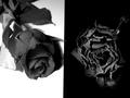
Death After Life or Life After Death ?by Charles PhilipComment: Unique idea, the story of the photo is one of my favourites here! The transition between life and death is truly one of those mistical boundaries that's hard to understand exactly and catches most people\'s fantasy! I also like that the living rose is so soft, and the dead one is rough. Just 2 small issues I have to mention here: I would have rotated the photo 1 degree CCW, because the borderline between the 2 sheets is not perfetly vertical. I also would have used one more lightbulb to make the shadow of the living rose more diffused. All together a great job! |
| Photographer found comment helpful. |
| 12/26/2003 03:51:12 PM |
Simplicity B&W Versionby cbellerComment: Wonderful in B&W. :-) Now that I can compare the 2 photos, I think I have to rethink my comment on the original. :-) The blue skirt helped to balance the distractness of the lean-to (fence?) in the foreground. Both versions are great otherwise. :-) |
| Photographer found comment helpful. |
| 12/26/2003 02:14:08 PM |
Test Your Snake-Phobia-Boundary !by MonaComment: The snake could have more accent here and I would have chosen a more homogenic background, otherwise the idea is one of my favourites in this challenge! Take 8 from me. |
| Photographer found comment helpful. |
| 12/26/2003 02:12:06 PM |
On the Edge of Dangerby SteveZComment: I LOVE TIGERS! I hope you have more photos of this wonderful one, extra point for choosing a tiger, and I hurry before he eats me for dinner. :-) |
Home -
Challenges -
Community -
League -
Photos -
Cameras -
Lenses -
Learn -
Help -
Terms of Use -
Privacy -
Top ^
DPChallenge, and website content and design, Copyright © 2001-2026 Challenging Technologies, LLC.
All digital photo copyrights belong to the photographers and may not be used without permission.
Current Server Time: 07/18/2026 05:59:09 AM EDT.