| Image |
Comment |
| 04/08/2011 05:50:03 PM |
Prophesyby AliciaComment: Lovely image. Perfect for this challenge. Nice stuff.
Back to look again. Such a beautiful photo. |
 Photographer found comment helpful. Photographer found comment helpful. |
| 04/08/2011 05:40:58 PM |
Social Networkingby gyabanComment: I am taking a chance and assuming this is gyaban. I gave this a 7 because it is technically perfect, it's a highly creative concept and relevant commentary, but I do think I can guess as to why it's not doing as well as you've expected.
Silly as it sounds, it's too clear. It's all revealed immediately. There's an interesting concept, but not much of a story and no mystery.
These are certainly not flaws, but in this pseudo-intellectual challenge, I think the voters might be demanding an accidental masterpiece, so to speak, and this might be too controlled.
For what it's worth, of course. |
| Photographer found comment helpful. |
| 04/08/2011 08:18:27 AM |
transportaréby whiteroomComment: Beautiful image. I don't dare say I have a box that defines what fine arts is to me, but this speaks volumes. I'm going to give this a 10, but don't be surprised if you lose that 10 at rollover, as I'll likely just still be here staring at it, without voting on the required 20%. |
| Photographer found comment helpful. |
| 04/08/2011 08:07:58 AM |
Fear Of Letting Go by jagarComment: Wow. This is something else. Incredibly creative, interesting story, a couple lifetimes of effort, and perfectly executed. This is quite a piece of work. |
| Photographer found comment helpful. |
| 04/08/2011 05:35:46 AM |
All Inby smardazComment: Great portrait. I have to say I think I prefer the color version, though. It just pops, and it's nearly criminal to go B&W with her eyes. Nice one. |
| Photographer found comment helpful. |
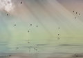
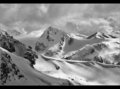
| 04/08/2011 05:16:28 AM |
Luminous Landscapeby MargaretNetComment: I could've sworn I commented on this last night. I suppose not. Well it's a hell of a shot. Only thing I might have done differently is deliver a heavy dose of dodge & burn to those clouds to get them to pop a bit and hold up their end of the photo, or crop another 40 pixels or so off the top of the image. The lighting on the peaks is quite nice but the clouds are just kind of blah next to them, yet my eyes keep floating up there for some reason. A tighter crop to remove some of those clouds would make this image more dramatic.
Before you consider these points, however, please keep in mind you placed nearly 100 spots ahead of me in this challenge. |
| Photographer found comment helpful. |
| 04/08/2011 03:50:04 AM |
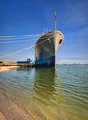
Pride of the Aggie fleetby Yo_SpiffComment: This score should be decommissioned. It's a great perspective and tack sharp.
As much as you want some foreground, I think this would have benefited from a tighter crop, possibly square. It would be large and in charge then, and the massive ship would feel a bit more massive. |
| Photographer found comment helpful. |
| 04/08/2011 03:36:20 AM |
|
| Photographer found comment helpful. |
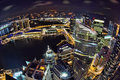
| 04/07/2011 05:31:52 PM |
On Top of the Worldby keeyewComment: Andrew? Is that you with your fisheye? Wonderful shot. The processing makes this look even more futuristic than it normally does, which is quite a bit to begin with. Certainly an eye-grabber. Nice stuff. |
| Photographer found comment helpful. |
| 04/07/2011 05:26:35 PM |
Enchanted Forestby amnonComment: I like the idea here, but a few tweaks in production would make a big difference in my opinion.
First off, it's an interesting scene, with nice play of light and interesting trees that are well arranged by you so that they are distinct from each other. Initial thought is that it should be bigger. Presentation on DPC pretty much mandates you go 800 pixels on the longest side. You really have to use it or it's immediately noticeable.
Next, the tone is fine, but I think there needs to be greater tonal range. I think a levels adjustment is in order. Bring out those blacks a bit, play with curves to improve the contrast a bit. Maybe use an overlay layer to further make it pop a bit.
This is a lovely shot, and if it's exactly what you were after I completely understand it. However, to the quick-voting public it might come off as an awkwardly processed image.
Not voting, just commenting. |
| Photographer found comment helpful. |
Home -
Challenges -
Community -
League -
Photos -
Cameras -
Lenses -
Learn -
Help -
Terms of Use -
Privacy -
Top ^
DPChallenge, and website content and design, Copyright © 2001-2026 Challenging Technologies, LLC.
All digital photo copyrights belong to the photographers and may not be used without permission.
Current Server Time: 07/19/2026 04:58:07 PM EDT.