I like the idea here, but a few tweaks in production would make a big difference in my opinion.
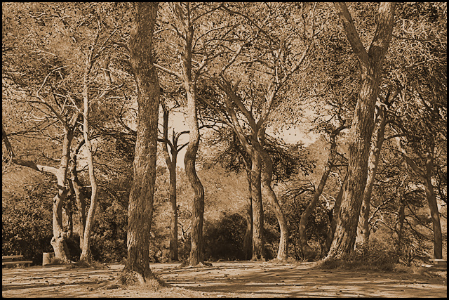
First off, it's an interesting scene, with nice play of light and interesting trees that are well arranged by you so that they are distinct from each other. Initial thought is that it should be bigger. Presentation on DPC pretty much mandates you go 800 pixels on the longest side. You really have to use it or it's immediately noticeable.
Next, the tone is fine, but I think there needs to be greater tonal range. I think a levels adjustment is in order. Bring out those blacks a bit, play with curves to improve the contrast a bit. Maybe use an overlay layer to further make it pop a bit.
This is a lovely shot, and if it's exactly what you were after I completely understand it. However, to the quick-voting public it might come off as an awkwardly processed image.
Not voting, just commenting. |







 Add photograph to your favorites
 Add photographer to your favorites


 Photographer found comment helpful.
