| Image |
Comment |
| 06/22/2010 09:23:33 AM |
Sun in Bloomby MinsoPhotoComment: The processing is way overdone for my tastes. Way too much saturation, way too much sharpening. Otherwise you did a good job with the complementary colors and the pop of color off the background. Sticking that flower more in the corner might help with the composition getting it more in the third. |
 Photographer found comment helpful. Photographer found comment helpful. |
| 06/22/2010 09:06:27 AM |
who ordered their's rare?by kellmak10Comment: Not bad for a shot of hamburgers. I mean it's not very interesting or anything, but the photo is quality. It is clear, in focus with a good exposure. You got some of the flame to show through the grill. It would be a great shot for advertising or some other such need. |
| Photographer found comment helpful. |
| 06/22/2010 08:37:42 AM |
badge engineeringby raishComment: The busy background detracts from the main subject. The shapes are too similar to the flower. You did get a pop of color but my eye travels away from the color to the right side of the image. |
| Photographer found comment helpful. |
| 06/22/2010 08:36:22 AM |
Flipby colorcarnivalComment: This isn't really in line with the challenge details or the challenge title. There is no real point of color here. No spot of color that pops due to a neutral background or due to a contrasting color. |
| Photographer found comment helpful. |
| 06/22/2010 08:34:45 AM |
|
| Photographer found comment helpful. |
| 06/22/2010 08:33:19 AM |
Rosa Rugosaby Bear_MusicComment: I really enjoy this as it has several good qualities... Excellent sharpness, great lighting, excellent exposure, good composition, wonderful texture and beautiful color. It also has great layers of differing elements: Layered Depth of Field from ultra sharp in the foreground to OOF in the background, layered lighting bright to dark, and layered color. It really pops! Excellent Job! I don't know if you missed anything with this photo. |
| Photographer found comment helpful. |
| 06/14/2010 08:13:01 PM |
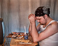
Urban Grace (remake of "GRACE" by Eric Enstrom)by dswannComment: I like your choice for this challenge. I think everyone's grandparents had this portrait hanging on the wall somewhere in the house. I like your twist on the portrait too with the urban theme. It really shows how far removed current society is from the spiritual foundations of our forefathers. A Comic Book and a TV replaces the bible and the can of food and crackers depicts just how far removed from the land we are. I would love for you to redo this to appear closer to the portait rather than with the HDR look. A nice black background and some softer focus would be great. At any rate. I enjoyed your photo. |
| Photographer found comment helpful. |
| 06/14/2010 09:40:07 AM |
Le Professionnelby manic35Comment: errr uhmm.... How did this not ribbon?? 43rd? With a 6.0?? Hardly! More like #1 with a 7+. This was absolutely the most striking image of the challenge!! |
| Photographer found comment helpful. |
| 06/13/2010 08:34:35 PM |
|
| Photographer found comment helpful. |
| 06/13/2010 08:31:57 PM |
|
| Photographer found comment helpful. |
Home -
Challenges -
Community -
League -
Photos -
Cameras -
Lenses -
Learn -
Help -
Terms of Use -
Privacy -
Top ^
DPChallenge, and website content and design, Copyright © 2001-2026 Challenging Technologies, LLC.
All digital photo copyrights belong to the photographers and may not be used without permission.
Current Server Time: 06/23/2026 12:06:37 AM EDT.