| Author | Thread |
|
|
06/28/2010 11:43:58 AM |
This is WAY better than where you finished!
Message edited by author 2010-06-28 11:45:21. |
|
 Photographer found comment helpful. Photographer found comment helpful. |
Comments Made During the Challenge  |
|
|
06/24/2010 10:16:19 PM |
|
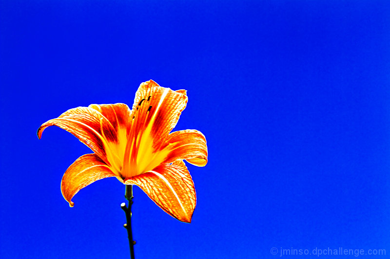
I ant too like it but it's too saturated |
|
| Photographer found comment helpful. |
|
|
06/24/2010 08:22:15 PM |
|
Nice image. Intense colour. |
|
| Photographer found comment helpful. |
|
|
06/22/2010 09:23:33 AM |
|
The processing is way overdone for my tastes. Way too much saturation, way too much sharpening. Otherwise you did a good job with the complementary colors and the pop of color off the background. Sticking that flower more in the corner might help with the composition getting it more in the third. |
|
| Photographer found comment helpful. |
|
|
06/21/2010 10:00:31 PM |
|
the blue background is so strong i feel it takes away from the image. |
|
| Photographer found comment helpful. |
Home -
Challenges -
Community -
League -
Photos -
Cameras -
Lenses -
Learn -
Help -
Terms of Use -
Privacy -
Top ^
DPChallenge, and website content and design, Copyright © 2001-2026 Challenging Technologies, LLC.
All digital photo copyrights belong to the photographers and may not be used without permission.
Current Server Time: 07/01/2026 07:46:44 AM EDT.