| Image |
Comment |
| 09/28/2010 06:54:32 PM |
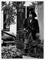
Gentleman O' Fortuneby HipychikComment: The processing is neat in that it gives the photo a 3D look... separating foreground, midground and background... however it does still look waaay over sharpened or HDR'd. I do like the composition and the framing with the branches. |
 Photographer found comment helpful. Photographer found comment helpful. |
| 09/25/2010 10:35:33 AM |
My mother  by svavaComment: The handbag, the serious face, the legs crossed... they all serve to tell the story of who she is! The image is very good... crisp, clear , great tones, well composed! |
| Photographer found comment helpful. |
| 09/25/2010 10:29:40 AM |
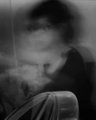
chair with girlby whiteroomComment: Ghostly!!! I get a spanish or mexican vibe off this because I see the face of Jesus in the misty blur... (Bottom left above the chair!!) |
| Photographer found comment helpful. |
| 09/25/2010 10:28:06 AM |
Mr. Fixitby torwickComment: I like this portrait. It tells the story of the man very well. I just question why you have framed the man with him in the left third here. |
| 09/25/2010 10:19:20 AM |
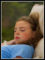
"A Penny For Your Thoughts"by Jon_HComment: Very nice and dreamy effect created by the soft focus and wide open aperture. It conveys the message of the title well and gives a glimpse into the girls personality. I think of what can be improved and I would have to say that there is too much space above the head. The way you have her framed, it puts her face in the center of the photo and I would like to see it either in the top third using a portrait layout or in the left third using a landscape layout. Everything else is good... color, clarity, focus. |
| Photographer found comment helpful. |
| 09/15/2010 11:19:22 AM |
Amish Triangleby MeMex2Comment: This is just in response to your request for comments in the forums...
I voted a 4 on this. For me it met the challenge well. I liked the composition well enough and the fact that the challenge subject was a nice pop of color.
What I found to be lacking in the photo was the background. There is something funky with the leaves and stuff not really looking blurred through the shallow depth of field, but by some other wierd means. Also it had some high noise for the time of day it was taken. I would have liked to see this sharper and crisper.
Also be careful with the ruleset. I believe dodging and burning is illegal under basic rules as it is considered spot editing. I could be wrong though. |
| 09/15/2010 11:12:48 AM |
Curvesby MeMex2Comment: Just some feedback from your request in the forums...
I think this is a good shot because it is nice and sharp and has good perspective. I personally would have gone with f8 at 100 ISO and let the shutter fall where it neded to be. But that is just me. |
| 09/11/2010 11:28:52 AM |
|
| Photographer found comment helpful. |
| 09/11/2010 11:26:06 AM |
The Nose Of The Lionby kannewurfComment: Perhaps you could have used a reflector to get a little more light onto the right side of her face. Maybe you could have asked your model to turn a little toward the light??? (just kidding!!)
Good shape! The photo really has good sharpness showing off the texture of the fur well. Nice lighting too. |
| 09/11/2010 11:23:43 AM |
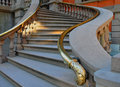
Triangles & Squaresby sjshafComment: Very nice. If possible I would have framed out any elements that were not related to the shape. A different camera angle, zoom length or perspective could have helped to achieve that. Great color and reflections in the glass. |
Home -
Challenges -
Community -
League -
Photos -
Cameras -
Lenses -
Learn -
Help -
Terms of Use -
Privacy -
Top ^
DPChallenge, and website content and design, Copyright © 2001-2026 Challenging Technologies, LLC.
All digital photo copyrights belong to the photographers and may not be used without permission.
Current Server Time: 06/25/2026 05:25:58 AM EDT.