| Image |
Comment |
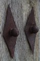
| 11/16/2011 02:00:42 PM |
Two of diamondsby DarkpixelComment: I think, given the title, that a smaller aperture bringing both items into focus would have been more fitting. |
 Photographer found comment helpful. Photographer found comment helpful. |
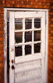
| 11/16/2011 01:59:17 PM |
Ajarby npaselComment: I was thinking of whipping out the lensbaby!!! Nice placement of the sweet spot and a great rush of blur toward the door! |
| Photographer found comment helpful. |
| 11/16/2011 01:57:45 PM |
|
| Photographer found comment helpful. |
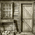
| 11/16/2011 01:56:52 PM |
Pioneer Cabin Doorby Snowboard3rComment: Very good light, textures and sharpness. Though there is a range of tones shere, it is coming off very drab and grey making it appear flat. |
| Photographer found comment helpful. |
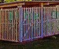
| 11/16/2011 01:53:21 PM |
Pump House Gatesby BrianRComment: I think a study of the details of the gate could have brought something a little stronger. You did get good perspective however the point of view seems to be pretty ordinary. (Standing at close to eye level??) Great texture and sharpness overall! |
| Photographer found comment helpful. |
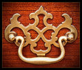
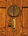
| 11/16/2011 01:50:25 PM |
Doors, Knob, Lock and Handlesby banmornComment: The light is a little orange overall. Maybe too warm. Perhaps checking the white balance could help. It could be from the fact that the brass does not really contrast that much from the stained oak? (I am guessing oak wood here) Otherwise nice and sharp texture and details. |
| Photographer found comment helpful. |
| 11/16/2011 01:47:34 PM |
Strong teethby paynekjComment: I like how they retro-fit the letter opening into the door vertically! As far as the photo goes I like the nice unobtrusive vignette and the decent viewpoint possibly could have been made stronger shooting more from below. The light is a little brighter at the top. I would have tried to make it more even using a brightness/contrast adjustment layer and masking and blending with a big, soft brush. The light at the top is more blue and cool where it is more warm and dark at the bottom. I think the same concept as above with a hue/saturation adjustment layer or a warming filter could have worked to tweak that too. |
| Photographer found comment helpful. |
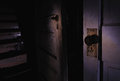
| 11/16/2011 01:38:11 PM |
Door By Doorby IchristfollowerComment: This is kind of spooky! You did get good light and shadow on the right side door handle, but I think the light spills over too much into the left side of the photo onto the stairwell. The reflection of the light on the stair riser kind of takes away the ambiance. The light on the left is not as even as on the right side of the photo. The light on the right door is good and it should, in my opinion, fade out to the edges of the photo to make it more evenly distributed. Great concept and location! |
| Photographer found comment helpful. |
| 11/16/2011 09:41:41 AM |
|
| Photographer found comment helpful. |
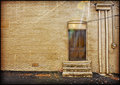
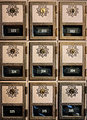
| 11/16/2011 09:40:30 AM |
Post Office Boxesby kleskiComment: You got good lighting. I think you could have left a hair more on the left side so the misaligned doors weren't getting cut off. Perhaps it wasn't possible. |
| Photographer found comment helpful. |
Home -
Challenges -
Community -
League -
Photos -
Cameras -
Lenses -
Learn -
Help -
Terms of Use -
Privacy -
Top ^
DPChallenge, and website content and design, Copyright © 2001-2026 Challenging Technologies, LLC.
All digital photo copyrights belong to the photographers and may not be used without permission.
Current Server Time: 06/25/2026 01:10:16 AM EDT.