| Image |
Comment |
| 01/23/2010 09:10:46 PM |
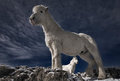
Partners IIby BrinComment: I like the composition, but the backlighting seems to leave the front horse in shadow. 7 |
 Photographer found comment helpful. Photographer found comment helpful. |
| 01/23/2010 09:09:39 PM |
Together They Leapby jasonlpriceComment: I really like this, so well conceived and executed. Seems to have some flash to separate the kids from the background; however it was done, the light is great. 9 |
| Photographer found comment helpful. |
| 01/23/2010 09:07:06 PM |
|
| Photographer found comment helpful. |
| 01/23/2010 09:05:21 PM |
Her-Selfby WeJayComment: Beautiful. The only concern I have is the yellow pole, which is just too prominent for me. 8 |
| Photographer found comment helpful. |
| 01/23/2010 09:02:54 PM |
Rotundaby GeorgeComment: The tree obscures so much of the building, you are left wondering if that is the focus of the image (especially since it is sharply focused.) Perhaps selective depth of field could have solved that? |
| Photographer found comment helpful. |
| 01/23/2010 09:01:15 PM |
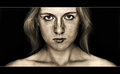
Portrait of a manby IraklisComment: I like the off-angle framing, the light, and the gaze of the man. But the man seems to have soft focus, and the wall seems sharper, which is reversed to me. 6 |
| Photographer found comment helpful. |
| 01/23/2010 08:59:20 PM |
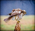
Behind the waterfallby GudjonottoComment: I'll be interested to read how this was done, it is pretty with good colors, but I think I would prefer to see where the water originates. 7 |
| 01/23/2010 08:55:04 PM |
The Rainbow Fenceby prperoldComment: Nice image, interesting texture in the water. Sky seems over saturated, though. And it seems a bit unlucky that the diagonals lead the eye to the extreme upper left of the image, with no real subject at the destination. 7 |
| Photographer found comment helpful. |
| 01/23/2010 08:51:15 PM |
Mírameby inshaalaComment: Interesting image, I like what you were trying to do. The ring lighting is very good, with the nice catch light in the eyes. But the eyes don't look natural to me, and seem to not match the overall image - I think it is the whites of the eyes that lost their detail with the boost in contrast. 7 |
| 01/23/2010 08:48:12 PM |
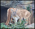
The Guardianby KelliComment: The cat's head looks good, perhaps a bit over processed. But the second cat's rear really diminishes this for me. |
| Photographer found comment helpful. |
Home -
Challenges -
Community -
League -
Photos -
Cameras -
Lenses -
Learn -
Help -
Terms of Use -
Privacy -
Top ^
DPChallenge, and website content and design, Copyright © 2001-2026 Challenging Technologies, LLC.
All digital photo copyrights belong to the photographers and may not be used without permission.
Current Server Time: 07/17/2026 12:57:00 AM EDT.