|
|
|
Showing 851 - 860 of ~1569 |
| Image |
Comment |
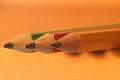
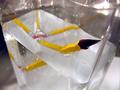
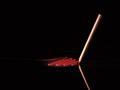
| 08/26/2002 09:36:00 AM | threeby FranziskaLangComment: thank you all for your comments, as usual. the three pencils are lying on the upper shelf of my desk at home, sticking over the side of the shelf, hence those shadows. i liked the way the yellow pencil fades in with the background, but realize from the comments that people either love it or hate it. oh well. i have taken a couple of shots with a white background and having the pencils enter diagonally into the shot, but it just didn't work as well for me. it was pretty dark, so i hand-held a desklamp, that was all the light i could muster at that time of night. hence also the reflection on the pencil tip (which i noticed only after uploading the pictures). lastly, i included the yellow pencil (rather than going just with primary colors) because i still had this yellow pencil thing in my head from the initial challenge description, as well as because it did blend so much with the background ... i wanted it that way! ;) |
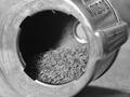
| 08/19/2002 12:45:00 PM | Pencilby mscott821Comment: i'm not sure i understand what the item is ... the inside of a pencil sharpener maybe? it's pencil shavings inside, i assume). so, while you technically met the challenge, i would've preferred to see a whole pencil - but that's just my opinion. the focus is good on the photo, i like the framing, too, and the b&w works. i'm just overall confused by what i'm looking at, i guess. sorry, probably me being dense. -- gr8photos (3) |
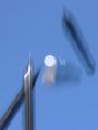
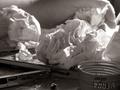
| 08/19/2002 12:47:00 PM | mechanical free fallby cq107Comment: i have to admit, if this wasn't an entry for the pencil challenge, it would've taken me a while to figure out that i was looking at pencils. what's the white thing in the middle? i like the background color, and the grayish pencils against that, but was there a way to stop the motion a little more to make it not quite as abstract (of course, that's probably exactly what you are trying to achieve ... don't you just hate it when people don't appreciate what you worked hard for?). but, the truth is, deliberately abstract or not, to me, the photo isn't that appealing, sorry. -- gr8photos (3) |
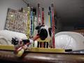
| 08/21/2002 03:41:00 PM | Poo Mooby MagsCoyoteComment: that looks painful! there's too much clutter in the background of this photo, i am especially intrigued by what you have framed there. labels? stickers? beer mats? and why is the hardhat there? all that distracts from the actual subject -- gr8photos (3) |
| 08/21/2002 03:50:00 PM | Stayin' Aliveby sylkComment: cool idea. that's just one pencil, isn't it? while i like the idea, there are a few things about the implementation i don't like. the waterdrops on the inside/outside are distracting, some of the background (especiall the bright spot in the top right) is also. if you retry this, try wiping the drops off and position the vase onto a large white cardboard sheet (from your local arts store) so that the background and the underneath is nice and simple and doesn't distract. -- gr8photos (4) |
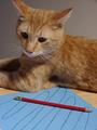
| 08/20/2002 03:08:00 PM | "You want me to hold what???"by marvinmartian79Comment: very cute kitty, the drawing on the paper is also a good idea. i just wish there was more interaction between the cat and the pen and you hadn't cropped off the kitty's ear at the top. -- gr8photos (4) |
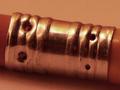
| 08/20/2002 11:57:00 AM | ferruleby just-marriedComment: i'm sorry, this photo, while meeting the challenge, doesn't excite me very much. i think you probably went for those muted, similar colors (no bright yellow or red) deliberately, but personally, i feel they are missing, and the background has a color that's too similar. picture also doesn't seem quite sharp. -- gr8photos (3) |  Photographer found comment helpful. Photographer found comment helpful. |
| 08/20/2002 01:27:00 PM | Frustrationby annelizabethComment: nice concept, b&w works well here. overall, the photo is a little too busy for my liking. the pencil in the foreground is definitely not the first thing i see, and it took me a moment to notice the hand. the bottlecap on the bottom right doesn't really fit in in my opinion. i think if the foreground was a little lighter, more of my focus would be there. -- gr8photos (3) |
| 08/25/2002 02:08:00 PM | Ghostwriterby gkochComment: very nice idea, and nicely implemneted. i have no criticism to offer, just a small nitpick - there's a dot in the lower left corner. your photo is in my top 10 this week. -- gr8photos (9) |
| 08/21/2002 03:43:00 PM | The Pencil Guardianby HendrikComment: my god, that thing is ugly! ;) you did take a nice photo of it though, the black background is good and centering the object is fine here. for some reason the eyes look a little out of focus. -- gr8photos (5) |
|
Showing 851 - 860 of ~1569 |
Home -
Challenges -
Community -
League -
Photos -
Cameras -
Lenses -
Learn -
Help -
Terms of Use -
Privacy -
Top ^
DPChallenge, and website content and design, Copyright © 2001-2026 Challenging Technologies, LLC.
All digital photo copyrights belong to the photographers and may not be used without permission.
Current Server Time: 07/23/2026 02:54:06 AM EDT.
|