|
|
|
Showing 411 - 420 of ~1569 |
| Image |
Comment |
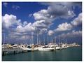
| 03/05/2003 09:06:46 AM | Storm Brewingby GraciousComment: Critique Club Critique
First Impression
I love sailing. All those sailboats instantly remind me of Sweden, which is where I learned to sail. Those were good times :)
(1) Composition / Content
Your photo "flows" very nicely. The pier on the left leads the eye into the photo, it then travels along the boats and ends up on the big boat on the right. The dramatic sky and the little bird (perfectly timed to be surrounded by clouds) provide additional accents and places of interest.
(2) Background
The sky is very dramatic with the white clouds on the dark blue sky. Did you use a polarizing filter for this? It worked well. The bottle green of the water is also nice, and the two frame the rows of mainly white boats very well.
(3) Camera Work / Technical
Good. The photo is in focus, the horizon level, and there's a nice range of contrast and colors.
(4) Post-processing
Looks fine to me. I like the simple white frame that you've chosen, it complements the picture well without being distracting.
(5) Meeting the Challenge
Absolutely. I could easily see this in a sailing magazine or brochure.
(6) My Opinion
As I already mentioned, I like sailing. I think you've captured the feeling of being out there really well, I can almost here the lines click against the masts. A very nice photo, and I think your score reflects it. I really have nothing to add to improve it. :)
Please let me know if you have any questions or comments about this review.
Franziska. |  Photographer found comment helpful. Photographer found comment helpful. |
| 02/27/2003 12:23:36 PM | Illuminated Texasby AnachroniteComment: I can see this being used in an article with text overlayed on the black background, so the challenge is definitely met. I like the nice even black background and the warm colors of your globe. Focus is good, too, although I could see this cropped a little more at the bottom and left, because rather than Texas, I'm more drawn to the yellow corner with the large writing (part of which denotes cities in Texas, I know). That's where the eye usually wanders in a photo, the lighter places. Overall, a good submission. :) | | Photographer found comment helpful. |
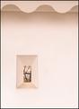
| 02/26/2003 01:18:45 PM | Seeing Beyondby NatashaComment: Oh, this shot is incredible ... I love the soft colors, the curves at the top and then the tiny window in the thick wall, placed just right ... you might just have a winner here :) | | Photographer found comment helpful. |
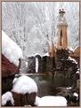
| 02/26/2003 01:17:35 PM | Castle in the Snowby MalokataComment: This looks like a really cool place to take photos, bet you took many more than just this one :) You've met the challenge with it, too. I can see this being used in a travel-kind of article. I really have no constructive criticism to offer, except maybe use a different border, the color of this one doesn't really match anything of the photo. I do like how you got your snow white with only very little blowout, and you kept the detail in the dark walls. You made the photo look 3D by having the snow-covered rocks in the foreground. I'll be curious to see next week where this was taken. | | Photographer found comment helpful. |
| 02/26/2003 11:38:05 AM | Communicate hereby vjozComment: I can see this concept being used for stock photography, so you've met the challenge. It's fun to see one of those phones, my parents had one, now it looks old and clunky to me. I like the composition of your photo for stock photography, too. Generally, I would have said it's a little unbalanced, but in this case I feel there's room available for someone to add text to the photo. I do see some issues with the technical site of this photo. Overall, the focus is soft, and there are highlights from the lighting. That can be fixed by holding a couple of sheets of paper between the light-source and your subject. I can see your reflection in the middle of the dial, I'm not sure what would've been the easiest way of removing that. Lastly, your background is a little gray in the bottom right corner (I know just how hard it is to get a really white background so I appreciate your effort) and there are some dirtparticles (?) visible (right middle, inside of the loop made by the cord). | | Photographer found comment helpful. |
| 02/25/2003 03:22:13 PM | Dawn at the Harbourby andrewmComment: Challenge met, I can definitely see this being used as stock photography. It is also a nice photo. The clouds add a lot of interest to the photo (could almost qualify for leading lines this week :-P). Overall, I think I would like to see this just a tinsy tad brighter to see just a little bit more detail, but w/out blowing out the sky. Good entry :) | | Photographer found comment helpful. |
| 02/25/2003 03:20:10 PM | Stock Kittyby jerrftComment: Challenge met. Nice sharp and focused image. Very beautiful cat, I especially like that little black dot on her/his nose. There's a little hair in the top right corner that's a bit distracting, but I expect you would clone that out for real stock photography. Personally, I think the crop is a bit tight, but I can still see this being used as a stock photo. Good job :) | | Photographer found comment helpful. |
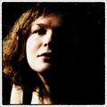
| 02/25/2003 08:58:37 AM | Could be used for an Ad (right side available for text)by dimitriiComment: Wow, talk about a title that explains things ... good thing this is a photography site :-P Challenge met. I'm torn about your picture. I very much like the composition, the stark shadows, the frame works extremely well with it. I wish the woman was just a little more sharply focused. There are a couple of tiny (nitpicky) distraction behind her hair that you could easily clone out after the challenge and before sending this to an ad agency. I think I'll have to come back and look at this one a couple of times to determine my final score. :) | | Photographer found comment helpful. |
| 02/24/2003 03:31:06 PM | one item, wine, glass, drink, vertical, nobody, close-up, empty, curve, blue, fragile, transparent by Pep VentosaComment: A very nice simple and clean image, I like that a lot. You've done an incredible job on the glass, no reflections or blown-out highlights, wonderful. The background behind the glass is very nice also, the surface the glass is standing on is very distracting in my opinion, it introduces a much darker color and a clear straight separation of background vs. surface in an otherwise curvy photo. To my eye, it also looks just a tad rotated, but that may be me not holding my head straight today. :) I would suggest redoing this with a different surface (put the glass on a curved piece of cardboard that serves as background and surface?) and you have a winner in my mind. | | Photographer found comment helpful. |
| 02/24/2003 03:26:17 PM | Jelly Belliesby KazComment: What a nice and colorful photo. You've got good focus here and nice framing, too. However, I don't see this working as a stock photo for two reasons (a) the Jelly Bean name on the beans!!! This makes this unusuable for generic stock photography (b) the highlights on the beans, I think to see this as a stock photo, the lighting needs to be a little more even. These days, I always put my camera on a tripod, use a strong light source but hold a bed sheet inbetween the light and the source. That allows sufficient light to take a long(ish) exposure but avoids the blown out highlights. | | Photographer found comment helpful. |
|
Showing 411 - 420 of ~1569 |
Home -
Challenges -
Community -
League -
Photos -
Cameras -
Lenses -
Learn -
Help -
Terms of Use -
Privacy -
Top ^
DPChallenge, and website content and design, Copyright © 2001-2026 Challenging Technologies, LLC.
All digital photo copyrights belong to the photographers and may not be used without permission.
Current Server Time: 07/18/2026 04:05:15 PM EDT.
|