| Image |
Comment |
| 07/04/2004 05:13:50 PM |
Consideringby AmiYuyComment: Lovely cat picture, there's really nothing that I'd do differently. I like the splash of color in the front from he blanket and how we can clearly see all the fuzzy hairs of the cat. Actually, one thing that would be nice, too (and it depends much on your cat) is if you captured a shot with him/her looking at you, too. This one works in b&w, too, I think. |
 Photographer found comment helpful. Photographer found comment helpful. |
| 07/03/2004 01:21:43 AM |
Young Boy (Josh)by GraciousComment: Grace, sorry to hear you took this one in May, not June. I had ranked this one highly, I really like how the light outlines his profile. Great job! |
| 07/02/2004 02:20:31 PM |
Blueby MikeOComment: Nice abstract concept and idea. I like different looks at every-day things. Overall, I find this image has a plasticky kind of look to it (maybe that was intentional?) that I personally don't care for. |
| Photographer found comment helpful. |
| 07/02/2004 01:41:21 PM |
Small Kite, Tall Grassby lagavulinComment: I'm sure you've already received comments that this shot is too dark. Looks like you took this during full sun and that's hard, the camera doesn't have the capability to capture light/dark contrasts in as wide a range as our eyes. A different time of day, or fill-flash may be the answer. Apart from that, a couple of things that may further improve your photo (in my opinion at least) would be to clone or crop that little bit of a branch (?) out that is poking in the frame at the top left corner. Cropping a bit more off the right side could improve composition (have the person off-center, in this case, her being center doesn't add to the image I think) and it would get rid of another set of distracting branches. |
| Photographer found comment helpful. |
| 07/01/2004 11:32:27 PM |
Touched by the Evening Light by librodoComment: OMG, this is just perfect. There's not a single thing I'd do differently. I can definitely see this as a print. Love the hues and the clean and simple composition. There's nothing that distracts, in some way, it's like a silhouette, but you also have the details to keep you interested. Hope you get a ribbon! |
| Photographer found comment helpful. |
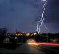
| 07/01/2004 06:25:41 PM |
Lightning over Prague Castleby mbardeenComment: Nice catch! Personally, I thinhk this image would be much stronger with the bottom third cropped off (the road and the lit up building, too). As it is now, the light trails on the road are competing too much with the lightning. I realize that you obviously intended the shot this way, this is just my opinion on what I feel would be a stronger crop, even though it's a very different shot at that point. |
| Photographer found comment helpful. |
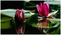
| 07/01/2004 03:42:36 PM |
A Touch of Monetby waterliliesComment: Nice backlighting. Love the composition, too. Two things I would've tried to do (considering this was an advanced editing challenge) would be to clone out the light area right at the top, and also either not crop so tightly at the bottom (since the reflection is such an integral part of the image), or, if you have to crop tightly to get other distracting stuff out of the way, maybe some cloning there, too. Having said all that, of course, I don't know what the surroundings looked like so all of these suggestions may be impossible. They are just impressions of what would have improved this particular photo from my point of view. |
| Photographer found comment helpful. |
| 07/01/2004 11:28:30 AM |
Midsummer Sceptivitiesby DonatienComment: What a cutie! I spent a couple of midsommar evenings in Sweden (no idea whether this was taken there) and this immediately reminded me. There's really not much I would change, it's a great capture. I would consider cropping a bit on the right, while I like the open space there, there's a white spot right at the top that draws attention away, and there's alos just a tad too much empty room there for my liking. |
| Photographer found comment helpful. |
| 07/01/2004 09:29:55 AM |
Spring Coloursby melongrindComment: I like the classic portrait composition, also, that she is looking at the viewer and that there's room to the right of her. The backgorund is a nice contrast and complements her eyes well. My only preference would be to have the image a little sharper, it looks soft to me. Not sure if that's a tad OOF or neatimage, my guess is neatimage. |
| Photographer found comment helpful. |
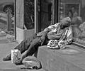
| 07/01/2004 09:09:34 AM |
Harsh Realityby flip89Comment: Sad situation, but wonderful capture! I really like the composition and the black and white treatment. The best part of the image to me though is the painting in the shop behind the guy, it just increases the contrast between the homeless guy and the world of those with money and jobs and nice paintings and really brings it home. I wouldn't do a thing differently with this photo. |
| Photographer found comment helpful. |
Home -
Challenges -
Community -
League -
Photos -
Cameras -
Lenses -
Learn -
Help -
Terms of Use -
Privacy -
Top ^
DPChallenge, and website content and design, Copyright © 2001-2026 Challenging Technologies, LLC.
All digital photo copyrights belong to the photographers and may not be used without permission.
Current Server Time: 07/16/2026 10:24:13 PM EDT.