| Image |
Comment |
| 11/22/2003 11:49:57 PM |
|
 Photographer found comment helpful. Photographer found comment helpful. |
| 11/22/2003 11:48:46 PM |
|
| 11/22/2003 11:47:23 PM |
|
| Photographer found comment helpful. |
| 11/22/2003 11:27:35 PM |
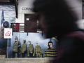
Beware of "The Phog"by CraigDComment: I'm not sure what cause the image is trying to promote, but it is a great photo of this statue. The viewpoint emphasizes the player's height. The trees and sky make a nice background. |
| Photographer found comment helpful. |
| 11/22/2003 11:24:14 PM |
|
| Photographer found comment helpful. |
| 11/22/2003 11:21:01 PM |
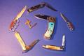
knifesby tolovemoonComment: A nice assortment of knives, artfully arranged. The gradient background is nice. The focus is too soft for the subject; it needs some sharpening. But your interpretation of the beauty and variety of knives is too neutral to be propaganda. |
| Photographer found comment helpful. |
| 11/22/2003 11:12:41 PM |
|
| Photographer found comment helpful. |
| 11/22/2003 05:46:59 PM |
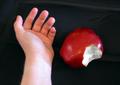
Snow Whiteby GinxComment: Greetings from the Critique Club!
The composition is simple but very effective, a vivid portrayal of a crucial scene from the well known story. The hand and apple are well placed to convey your message. A more realistic background would have been nice as would better focus. But lighting is really the key to an image like this. You have a strong key light on the right, which is good. But either other lights or reflections make the shadows too light. A single small light with no other lights or reflectors would case stark shadows and make the image more dramatic. Probably too much so, but start there and add just enough fill light to define the shapes of the hand and apple yet keep the shadows dark. It would also be interesting to experiment with a red fill light (or red poster board to reflect some of the key light back to the subjects). |
| 11/22/2003 03:48:09 PM |
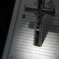
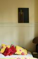
Unbearable lightness of beingby sergutComment: Greetings from the Critique Club:
I haven't read the book so can't comment on how well this image reflects its ambiance. The painting is dark and somber, with the subject distorted and squeezed to one side. It is displayed in a light and cheerful bedroom. The combination gives me the feeling of someone who seems happy and balanced but harbors some hidden insecurity or depression. There are two centers of interest, the painting and the pillows. This is normally undesirable, but here it reinforces the dichotomy of happy outside and melancholy inside.
The natural lighting from the windows is perfect; it makes the wall more interesting but doesn't seem to touch the painting. The vertical format matches the painting and is the right artistic choice. Color was the best choice as well; the yellow adds to cheerfulness of the room.
Since you requested a critique, let me point out some weak points. The photo is somewhat blurry; I think sharp focus would have worked better. There is quite a bit of digital noise throughout the photo; it is fine on the painting but somewhat distracting everywhere else. And although the image says plenty to those who make the effort to look, it lacks some element to reach out and grab the viewer's attention. It's message is whispered, not shouted. This isn't necessarily bad, but will probably destine this image to obscurity. |
| Photographer found comment helpful. |
| 11/20/2003 11:41:23 PM |
In My Little Townby TerryGeeComment: Greetings from the Critique Club!
This quaint church is a great subject for a photograph. The colors are great and the fallen leaves are a nice touch. You already realize the spotlight is too harsh. I personally like the face-on view; better lighting and some sharpening would help give it some depth. The formal symmetric composition matches the subject well, although it needs a bit of space on the sides and even more on the top.
Do keep making photos of this photogenic church in various lighting conditions and seasons. You may be surprised how different it can look. |
| Photographer found comment helpful. |
Home -
Challenges -
Community -
League -
Photos -
Cameras -
Lenses -
Learn -
Help -
Terms of Use -
Privacy -
Top ^
DPChallenge, and website content and design, Copyright © 2001-2026 Challenging Technologies, LLC.
All digital photo copyrights belong to the photographers and may not be used without permission.
Current Server Time: 07/21/2026 11:46:29 PM EDT.