|
|
|
Showing 631 - 640 of ~1171 |
| Image |
Comment |
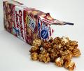
| 12/03/2003 08:28:43 PM | Guess What's Insideby ScottKComment: Greetings from the Critique Club!
This photo expresses the essence of Cracker Jack: caramel popcorn and a surprise from a box. (Peanuts are missing, but there are never enough of those in Cracker Jack anyway!) The composition works well; the surprise is the center of interest as you intended, and the popcorn and box support it well. The lighting is good, casting nice soft shadows; spotlighting the surprise was a good idea. The background is perfect, using a slightly warmer white than the whites on the subject help the latter stand out.
Overall a great photo. But it seems just a bit muted; I think a small contrast boost would help add some impact. |  Photographer found comment helpful. Photographer found comment helpful. |
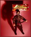
| 12/01/2003 08:51:34 PM | We Come in Peace.by BobsterLobsterComment: Greetings from the Critique Club!
Like many of the others who commented, I see this image as an ironic portrayal of enforcing peace using weapons of war. One thing that contributes to this is the looming "shadowy" shadow (by that I mean it's rather blurry and indistinct). But most importantly, I think, is the red background, symbol of war and blood. (Blue would have probably been preferred by those who sent him since it represents peace; white does too, but that would made this look like a product shot rather than propaganda.)
The lighting is great, except for the reflection of the box behind the figure's head, which is a bit distracting. The figure and box are nicely arranged (I like the box prominently positioned with its shadow contributing to the figure's.)
There are some minor technical problems: halos around the figure's arms and shoulders (probably from oversharpening), and some noise in the background (I'm guessing from a saturation boost, although I do like the very red color).
This propaganda probably won't convince many national or military leaders, but to me it conveys a strong message that the "peace" being kept here really isn't very peaceful. | | Photographer found comment helpful. |
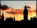
| 11/29/2003 01:44:02 PM | What's the Point?by KonadorComment: Greetings from the Critique Club!
To me, it is the repetition of the pointed towers that really makes this photo interesting. Of course, the beautiful sunset-lit clouds help too. I also like the light coming through open areas in the towers. To me the center of interest is the building with all the small towers (parliament?), not the clock tower which, though larger, isn't as interesting in silhouette. From your comments that wasn't your intent, but it doesn't affect the impact or quality of the image. Exposure, focus, and post-processing are all perfect.
One nit: To me, the photo seems slightly tilted to the right. It isn't; Big Ben is perfectly vertical in this image! But the silhouette removes the depth cues that indicate the rooftops are slanted because of perspective, making them seem tilted. A slight counter-clockwise rotation might make the image look straighter. | | Photographer found comment helpful. |
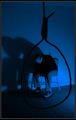
| 11/28/2003 08:21:35 PM | Give Him Enough Rope And He'll Hang Himselfby BeagleboyComment: Greetings from the Critique Club!
This image conveys a very clear message. The dark tones, blue color, and the model's pose all indicate depression. The noose shows the portent of his thoughts, and using it to frame the subject works really well. The shadow adds drama. Overall, a great photo, and perfect for the Literalisms challenge.
Since you did request a critique, let me point out the minor and barely noticable weaknesses. There are indentations in the carpet where the furniture was before you moved it out of the way for the photo. There are apparent compression artifacts around many of the edges (did you use jpeg to go to and from NeatImage?). And parts of the chair legs and baseboard seem a bit oversaturated. The red lamp makes this basically monochrome; the Colorize option of Hue/Saturation may have worked a little better than Color Balance to avoid this. | | Photographer found comment helpful. |
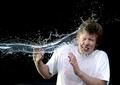
| 11/28/2003 01:46:00 PM | Splash! by arnitComment: Great stop action, and the model does seem surprised. I think the photo would be more effective if the shirt was dry. | | Photographer found comment helpful. |
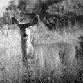
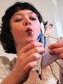
| 11/28/2003 01:44:05 PM | A Silent Stareby vtruanComment: Nice photo that works well in black and white. I'm sure surprise was involved (either you surprised her or she surprised you), but it doesn't really show here. | | Photographer found comment helpful. |
| 11/28/2003 01:38:03 PM | | | Photographer found comment helpful. |
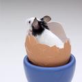
| 11/28/2003 01:26:00 PM | What's up? by sahkoComment: Creative and attractive image, technically very well done. The juxtaposition of elements works very well here. Maybe if it looked more like the mammal was hatching, or it was being served to a diner it would convey surprise better. As is, it is just a nice setting for a cute photo. | | Photographer found comment helpful. |
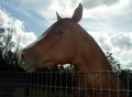
| 11/28/2003 12:16:07 PM | are you lookin' at me?by jbruno1397Comment: Greetings from the Critique Club!
This horse is beautiful and well-groomed, and its interest in the photographer is captured in this portrait. The dramatic sky with the silhouetted woods is a great background. The composition works; the subject's eye is the center of interest, which seems to be the intent.
I imagine this was a difficult photograph to make with so much contrast in the background. Using a flash prevented the horse from being little more than a silhouette. Yet there seems to be a lack of contrast in the horse itself, especially around the muzzle; I can't tell whether this is due to the lighting, post-processing, or low compression quality. There also seems to be a slight yellowish color cast and the photo is tilted a bit. |
| 11/27/2003 11:50:37 AM | Girls Are Weird!by darcyComment: Greetings from the Critique Club!
I think this photo works pretty well as a promo shot for Sara's show. The camera angle, slight tilt, and paper dolls suggest it will be rather zany (the title suggests the same thing, so I assume this is the case). The use of dolls also indicates that the solo show is not a soliloquy, but has multiple characters; an important fact for someone making a decision about her show.
The composition is good; the cropping and vertical format work well. I even like the light strip in the background; it adds interest to an otherwise boring background without being distracting. The focus and DOF are also good. The lines from Sara's fingers and facial features all point to the dolls, making them the center of interest. But they are a bit out of focus, keeping the viewer's eye from sticking there and allowing it to go back to Sara's face, which is in focus and interesting. The effect is perfect; the characters are what make the show interesting, but it is Sara that gives them life.
What isn't good is the lighting, one of the most important aspects of photography. You don't have to own fancy studio lights; just learn how to use household lamps effectively. The goal in most images is to have even lighting with a single set of shadows pointing in a consistent direction. Use a bright "key light" to cast the shadows and a less bright "fill light" or a bounce to lighten the shadows and make the lighting even. | | Photographer found comment helpful. |
|
Showing 631 - 640 of ~1171 |
Home -
Challenges -
Community -
League -
Photos -
Cameras -
Lenses -
Learn -
Help -
Terms of Use -
Privacy -
Top ^
DPChallenge, and website content and design, Copyright © 2001-2026 Challenging Technologies, LLC.
All digital photo copyrights belong to the photographers and may not be used without permission.
Current Server Time: 07/19/2026 10:04:24 AM EDT.
|