| Image |
Comment |
| 01/03/2004 10:59:39 AM |
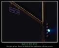
Believeby brianlhComment: Hmmm... This light is green, so traffic along Victory Lane is stopped. ;-)
Sorry, couldn't resist. This photo conveys just the message the text suggests. I like the way the green light shines and the fact that the darkness in the photo isn't quite black (like the poster background is). Good composition; putting the light and sign so close to the edge of the photo is daring, but it works here because of the vast negative space. |
 Photographer found comment helpful. Photographer found comment helpful. |
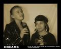
| 01/03/2004 10:46:37 AM |
Dreamsby NeuferlandComment: Wonderful photo. Soft and dreamy. A few technical problems (glare on the taller girl's jacket and lots of artifacts from low quality JPEG compression). I don't like the composition of the overall poster; cramming words into the bottom margin just doesn't work. The top and side margins are great, but the bottom needs about twice as much, and the quote needs to be right justified with the right edge of the photo. The letters in the quote are garbled, but I think this is due to the same compression artifacts that plague the photo. DPChallenge allows files up to 150K, so a higher quality compression setting can be used to avoid these. |
| Photographer found comment helpful. |
| 01/02/2004 08:57:15 PM |
|
| Photographer found comment helpful. |
| 01/02/2004 08:53:31 PM |
Respect....by willemComment: Good humorous use of a common object, which is photographed very well. I like the color used here and the various textures of the paper. |
| Photographer found comment helpful. |
| 01/02/2004 08:50:14 PM |
|
| Photographer found comment helpful. |
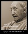
| 01/02/2004 01:30:23 PM |
Wisdom Grows With Ageby HRoxasComment: Good composition and pose. Tinted monochrome is effective (I don't care for the color, but I'm color blind, so what do I know!). A catchlight to put a "twinkle" in his eyes would make him look wiser. The focus is soft, which is fine (even preferred for younger people), but older people have great texture in their face and a little sharpening would show it off better. |
| Photographer found comment helpful. |
| 01/02/2004 01:17:12 PM |
Stand Tallby GeneralEComment: Cropping off the left side to make a vertical format would have better suited the message. |
| Photographer found comment helpful. |
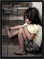
| 01/02/2004 01:13:02 PM |
Count Your Blessingsby librodoComment: Poignant. A few minor flaws (light rectangle around the words and a bit bright on the top of her shirt and her nose), but very well done. The model has a great pose and the setting is perfect. |
| Photographer found comment helpful. |
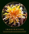
| 01/02/2004 01:02:30 PM |
Imagine... by JasperComment: Great composition and depth here; it almost seems like the flower is embedded in a crystal ball. |
| Photographer found comment helpful. |
| 01/02/2004 12:59:32 PM |
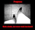
Progressby kncoughlinComment: The wide-angle focal length effectively exaggerates the length of the legs. It also distorts the floor tile, but that's minor. The whiteness of the upper legs is distracting. I don't care for the red letters; it is too intense. I think orange or gold would go better with the message. |
| Photographer found comment helpful. |
Home -
Challenges -
Community -
League -
Photos -
Cameras -
Lenses -
Learn -
Help -
Terms of Use -
Privacy -
Top ^
DPChallenge, and website content and design, Copyright © 2001-2026 Challenging Technologies, LLC.
All digital photo copyrights belong to the photographers and may not be used without permission.
Current Server Time: 07/18/2026 07:49:52 AM EDT.