| Image |
Comment |
| 03/25/2004 08:10:46 PM |
|
 Photographer found comment helpful. Photographer found comment helpful. |
| 03/25/2004 07:59:21 PM |
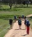
Backpackingby PaigeComment: Nicely captures the subject, but there is nothing to make the photo special. |
| Photographer found comment helpful. |
| 03/25/2004 07:47:27 PM |
|
| Photographer found comment helpful. |
| 03/25/2004 07:40:31 PM |
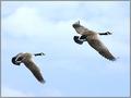
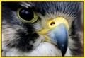
Bird Timesby pitsamanComment: I like the composition, but the depth of field is too narrow. The center of interest is the nostril, and it should be in focus, as well as the feathers with their fascinating texture. |
| Photographer found comment helpful. |
| 03/25/2004 07:34:16 PM |
|
| 03/25/2004 07:29:52 PM |
Los Angeles Times Magazineby qmdiComment: Great combination of repetitions and contrasts. I like the composition. It's a bit soft; making it sharper would make it catch the eye better. |
| Photographer found comment helpful. |
| 03/25/2004 07:17:43 PM |
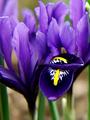
Horticultureby BAMartinComment: Striking orchids. I wish the lips were in focus as well as (or instead of) the petals. |
| Photographer found comment helpful. |
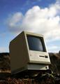
| 03/21/2004 12:07:37 PM |
Classicby helgihelgiComment: Greetings from the Critique Club!
The message
By putting the computer in an outdoor setting, far from any source of power and sans a keyboard and mouse, this image focuses on the physical design of this venerable device, thus creatively meeting the challenge. More subtly, the image says something about how useless the device is today--little more than a nostalgic reminder of how far computing has advanced in recent years. The dichotomy works well for me, and makes this a great photo. But it's not something you see with a quick glance, so most voters probably missed it.
Creative choices
Great composition; the photo is nicely balanced and shooting upward from a low angle gives the obsolete device an aura of dignity, as does the backwards tilt ("keeping its head up"). The photo works great in color, with the beige computer a nice contrast to the colors of the setting in which it is placed. I personally think it would have worked well as a sepia monochrome, which would give a more "antique" feel.
Technical aspects
The tonal rendition here is wonderful; some detail is lost in the darkest shadows and brightest parts of the clouds, but it doesn't have any negative impact on the image at all. |
| Photographer found comment helpful. |
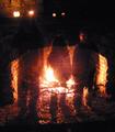
| 03/14/2004 11:52:31 PM |
three ghostsby jbruno1397Comment: Greetings from the Critique Club!
The message
This was one of the most memorable entries from the challenge to me. The center of interest is the fire (which is appropriate for the challenge), but the ghosts add an extra element that moves the image above the mundane. The image has an overall warm, cozy feeling, not at all creepy or scary; the ghosts just want to get warm!
Creative choices
The lighting from fire is great, but the candles are distracting; the image would work better without them. The setting (a fireplace as opposed to an open campfire) works well to define the shapes of the ghosts, as well as adding an interesting texture to the photo. The soft focus and noise add to the cozy feeling.
Technical aspects
The fire is overexposed, although avoiding this would certainly underexpose the rest of the image and probably not allow enough time to achieve the ghost effect, so it was probably a good tradeoff. The ghosts are mostly done well, but the one in the middle is a bit too transparent where the flame shines through and the right leg of the right one is obaque where the flame reflected off his pants. Some judicious retouching could have improved both of these areas. |
| Photographer found comment helpful. |
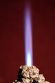
| 03/14/2004 11:23:45 PM |
Rock 'n Flameby DrakeComment: Greetings from the Critique Club!
The message
The idea this image conveys is creative. The shape of the rock is similar to the cone of a volcano, so the flame shooting from it works well. It has a nice "wow factor".
Creative choices
The background is perfect. The composition works well, as does the vertical format. Lighting from the flame is great, but the lighting on the rock needs to be more even; a fill light on the left would avoid the distracting deep shadow. Some sharpening would bring out the texture of the rock. I also think the rock would work better if it was a reddish brown; adjusting the hue slightly would be fairly easy in most photo editing programs (and legal for this challenge).
Technical aspects
Focus is fine, though a bit soft. Exposure of the flame is great, but the rock has some hot spots. Color rendition is very nice. |
| Photographer found comment helpful. |
Home -
Challenges -
Community -
League -
Photos -
Cameras -
Lenses -
Learn -
Help -
Terms of Use -
Privacy -
Top ^
DPChallenge, and website content and design, Copyright © 2001-2026 Challenging Technologies, LLC.
All digital photo copyrights belong to the photographers and may not be used without permission.
Current Server Time: 07/18/2026 05:36:01 AM EDT.