| Image |
Comment |
| 12/05/2005 11:08:01 PM |
|
 Photographer found comment helpful. Photographer found comment helpful. |
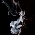
| 12/05/2005 11:06:19 PM |
Portrait of a Taurus by peeteComment: Interesting. My eye is drawn first to the bright smoke, then while following its shape, wondering what it is, I suddenly see the man and understanding clicks in. Effective. |
| Photographer found comment helpful. |
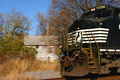
| 12/05/2005 11:01:52 PM |
Tirelessby snowdogComment: Great train! But the house steals the attention here by its placement and lightness. There needs to be a little more train and a less distracting background. |
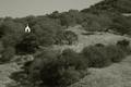
| 12/05/2005 10:50:58 PM |
The Chapelby saiphfireComment: A great subject for a photo, but not well executed. The chapel really needs to be in focus, and it would work better a bit to the right (at a "rule of thirds" point). |
| Photographer found comment helpful. |
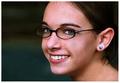
| 12/05/2005 10:34:12 PM |
Danielle Nicoleby bobdaveantComment: Unusual orientation for a portrait, but it works here. I get the impression she is an unusual person, someone who would be fun to know. |
| Photographer found comment helpful. |
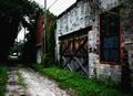
| 11/06/2005 08:33:04 PM |
Once Upon a Time....by Sherri1209Comment: Greetings from the Critique Club.
This building is indeed an interesting one, especially the wooden doors (which I personally think would have made a more interesting subject than the entire building). I don't know if the bricks around the doors are really gray or whether that is where you selective desaturated the photo, but I like it. I do think that there might be a better point of view; the building to the left is not nearly as charming, and the end of the alley even less so. The soft focus and grain give the building a feeling of fantasy, which goes with your title but isn't really the character I see in the building; it's just hard to imagine someone from a fairy tale living or working here. To me, the building's charm comes from the weathered textures, which I wish had been brought out more. |
| Photographer found comment helpful. |
| 11/03/2005 10:59:13 PM |
etched in stoneby lisajamesComment: Greetings from the Critique Club.
I like this photo. It combines recognizable shapes with an abstract appearance giving a surreal feeling. The letters are just the right size compared to the hands to give a sense of dimensionality; the hands seem "in front" of the letters, adding to the surrealism. Great textures, and the overall color is perfect for the image. I do think it would have worked better in a vertical format, with just the left part and some negative space (with the same texture) above and especially below the shapes. |
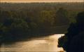
| 11/03/2005 10:34:30 PM |
The Flow of Seasonsby jseyerleComment: Greetings from the Critique Club.
This is a nice photo. It has all the elements of a good landscape: dramatic perspective; depth; areas of foreground, midground, and background; attractive color; a focal point (the birds). Composition is fine; although I'd prefer a bit more sky, I like the wide format. But it doesn't have anything to lift it above the crowd of everyday photos and give it real impact. I'm not sure just what to suggest here. Maybe sharper overall focus, especially the water. Maybe more contrast in the midground trees, which seem to have lots of interesting textures and colors, but it's too subtle here to be interesting. I don't think the grain/noise was an asset here; it makes the photo look muddy rather than contributing to a mood. |
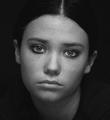
| 11/02/2005 03:14:30 PM |
Sad Eyed Ladyby ColeyComment: Greetings from the Critique Club.
A very beautiful and emotive portrait. Her expression really make this work. The low-key lighting complements the mood perfectly and shows off the 3-dimensional form of her face, making the photo look very real. Using black and white with grain counters the realism and adds to the overall mood. But I also find the grain distracting; perhaps a bit overdone. Nonetheless, a great photo that I have enjoyed examining very much. |
| Photographer found comment helpful. |
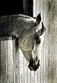
| 11/02/2005 02:45:06 PM |
Horses love grainby BrennanOBComment: Greetings from the Critique Club.
A strong photo. Very pensive. A feeling generated mostly by the subject's head position and expression, the spare composition, and the inherent lack of contrast in the scene. It is accentuated by the processing, including not only the grain, but also the contrast and brightness adjustments. Together, these remove the "realism" from the image, leaving the emotion behind. I don't know (or care) whether the color is natural or artificial, but it is perfect for the mood here. Beautifully done.
The flaws are few and mostly irrelevant. When looking at the photo awhile, a mildly distracting circle pops out in the center (starting in front of the eye, proceeding to the bottom of the head, and up the front of the mane). I think the forehead should just a bit darker. And the title is awful, not matching the photo at all. |
| Photographer found comment helpful. |
Home -
Challenges -
Community -
League -
Photos -
Cameras -
Lenses -
Learn -
Help -
Terms of Use -
Privacy -
Top ^
DPChallenge, and website content and design, Copyright © 2001-2026 Challenging Technologies, LLC.
All digital photo copyrights belong to the photographers and may not be used without permission.
Current Server Time: 07/16/2026 09:55:25 PM EDT.