| Image |
Comment |
| 08/25/2004 02:20:52 PM |
|
 Photographer found comment helpful. Photographer found comment helpful. |
| 08/25/2004 12:15:03 AM |
|
| Photographer found comment helpful. |
| 08/24/2004 12:58:41 AM |
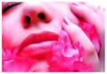
A subtle patience by heidaComment: Very good photo, I like the background a lot and how you've burned it, good use of lights, well done. Maybe if the model would have looked a bit more towards to the light, bringing more light to the face of the model, would have improved it, but I'm not sure, it could then maybe just take to much of attention to the face. This is definately one of the best in this challenge, maybe even a ribbon photo imo. |
| Photographer found comment helpful. |
| 08/24/2004 12:51:28 AM |
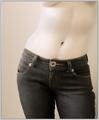
Denim Dreamsby lizzyc3Comment: I like this shot a lot, I think it will be in top ten and should have a ribbon imo. Very good composition, great use of toning. Some people might say that they wanted to see more flesh, but imo the jeans add a lot to it, the large button especially. |
| Photographer found comment helpful. |
| 08/24/2004 12:47:31 AM |
Serenity by grigrigirlComment: The best photo in this challenge imo, great composition, the model is very well positoned and the light is good. Congrats on your ribbon in advance... |
| Photographer found comment helpful. |
| 08/21/2004 12:51:49 PM |
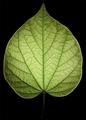
populus balsamiferaby RemieComment: I like the simplicity a lot in this photo and find it one of the best in this challenge, if not the best, It would make a nice wall deco imo. I would give you a ribbon for it if I could. |
| 08/21/2004 12:50:05 PM |
Ace of Spadesby troyloxComment: Superb quality photo, very good aparture and great sharp focus, you should have a ribbon for this. |
| 08/21/2004 12:42:26 PM |
|
| Photographer found comment helpful. |
| 08/21/2004 12:41:36 PM |
|
| Photographer found comment helpful. |
| 08/21/2004 12:39:10 PM |
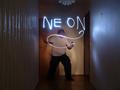
Me On, He On, NeOnby ArnarpComment: Nice idea, and good outcome. I would have liked to see a vertical framing/cropped version of this, at least without the wall on the left side of the photo, and maybe only half of the wall on the right side, leaving some of the light reflection on the wall there in the photo, that and also cropping out the light showing at the top would have made this photo much better as a photograph. Message edited by author 2004-08-25 00:19:39. |
| Photographer found comment helpful. |
Home -
Challenges -
Community -
League -
Photos -
Cameras -
Lenses -
Learn -
Help -
Terms of Use -
Privacy -
Top ^
DPChallenge, and website content and design, Copyright © 2001-2026 Challenging Technologies, LLC.
All digital photo copyrights belong to the photographers and may not be used without permission.
Current Server Time: 05/06/2026 04:08:06 PM EDT.