|
|
|
Showing 6161 - 6170 of ~7723 |
| Image |
Comment |
| 01/24/2010 06:14:16 PM | Togetherby AlexSaberiComment: How fun!! I assume that you're getting hit for the white background and all the negative space, but that's why I love it! I would have liked it with a tad less negative space, however, because they look so interesting, and I wish I could see them better. (here's for 1600 pixel challenges!!) |  Photographer found comment helpful. Photographer found comment helpful. |
| 01/24/2010 03:48:52 PM | For the Love of Macroby zeke123caComment: Good day! You're the recipient of a "critique club" critique! So feel free to take this with a grain of salt :D
First Impression: I like the apple, the blue is incredibly bright, almost a tad painful, and why didn't you utilize the size available? Good day! You're the recipient of a "critique club" critique! So feel free to take this with a grain of salt :D
Composition: I like the composition. I think using just a part of the fruit is interesting. I was actually playing around with something similar for still life with fruit, though I decided to go with something different. But this is an idea you don't see very often, and I found your taking on it very interesting.
Subject: good choice of apple -- I do like the green and red combination. However, I think the blue background is not the best choice. It's a little painfully bright, and it draws the eyes to it much more than the apple does. I like the idea of oversaturation and making the colors go, but I question the choice of color.
Technical: Some people might not like the shallow depth of field in the foreground. I actually like the softness -- it works in this case, while the interesting patterns in the back of the apple are nice and crisp. My eyes are not that great, so I could be wrong on this part, but the stem looks a little soft. I think it's an important part of the composition, and you might want to play with the DOF a little to get the back part and the stem sharper (or perhaps it could be sharpened in photoshop)
One thing that people have a tendency to dislike is when people submit a small photo - not utilizing the 800 pixel limit. Is there a reason that you're sticking with the 643 pixels size? It's harder for people to really examine the picture when it's smaller. I'd really recommend using a larger size, if possible. Give people more of an opportunity to really explore the picture.
Final thoughts: Nice idea, nice execution, questionable color choice. Enjoy the macro photography -- it is a lot of fun! |
| 01/24/2010 03:42:57 PM | |
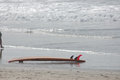
| 01/24/2010 03:27:58 PM | Waiting For The Ride Not Takenby dwedekingComment: Good day! You're the recipient of a "critique club" critique! So feel free to take this with a grain of salt :D
First Impression: I like the emptiness and the feeling of abandonment, but the shot seems a tad light.
Composition: I like the composition, I might have cropped out a little of the sand in the foreground, since it's not as interesting as the waves, but that's a very minor point. However, I do agree with the commentors -- the leg on the side is very distracting. If you wanted to get the sense of someone walking in the picture, I think you would have needed a little more of the person. It would have been better to crop it out, however.
Subject: Interesting subject, I liked the little bit of red on it.
Technical: As I mentioned, it seems light to me--I think it would have benefited by some increased contrast by playing with curves or levels. The shallow depth of field works for the waves -- I like the softness, but the blur of the sand in the foreground doesn't add much to the picture, I might have cropped that in a tad.
Final thoughts: Fun shot, nice softness, good choice of subject matter. Some adjustments in the contrast/cropping might strengthen it. Very evocative title! |
| 01/24/2010 08:49:59 AM | The Green, Green Grass of Home.by CLeeComment: But where's that old oak tree that I used to play on?
Beautiful!! Truly lovely! I'll have to fav it to study it more. This is how you take a normal nature shot and make it art. | | Photographer found comment helpful. |
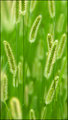
| 01/24/2010 08:45:11 AM | Allureby IndigoButterflyComment: This is lovely. The flowers on the right are so interesting, that I would have liked this better with just those; they're more ethereal and just plain beautiful! Nicely done. | | Photographer found comment helpful. |
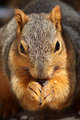
| 01/23/2010 08:22:56 AM | The Hungeringby Adamsw216Comment: Fun little guy! I love the warmth and the face. If possible, getting down a little lower to be even more on his level would really make this outstanding. Very nicely done as is, however! | | Photographer found comment helpful. |
| 01/23/2010 08:20:30 AM | Childhood Memories...Summer Vacation 2009by GrayEllaComment: to be honest, I'm not sure that the post and the rope are that interesting of a subject. It doesn't have much character to it. However, it blurs remarkably beautiful! The two posts in the distance and the distant grasses have such a dream-like quality to them. I wish the front post could somehow be a little less prominent.
Lovely colors, lovely background, and very good choice of title. -7- | | Photographer found comment helpful. |
| 01/22/2010 08:32:44 AM | Together They Leapby jasonlpriceComment: fun shot, wonderful expressions, trepidation, excitement? However, there seems to be a strange glow around them, and it's a tad oversaturated. -7- | | Photographer found comment helpful. |
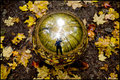
| 01/22/2010 08:30:25 AM | Autumn Reflectionby jegerComment: Loved this when I saw your other one. Very cool idea. For some reason I want the leaves on the ground in focus as well, but it's not affecting the vote one way or another. -8- | | Photographer found comment helpful. |
|
Showing 6161 - 6170 of ~7723 |
Home -
Challenges -
Community -
League -
Photos -
Cameras -
Lenses -
Learn -
Help -
Terms of Use -
Privacy -
Top ^
DPChallenge, and website content and design, Copyright © 2001-2026 Challenging Technologies, LLC.
All digital photo copyrights belong to the photographers and may not be used without permission.
Current Server Time: 07/30/2026 04:54:56 PM EDT.
|