Good day! You're the recipient of a "critique club" critique! So feel free to take this with a grain of salt :D
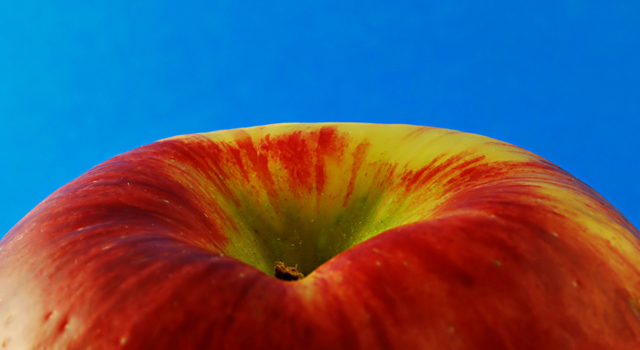
First Impression: I like the apple, the blue is incredibly bright, almost a tad painful, and why didn't you utilize the size available? Good day! You're the recipient of a "critique club" critique! So feel free to take this with a grain of salt :D
Composition: I like the composition. I think using just a part of the fruit is interesting. I was actually playing around with something similar for still life with fruit, though I decided to go with something different. But this is an idea you don't see very often, and I found your taking on it very interesting.
Subject: good choice of apple -- I do like the green and red combination. However, I think the blue background is not the best choice. It's a little painfully bright, and it draws the eyes to it much more than the apple does. I like the idea of oversaturation and making the colors go, but I question the choice of color.
Technical: Some people might not like the shallow depth of field in the foreground. I actually like the softness -- it works in this case, while the interesting patterns in the back of the apple are nice and crisp. My eyes are not that great, so I could be wrong on this part, but the stem looks a little soft. I think it's an important part of the composition, and you might want to play with the DOF a little to get the back part and the stem sharper (or perhaps it could be sharpened in photoshop)
One thing that people have a tendency to dislike is when people submit a small photo - not utilizing the 800 pixel limit. Is there a reason that you're sticking with the 643 pixels size? It's harder for people to really examine the picture when it's smaller. I'd really recommend using a larger size, if possible. Give people more of an opportunity to really explore the picture.
Final thoughts: Nice idea, nice execution, questionable color choice. Enjoy the macro photography -- it is a lot of fun! |