| Image |
Comment |
| 01/20/2022 10:43:54 AM |
Poor Thingby cloudsmeComment: Great catch! But something looks odd on the outline of the great egret, seems too sharp or discolored or something. Did you add blur to the background? |
 Photographer found comment helpful. Photographer found comment helpful. |
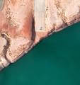
| 01/20/2022 10:41:41 AM |
End of the Road by TerramarComment: very intriguing shot. I wish the road/land took up more of the scene. I like the fact that the sea is shown, but the land has a lot to explore, and the sea doesn't. Plus, if the land was a little more intrusive, it might give more of a immediacy, more of a problem that the road doesn't continue. Right now with it being just half of the photo, it feels more balanced and that it's not a problem that the road has ended.
Just a thought. |
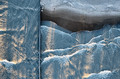
| 01/18/2022 09:27:18 PM |
The break wall by markwileyComment: Very unique and marvelous confusing when you have no clue what it is. Congrats on the blue! |
| Photographer found comment helpful. |
| 01/18/2022 09:24:28 PM |
|
| Photographer found comment helpful. |
| 01/18/2022 09:23:52 PM |
A shimmer of green by IndigoButterflyComment: I'm not crazy about the chopstick stand , I think it would have been stronger without it . But the rest is quite magical. Beautifully done! Congrats on the Ribbon! |
| Photographer found comment helpful. |
| 01/10/2022 09:42:32 AM |
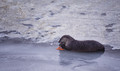
Predator/Preyby jcarComment: Nice shot! Make sure you get as low as you can to be on his same level. I assume you're up on a snow bank and didn't have the opportunity.
I cant tell what the orange stuff is. Is it roe? |
| 01/08/2022 07:43:58 PM |
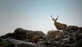
Highland Stagby PangurbanComment: Way to go, Ellie!! Huge congrats! Have you tried topaz sharpen? It’s even better at denoising than topaz denoise. You should download the trial and try it out. It can do wonders. |
| Photographer found comment helpful. |
| 01/03/2022 06:09:25 PM |
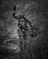
Merge by Bear_MusicComment: I found this stunning! I thought for sure it would take the blue. |
| Photographer found comment helpful. |
| 12/24/2021 08:38:24 AM |
|
| Photographer found comment helpful. |
| 12/22/2021 07:57:16 AM |
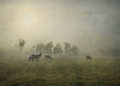
Keepers of the Herdby grahamgatorComment: I really really really love this. I could see it hanging on a wall!
Is there anyway you'd give me lessons on how to do this? |
| Photographer found comment helpful. |
Home -
Challenges -
Community -
League -
Photos -
Cameras -
Lenses -
Learn -
Help -
Terms of Use -
Privacy -
Top ^
DPChallenge, and website content and design, Copyright © 2001-2026 Challenging Technologies, LLC.
All digital photo copyrights belong to the photographers and may not be used without permission.
Current Server Time: 06/19/2026 05:24:45 AM EDT.