| Image |
Comment |
| 07/25/2012 11:36:25 AM |
Oh Chocolateby NeatComment: Didn't get around to voting on this one (I had hoped to get through the whole challenge, but fell short.) I don't mind the toning. Probably would have been a 7 from me -- simply because of the one looking at the other -- makes a great story. :) |
 Photographer found comment helpful. Photographer found comment helpful. |
| 07/25/2012 08:25:26 AM |
Cowboyby LydiaComment: oooh -- this is quite nice!! Congrats on the tt! |
| Photographer found comment helpful. |
| 07/25/2012 08:25:08 AM |
|
| Photographer found comment helpful. |
| 07/25/2012 08:24:48 AM |
|
| 07/25/2012 08:24:14 AM |
|
| Photographer found comment helpful. |
| 07/25/2012 08:23:36 AM |
Orangeby RobskiComment: whoa! Lovely! Congrats on the yellow! |
| Photographer found comment helpful. |
| 07/25/2012 08:23:11 AM |
Day Lily, Summer Evening by Bear_MusicComment: I'm running behind in my congrats -- so I'm trying to catch up. :)
Lovely, bear! I should have known this was yours because of the beautiful tone mapping! Nicely done. :) |
| Photographer found comment helpful. |
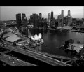
| 07/25/2012 08:22:29 AM |
The Lion City Sleeps Tonight by hotpastaComment: I'm running behind in my congrats -- so I'm trying to catch up. :)
Congrats on a blue in a cell phone challenge! I found this challenge more difficult than the rest because of the equipment. What a great piece of bling to add to your repertoire! |
| Photographer found comment helpful. |
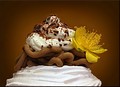
| 07/25/2012 08:18:00 AM |
Vermicelleby kasabaComment: whoo hoo!! Congrats on your first top ten!! (oooh... now that you mention that it's chestnut puree, it really doesn't matter what it resembles! :) |
| Photographer found comment helpful. |
| 07/25/2012 08:14:42 AM |
|
| Photographer found comment helpful. |
Home -
Challenges -
Community -
League -
Photos -
Cameras -
Lenses -
Learn -
Help -
Terms of Use -
Privacy -
Top ^
DPChallenge, and website content and design, Copyright © 2001-2026 Challenging Technologies, LLC.
All digital photo copyrights belong to the photographers and may not be used without permission.
Current Server Time: 07/23/2026 12:30:56 AM EDT.