| Image |
Comment |
| 10/10/2003 03:03:03 AM |
The house of Godby oskarComment: The colours and the unique building make this shot. It almost feels abstract due to the black foreground. It has nice symetry to it, but I would have cropped off more on the left to really balance it. |
 Photographer found comment helpful. Photographer found comment helpful. |
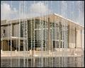
| 10/10/2003 02:55:34 AM |
Water Symphonyby crabappl3Comment: Just superb. Love the composition. This is a piece of art to me. The detail of the water is amazing, yet you can clearly see the building behind. This should do very well. |
| Photographer found comment helpful. |
| 10/10/2003 02:54:31 AM |
Melbourne at Midnightby loz1Comment: Oh, where is this, I want to go there!! Lovely photo. Great colour, very smooth, no visible distortion. Beautiful composition with a bridge. I bet this came out of a pricy SLR... This should ribbon. |
| Photographer found comment helpful. |
| 10/10/2003 02:52:01 AM |
Wichita - Downtown at Sunsetby fsieradzkiComment: Great symetry, great colour, good sharpness, lovely reflection shot. Taken at the right time of the day from what I can see. This should score very high. |
| Photographer found comment helpful. |
| 10/10/2003 02:50:23 AM |
City viewingby jonpinkComment: Very unique shot! Lovely colour. This could be a postcard. If you make this into a print, sharpen the centre image a bit. |
| Photographer found comment helpful. |
| 10/10/2003 02:48:18 AM |
Blue Gridby mjf99Comment: Beautiful night shot. Great abstractive feeling due to the rotation. Very artistic composition. One of my favourites. If you plan making a print of this, I would erase the thin brown line in the top right corner. |
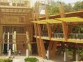
| 10/10/2003 02:44:38 AM |
Singing Walkway between buildingsby GrandmaEMTComment: I really like this image. It could use a slight clockwise rotation. Also, did you consider different viewpoint? Like taking it from lower on the ground. The center is not bad as it creates interesting symetry, but it is a bit off. It also need tiny colour boost. 7 |
| Photographer found comment helpful. |
| 10/10/2003 02:38:56 AM |
philippines!!!by miketherockComment: It's an interesting building, but your shot needs simplification. It also has a slight yellow colour cast which can be fixed with levels or colour adjustments. It is also pixelated. You could make it a tiny bit smaller and use less compression to get the same filesize, without distorting the image. |
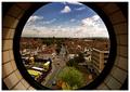
| 10/10/2003 02:34:53 AM |
17.09 at the Bullringby franComment: Very interesting composition. I looks sharp, but the the darks are lost which is too bad, as this could have been amazing shot with more detail in it. The sky is very dramatic which ads mystery to the object on the left. I will come back to check where this is. |
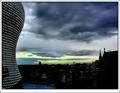
| 10/10/2003 02:33:05 AM |
urban landscapeby ursulaComment: Wow, this almost looks unrealistic as the sky in the reflection doesn't match the sky around the building. The whites are blown out and the darks lost detail. Maybe too much contrast adjustment? Otherwise not bad image, interesting to look at. |
| Photographer found comment helpful. |
Home -
Challenges -
Community -
League -
Photos -
Cameras -
Lenses -
Learn -
Help -
Terms of Use -
Privacy -
Top ^
DPChallenge, and website content and design, Copyright © 2001-2026 Challenging Technologies, LLC.
All digital photo copyrights belong to the photographers and may not be used without permission.
Current Server Time: 06/22/2026 02:58:19 PM EDT.