| Image |
Comment |
| 12/29/2003 03:55:00 AM |
Count Your Blessingsby librodoComment: One of the most emotional posters in this run. I wouldn't change a thing about the photo itself, but the frame could have been simpler for this kind of message. Also, I think it would have been even more powerful in b&w form. But don't get me wrong, I really love this poster. |
 Photographer found comment helpful. Photographer found comment helpful. |
| 12/29/2003 03:53:27 AM |
Not everything that counts can be counted; not everything that can be counted counts.by alyriveroComment: Good idea and concept, but the poster is kind of very busy. The torn border makes it even messier and the text running into the coins throws it out of balance. The text could have been smaller and with gentler shadow. I don't know what kind of lighting you use, but the glare on the coins further distracts from the whole image. Sometimes it's good to place a thin piece of tissue paper between the lightsource and the subject to diffuse hard light. But you have a unique ideas, so don't give up. |
| Photographer found comment helpful. |
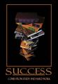
| 12/29/2003 03:49:46 AM |
Successby SonifoComment: Clean, simple, beautifully designed. Not so sure about the brown colour and the pinkish smaller text. But the photo itself is great and fits your caption perfectly. |
| Photographer found comment helpful. |
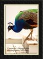
| 12/29/2003 03:48:48 AM |
Journey of a Thousand Milesby paganiniComment: Beautiful photo, but really ugly border (sorry). The colours are great, so is the sharpness. This is in one in the million kind of shot, where you catch the bird in the perfect moment of stepping down. The text is kind of lost in the image. It could have been better on the bottom of the black frame reversed. The photo itself is very good, but the framing really spoiled it. |
| Photographer found comment helpful. |
| 12/29/2003 03:45:54 AM |
There's No "I" in TEAM!by RoosterComment: Great teamwork shot. Love it in b&w. I am not sure why, but I see a line through the text for some reason. I don't know if this was intentional, but it looks kind of strange. The font works OK. The border could have been simpler for this image. But well done otherwise. |
| Photographer found comment helpful. |
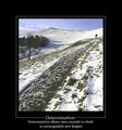
| 12/29/2003 03:44:33 AM |
Determinationby agwrightComment: The text really fits the theme of the photo. This photo would have been great in b&w as it has very little colour in it. But the sky is kind of nice too. Did you use hight speed film? It appears a bit grainy on the darker portions of the photo. But I still like it a lot. |
| Photographer found comment helpful. |
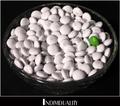
| 12/29/2003 03:42:44 AM |
Individualityby rickhd13Comment: Wow, I've never seen white M&Ms before. Cute concept. Simple colour with good effect. It's a bit too tightly cropped for my taste and more space around the text would have helped. It feels tiny bit claustrophobic. |
| Photographer found comment helpful. |
| 12/29/2003 03:39:36 AM |
Hang In Thereby browntComment: Nice framing. The colours and tones are on the darker side, but I guess this was too far for a flash to be of any use. The aerial perspective is nice. |
| Photographer found comment helpful. |
| 12/29/2003 03:38:17 AM |
Take from our lives the strain and stressby pcodyComment: Such a sweet photo. Love the detail of the fur. Great that it is kind of white all over as it really portrays the peacefulness. I am not too keen on the font you used, but over all it is ok. The outer border could have been dropped for simplicity. Well done. |
| Photographer found comment helpful. |
| 12/29/2003 03:36:40 AM |
Patienceby pitsamanComment: Photo is superb. Colours look very natural. But the font is kind of wild and unseen in pro posters. But if that's your style, then go for it. Well done photo. |
| Photographer found comment helpful. |
Home -
Challenges -
Community -
League -
Photos -
Cameras -
Lenses -
Learn -
Help -
Terms of Use -
Privacy -
Top ^
DPChallenge, and website content and design, Copyright © 2001-2026 Challenging Technologies, LLC.
All digital photo copyrights belong to the photographers and may not be used without permission.
Current Server Time: 06/24/2026 01:41:49 AM EDT.