| Image |
Comment |
| 03/19/2009 03:24:43 AM |
|
| 03/19/2009 03:17:51 AM |
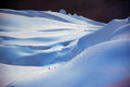
Mountaineeringby DudskiComment: This is incredible. Amazing how the tiny figures of people ad to the scale of the vast scenery. Without them it would look like a much smaller area. It looks so etheral. |
| 03/17/2009 11:53:37 PM |
|
 Photographer found comment helpful. Photographer found comment helpful. |
| 03/17/2009 11:05:12 PM |
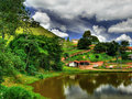
The lonesome farmby marcusvdtComment: Oh this reminds me of the "Shire" in Lord of the Rings. I think I can spot a Hobbit... Really cool shot! Love the HDR effect. The perspective and sharpening method here makes it look like a "miniature" landscape. The sky is amazing. |
| Photographer found comment helpful. |
| 03/15/2009 06:16:44 AM |
|
| Photographer found comment helpful. |
| 03/12/2009 09:19:59 PM |
|
| Photographer found comment helpful. |
| 03/12/2009 09:19:35 PM |
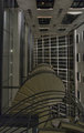
Stairsby hanserikComment: This is neat abstract image, but it is quite busy and due to it's low contrast feeling, there really isn't any focal point to rest your eyes on. The spiral staircase could be used as a diagonal to lead you into the image, maybe make it more prominant part of the image. Also, needs perspective correction (the walls are wonky). |
| Photographer found comment helpful. |
| 03/12/2009 09:17:07 PM |
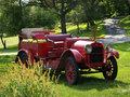
Fire Truck for the Farmby almgComment: Nice spring colours. However the image is very overexposed, hence you are loosing detail in the bright green areas behind the car. Also, if you are including foreground objects, like the grass in front of the car, make sure it's sharp. Your eyes go to it because it's brighter and less sharp then the car. The bit in the upper right hand corner could be cloned out as your eye does catch it and it again leads your eye away from the main subject. Other than that, it's pretty nice shot. |
| Photographer found comment helpful. |
| 03/12/2009 09:11:22 PM |
Shakers IIby ClayaComment: This is really nice image. Well lit, sharp, neat concept. But the border ruins it. If you really wanted to keep the border, it would have been better a bit thinner and closer to the edge, and a bit darker blue. The overlap of the image on the border doesn't really work here as it doens't overlap it enough for it to have any impact. |
| Photographer found comment helpful. |
| 03/12/2009 03:50:11 AM |
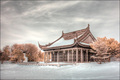
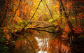
Falling Inby L2Comment: Beautiful scenery. Very "Thomas Kinkade" like. Could be made into an oil painting. Love the symmetry. |
| Photographer found comment helpful. |
Home -
Challenges -
Community -
League -
Photos -
Cameras -
Lenses -
Learn -
Help -
Terms of Use -
Privacy -
Top ^
DPChallenge, and website content and design, Copyright © 2001-2026 Challenging Technologies, LLC.
All digital photo copyrights belong to the photographers and may not be used without permission.
Current Server Time: 06/22/2026 07:09:59 AM EDT.