|
|
|
Showing 2471 - 2480 of ~3215 |
| Image |
Comment |
| 01/15/2005 06:48:19 PM | |
| 01/15/2005 06:47:38 PM | |  Photographer found comment helpful. Photographer found comment helpful. |
| 01/15/2005 06:47:03 PM | | | Photographer found comment helpful. |
| 01/15/2005 06:46:46 PM | | | Photographer found comment helpful. |
| 01/10/2005 07:40:01 PM | Broadening Paperclipsby SimonkasprzakComment: Greetings from the Critique Club.
Composition: The composition of the photograph is very interesting, if I squint my eyes I can almost make out letters in the shadows of the paper clips. I have read some of your previous comments and have to agree that a diagonal composition would have strengthened the photo. Also by cropping out the dark corners you would have led the viewers eye more clearly to the subject.
Colors:You soft muted colors are very pleasing to the eye, much like a late afternoon shot would.
Lighting:The direction of your lightening lead to the great shadows, and prevents this from being a flat photograph. I like the interplay of light with the paper clips, very interesting
Overall: Overall this is a nice picture but not overly interesting. It does not hold my interest for too long. A tighter crop would help by removing too much empty space. Good luck in subsequent challenges.
Barbara
| | Photographer found comment helpful. |
| 01/10/2005 09:46:50 AM | Empty eyesby saurabhsComment: Greetings from the Critique Club.
Composition: This has a nice composition, very balancde. I like how the coils fade into the background.
Colors:Black and white was aa very nice choice for this photo, although I suspect the original was close to black and white.
Lighting: The lighting seems a little harsh in the upper left, where it reflects off of the top of the coil. I like what you did with the contrast, but it may be a little over the edge for most of the voters.
Meeting Challenge: This photo definitely meets the challenge, and its a subject we all see everyday without really looking at it.
Border / Title: Your title maybe the best part of the photograph. I like the comparison to eyes.
Overall: Overall this is a good photograph, but it does not hold my interest for too long as there does not seem to be a very defined subject. My eyes tend to wander over the entire photograph without finding a place to land.
| | Photographer found comment helpful. |
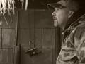
| 01/10/2005 09:07:55 AM | The Huntby Travis99Comment: Composition: The composition on this shot is very strong. You have placed the subject in the best possible location and added bit of other interest (duck call, rifle, little bit of straw) to add visual appeal and to give a feel of place.
Colors:You have done a great job on the color palette you chose to use for this photograph. Its much visually appealing with a sepia feel than it would be in natural color.
Lighting:Your lighting is rather flat, but I suppose under the shooting conditions you did not have much option. At least you did not use on-camera flash :-)
Technical Quality: The subject of the photograph is a little out of focus and my eye tends to stray from him because of that. The overall feeling is a bit too soft for my taste. I am thinking that you might have used a slow shutter speed, If I am right, you might try increasing the ISO so that the available light will give you the chance for a faster shutter speed.
Meeting Challenge: I am not sure how well this meets the challenge, it definitely has that “set-up” feeling. I think the subject was definitely aware that he was being shot (haha pun intended).
Border / Title: Your title is very appropriate, not too long and not cutsey. You have not used a border, which for this photograph is very appropriate.
Overall: Overall this is a very pleasing photograph, but one that may feel more at home in the family album.
| | Photographer found comment helpful. |
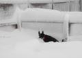
| 01/10/2005 08:46:37 AM | No Indoor Plumbingby Bear_MusicComment: Composition: The composition of this shot follows all of the rules of composition i.e. The Rule of Thirds. The lines of the fence do a good job of framing the dog in action.
Colors: You have managed to keep your whites bright without any visible signs of blowout, and at the same time the black of the dog is rich, This is sometimes a difficult thing to do. The red of the color adds the little something extra, without it this might as well have been a black and white photo.
Lighting:Your lighting seems just a little flat, although I am sure the atmospheric conditions did not help in any way. At least you did not have any harsh shadows.
Technical Quality: This photo seems to have a little bit of a “snapshot” feel to it.
Meeting Challenge: I would say that this does meet the very strictest of the challenge definitions, but many of the voters on DPC might disagree with this. Usually candids are considered shots of people that do not know they are being photographed. Unfortunately I believe this is the reason for the score you got. Sometimes thinking outside the box has its own drawbacks.
Border / Title: The title is the very best thing about this photograph, Its nice to see humor being used in creative ways, and you certainly gave me a smile.
Overall: Overall this is a pleasant enough photograph but definitely has a snapshot feel to it. I know with candids there is not much time to fire off a shot, but a photo of a pet or child needs just that something extra to move it out of the family album and onto an art site.
| | Photographer found comment helpful. |
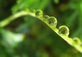
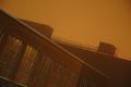
| 01/09/2005 10:37:10 PM | -empty storage-by HokaheyComment: Composition: The composition on this photograph is outstanding. Your use of diagonal line gives a real strength to the composition
Colors: Wow, I can not admire the colors enough. They are absolutely beautiful!
Lighting: The time of day that this was taken must have been late afternoon or early evening as the light seems so magical. The sky seems to glow. Just wonderful.
Technical Quality: I am not really a person to give you great criticism on the technical aspects of your photograph, but Ii do notice the slight darkening towards the corners. I am not sure what caused this, but I might guess it is a function of your lens, or filter. Its is not overly distracting, but something I did notice.
Meeting Challenge: I have read some of your other comments and I have to agree that zI do not see a hidden face here. You might see a face, but for the masses of voters on DPC, it might be just a little too subtle.
Overall: Overall this is a beautiful photograph and well executed. The biggest problem I have with it is the inability to find a face even after looking for a long time. Well done in all other ways.
|
| 01/09/2005 10:20:51 PM | The artist's dreamby nagangelComment: Greetings from the Critique Club.
Composition: The composition of this photograph is its strongest point. You have used the “other” rule of thirds; using three objects. The three paint brushes, the three lights and the three dabs of paint all echo this and the repetition is very pleasing to the eye. The fact that all of these elements are laid out in a triangle gives a certain strength to the photograph.
Colors: Other than the colors of the lights, the colors seem a bit muted, especially on the paint which screams to be vivid. Most of your whites are not truly white, which could be a function of your lighting.
Technical Quality: The total technical quality of this shot seems a bit weak. I think you could improve it if you had a studio setup with proper lighting. I do think for what you had to work with, you did a fair job.
Meeting Challenge: This indeed does meet the challenge and adds a humorous quality to it as well.
Overall: Overall this is a pleasant photograph but does not keep my attention for very long. Its a wonderful idea though, and one I feel you might go back and re-visit on another day. Overall I do like this photograph and you have shown you have a very creative eye for composition.
|
|
Showing 2471 - 2480 of ~3215 |
Home -
Challenges -
Community -
League -
Photos -
Cameras -
Lenses -
Learn -
Help -
Terms of Use -
Privacy -
Top ^
DPChallenge, and website content and design, Copyright © 2001-2026 Challenging Technologies, LLC.
All digital photo copyrights belong to the photographers and may not be used without permission.
Current Server Time: 06/24/2026 07:19:28 AM EDT.
|