| Image |
Comment |
| 01/29/2003 07:09:30 PM |
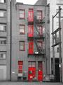
Red 139by JakComment: Color nicely manipulated out, except the red (did you mean to have the dumpster's label show up, too?) Focus is very good, sharp! (yes, the telephone wires look jagged, but that's not your fault or even the camera's!) 6 Swash |
 Photographer found comment helpful. Photographer found comment helpful. |
| 01/29/2003 06:34:18 PM |
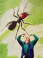
Incredible Shrinking Manby SwashbucklerComment: Just how strange would one want? Would anyone that voted this a 1, 2 or 3 be kind enough to explain what they thought was bad about this? I promise, no arguements, I just want to be a better photographer, please help me. |
| 01/29/2003 06:31:33 PM |
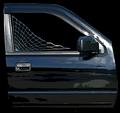
Custom Tintby spidermanComment: From the lines of the web and other edges, I think the focus seems good, but the color manipulation (at least I hope that's from post processing) distorts the image so that I'm not fully certain. (joke: what happened to the rest of the vehicle?) To me, this is overly processed...it looks more like a well done painting than a photo. (Was that your objective???) 6 Swash |
| Photographer found comment helpful. |
| 01/29/2003 06:27:57 PM |
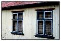
Windowsby vjozComment: Very good focus and color (well taken shot). The window frames are bizarrely painted (just noting it, no score effect). For a second, I thought you might be going for an optical illusion with the angle of the shot and framing, but honestly, they look the same size. The reflections in the window glass and the colorful curtains work against each other to confuse the viewer (me). 6 Swash |
| Photographer found comment helpful. |
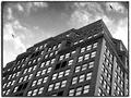
| 01/29/2003 04:23:14 PM |
New York Windowsby dimitriiComment: Nice building shot, the two seagulls are a big plus. Contrast is good, but the sky didn't seem to take the black and white well, it appears between grainy and very grainy. It's a nice building with neat trimmings, but it doesn't "grab" me visually.
6 Swash |
| Photographer found comment helpful. |
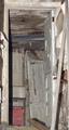
| 01/29/2003 04:19:09 PM |
Abandonedby RiderGalComment: Mostly well taken photo, there's at least two doors, so challenge well met. The two foreground items are a bit distracting (the bar of wood coming from the bottom of the frame - and the part of the door leaning on the wall on the right side of the frame). Plus the shadows created by the flash aren't very appealing (don't add anything but maybe a bit of depth). Visually, I don't care for it, sorry, it just doesn't appeal to me. 6 Swash |
| Photographer found comment helpful. |
| 01/29/2003 04:15:23 PM |
Windows of Opportunityby CreativeFlyPhotoComment: Very well taken shot, narrow DOF works very well in this case. This is a wildly different "take" on the challenge topic (so creative in that respect), but visually, not that appealing. 6 Swash |
| 01/29/2003 02:12:51 PM |
Eternal Doorwayby AnachroniteComment: This is a wonderful piece! If not inverse coloration, it seems close to it. The doors seem grainy, but I think that's your post processing. The arches above the door are perfect! I think I could have lived with the bottom of the doors being the bottom of the photo and (impossible wish) the little bricks in the upper corners, but what are you to do? (Maybe a higher, more straight on shot???) 9 Swash |
| Photographer found comment helpful. |
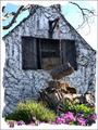
| 01/29/2003 12:02:02 PM |
Cottageby GotchaComment: Very cool shot!
Comment editted - My BAD. I did not enter this challenge and did not see the extra rules for it. Sorry. Awesome shot! Love the curly things. 10 Swash
(please for give a dumb old man!) |
| Photographer found comment helpful. |
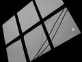
| 01/28/2003 06:05:09 PM |
Window & Lightby KathycComment: Nice sillhouettes, but not much else. The crop adds a little interest, but not enough. 5 Swash |
Home -
Challenges -
Community -
League -
Photos -
Cameras -
Lenses -
Learn -
Help -
Terms of Use -
Privacy -
Top ^
DPChallenge, and website content and design, Copyright © 2001-2026 Challenging Technologies, LLC.
All digital photo copyrights belong to the photographers and may not be used without permission.
Current Server Time: 07/17/2026 01:35:13 PM EDT.