|
|
|
Showing 2631 - 2640 of ~3862 |
| Image |
Comment |
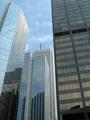
| 08/02/2002 04:34:00 PM | Where the Bigshots Work!by PeltzComment: Nice building shot. Seems like it needs something, like a point of special interest or I don't know, more....gotcha! A decent example would be a similar shot in this challenge, with the title "Shining Star VP on 42nd Floor". (it got a 7, too.) 7 Swash |
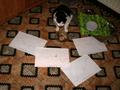
| 07/29/2002 05:10:00 PM | A litle lunchbreak at work,made by christian 12 yearsby Christian-12-YearsComment: Where do I start.....First the shot is on the dark side. Is that what you wanted? Is there some sort of message or feeling you are trying to convey? Next, the background (the floor) is too busy/distracting/takes away from the real subject. O.K. now what is the cat doing? I don't really mean to tear you apart like this, sorry. Still have to go with a 4, Swash. |
| 07/29/2002 07:25:00 PM | The Day The Music Diedby hokieComment: Wow, very, very cool. I know you have some sort of message with the bright light below the "necktie", but to me, it's too bright. Fabulous idea! This reminds me of a musician friend of mine. He works for $$$, but only when he HAS to. I want to give this a 10, but the light drags me down to 9. Swash |
| 07/29/2002 07:28:00 PM | Steppin' to Successby karmatComment: Really great concept. Nicely executed. A tad more light might have been nice, but maybe you did this to create a darker mood. (call it a push) I keep looking back at the pant leg. It's so minor, but seems more sleezy than uptown, you know what I mean? (Golf shoes would have been "classic!) 9 Swash |  Photographer found comment helpful. Photographer found comment helpful. |
| 07/29/2002 07:22:00 PM | The concrete jungle vs. our once green and pleasant landby HendrikComment: This is a great idea, but everything is soooo far away. The field is dark, I just realized there are people out there! (they are sooo small) The building in front looks more like an apartment building than a business, but I could be wrong. I started this as a 5, but except for the problems discussed above, it's really pretty good. I will change you up to a 7. Swash |
| 07/30/2002 04:32:00 PM | Are we going up?by tonythemonkComment: Is this a sepia shot? Wierd, and I am so sorry, but unless the message is Corp life is an endless, unsuccessfull story, I don't get it. I look at this and wonder, what happened to my "free" ride? Maybe a stairmaster would have conveyed this message better, assuming I am anywhere near the same ballpark as you. Nits: what's with the horizontal black bar halfway up the shot? The wall above and to the right of the "bar" is flared badly compared to the rest of the wall. Why is there a Beware of DOG sign in an office building? What is the jumble on the left side of the shot (with the graffiti on it)? Please, wait until after the challenge week, if you care to answer these and other burning questions. Basically, my message to you is, this shot raises more questions than answers. (Is that a watch on the third step up?) I started with a 5, and I'm not inclined to change. Swash |
| 08/01/2002 07:55:00 PM | Pharmaceutical Corporations - Greed and Profit Over Healthby MrsKroComment: Soo right! Nice title/pic match. Unusual angle of attack, usually this type shot is done from the opposite side (pills first). Somehow, I like this. I can see why the other view is used most often, it promotes the pretty pills. You did well to promote the drug company instead. You slipped up one notch, from 7 to 8. Swash |
| 08/01/2002 07:10:00 PM | Stimulating the Corp. World.by waltomlComment: Tom, this is certainly not your best shot. Couldn't you do something with your computer, etc, sort of a travelling businessman thing? Crop the greenhouse, lose more of the grey sky, would have been a little more effective. You might want to start going for your challenge shot a little earlier in the week (as opposed to Sunday evening around 8 PM.) 7 Swash |
| 08/01/2002 07:00:00 PM | Going upby snsComment: Pretty good construction shot. Difficult subject matter, bright sky and dark insides of building, but this looks pretty good. 7 Swash |
| 07/30/2002 07:42:00 PM | dot comby stephanComment: Neat trick! The colors in the shadow are great, subtle, but great! Your connection to the challenge is less loose than most, so good job there, too. Was the darkness on both sides on purpose? I am also fascinated by the "light" edges around the lettering (how?). 8 Swash | | Photographer found comment helpful. |
|
Showing 2631 - 2640 of ~3862 |
Home -
Challenges -
Community -
League -
Photos -
Cameras -
Lenses -
Learn -
Help -
Terms of Use -
Privacy -
Top ^
DPChallenge, and website content and design, Copyright © 2001-2026 Challenging Technologies, LLC.
All digital photo copyrights belong to the photographers and may not be used without permission.
Current Server Time: 06/20/2026 06:33:23 PM EDT.
|