| Author | Thread |
Comments Made During the Challenge  |
|
|
08/04/2002 09:48:00 PM |
|
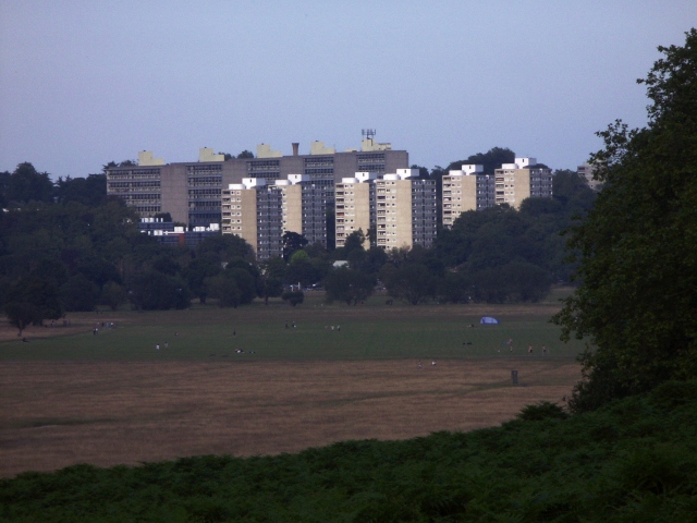
Your composition is nice, but you have two things competing - the buildings and landscape. I realize it would spoil the point of composition, but perphaps you could use one or the other and rename your pic. |
|
|
|
08/04/2002 06:22:00 PM |
|
I think this might look better on a day with more sunlight, to add more contrast to the image. |
|
|
|
08/02/2002 12:33:00 AM |
|
looks rather dark, some curves adjustment might bring out the foreground better. |
|
|
|
08/01/2002 10:38:00 PM |
|
good statement, photographic rendtition not quite up to it. maybe needs some levels adjustment. mag99 |
|
|
|
08/01/2002 08:59:00 AM |
|
Doesn't seem very well composed. There's a lot of dead sky space you could've used more effectively. Even taking the same shot on a partly cloudy day would've helped a bit. |
|
|
|
07/31/2002 09:37:00 AM |
|
How sad and true. Like the title. Good picture. |
|
|
|
07/31/2002 07:41:00 AM |
|
|
|
07/31/2002 07:00:00 AM |
|
|
|
07/31/2002 02:15:00 AM |
|
An unfortunate scene all over the world. |
|
|
|
07/30/2002 06:51:00 PM |
|
Nice contrast in subject matter, but I think it needs livening up with brightness/contrast, inversion of colours...anything! |
|
|
|
07/30/2002 04:28:00 PM |
|
The sky is a nice blue, and it is an interesting composition. I think there is too much foreground, and it seems a bit too dark to me. karmat |
|
|
|
07/30/2002 07:27:00 AM |
|
Nicely framed and good concept. A little flat, though - needs more light and colour. |
|
|
|
07/30/2002 05:35:00 AM |
|
its more like landscape for me :( |
|
|
|
07/29/2002 10:41:00 PM |
|
And so....where are these people supposed to live? |
|
|
|
07/29/2002 09:05:00 PM |
|
A brace or a tripod would have helped.The far buildings are fuzzy. |
|
|
|
07/29/2002 07:22:00 PM |
|
This is a great idea, but everything is soooo far away. The field is dark, I just realized there are people out there! (they are sooo small) The building in front looks more like an apartment building than a business, but I could be wrong. I started this as a 5, but except for the problems discussed above, it's really pretty good. I will change you up to a 7. Swash |
|
|
|
07/29/2002 01:04:00 PM |
|
Those appear to be apartments. I don't see that as corporate anything. |
|
|
|
07/29/2002 07:44:00 AM |
|
I understand the message, but still, I don't see the link to the challenge, sorry. |
|
|
|
07/29/2002 05:23:00 AM |
|
|
|
07/29/2002 01:55:00 AM |
|
It would possibly be more effective with more of the green showing---in contrast to the buildings in the back. |
|
Home -
Challenges -
Community -
League -
Photos -
Cameras -
Lenses -
Learn -
Help -
Terms of Use -
Privacy -
Top ^
DPChallenge, and website content and design, Copyright © 2001-2026 Challenging Technologies, LLC.
All digital photo copyrights belong to the photographers and may not be used without permission.
Current Server Time: 06/28/2026 08:43:14 AM EDT.