|
|
|
Showing 2621 - 2630 of ~3862 |
| Image |
Comment |
| 07/31/2002 01:37:00 PM | Money Hungryby Ricky CleaveComment: This is a really good idea! I especially like the coin drink! First, it does appear on the dark side on my monitor. Next, I question your photo angle and cropping. I would suggest taking this from the view of the eater. Next, I would suggest not cropping the basic elements out of the shot. (I'm so square, I like seeing the whole picture) Lastly, the red glow? Is that from a filter? Kinda surreal, if that was what you were going for....Good job! 8 Swash |
| 08/01/2002 07:14:00 PM | down with capitalismby olyaComment: Defacing the wall, just for a pic? Shame on you! (joking) Does the lamp have some sort of added meaning? (partly displayed) Less than exciting shot, maybe "catch the artist in the act" kind of thing or you correcting their spelling, you know what I mean? 7 Swash |
| 08/01/2002 07:48:00 PM | Running-On-Emptyby amonteforteComment: Slim staff! Don't know what to say....is the focus slightly off or am just tired? Get him/her to pound on the table, hold up a chart, ...do something! There's nothing all that wrong with the shot, technically, and there is challenge materiel here, too, but no reason to come back and look again. 7 Swash |
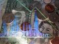
| 07/30/2002 07:37:00 PM | unknownby KathycComment: Is this supposed to refer to Corporate sponsorship of athletics? This is a great shot, please don't think I hate it. As with so many entries this week, it has a loose connection to the challenge, but acceptable. I certainly hope you didn't ruin your camera for this shot! It's very cool! Nice water effects. 8 Swash |
| 07/30/2002 07:22:00 PM | Reflecting On Faith Lostby jmattysComment: This is a really cool reflection shot. I tried a lazy crop, I like this better as a portrait shot of just the right half. The brick, NASDAQ sign and other building just add to the distractions. USBancorp and the church would have been good enough. Too bad you couldn't go into the business and close their blinds. Finally, your title, are you trying to say that in order to be successful in the corporate world, you have to lose your faith? 8 Swash (looks like the Puget Sound, is this Tacoma?) |
| 07/30/2002 07:04:00 PM | signby john22132Comment: I'm sure the bottom of the sign wasn't interesting, but how do the trees add to this photo? I don't like the sun flare near the bottom of the sign, I'm thinking this would have been a good candidate for cropping (you know that cropping is legal, right?). Cropping the sun flare would have also dumped most of the trees in the background, also a good thing (in my opinion). This is a very clear shot of this sign. (Ever consider working in their advertising section?) 6 Swash So you modified this sign to be your art? (bad joke/minor slam) |
| 08/01/2002 07:42:00 PM | Starbucksby chariotComment: Big corporation, good enough pic, estimated effort (rather not say....). The shot itself is pretty good, but the background is difficult. (joke: were you hanging out with Tom Walthrop? see him comments after the challenge, I am being nice to you!) Suggestions: take your cup up to the counter, use a menu as a back drop (or anything else interesting up there) ; or take the pic of the iced latte being made; or you enjoying it. (tried the 1/3rd rule? it helped) 7 Swash |
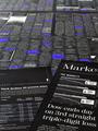
| 07/29/2002 07:53:00 PM | Makes the world go aroundby GordonComment: This seems like a wonderful concept. I want to think the transparency graph makes some sort of sense, but I don't see it. (It's the blue/red lines that don't seem to correlate to the green line.) I don't lke how this is lit. The bottom is too bright and the top is too dark, with a whole lot of interesting viewables hidden by that lighting. The graph is a cool idea, but I don't like the "hand drawn" look to it. (Kinda resembles Arabic, to me) I started this out as a 6, wanted to take you up to 7, but talked myself out of it. 6 Swash |
| 07/29/2002 05:17:00 PM | GOING DOWN !!!!!!!!by freetimeComment: Is it me, or does this seem distorted? (too round) Flash flare on the lower edge of toilet, not good, try different angle, might go away. I see the loose connection to this challenge, maybe a little tooo sublte. Title helps, but maybe hit me over the head with "Investments", or "Retirement Fund". 4 Swash |
| 07/31/2002 01:38:00 PM | Joblessby balynchComment: Interesting color scheme. Nicely focused shot, but a bit dry. 6 Swash |
|
Showing 2621 - 2630 of ~3862 |
Home -
Challenges -
Community -
League -
Photos -
Cameras -
Lenses -
Learn -
Help -
Terms of Use -
Privacy -
Top ^
DPChallenge, and website content and design, Copyright © 2001-2026 Challenging Technologies, LLC.
All digital photo copyrights belong to the photographers and may not be used without permission.
Current Server Time: 06/20/2026 06:33:30 PM EDT.
|