| Image |
Comment |
| 01/03/2011 12:31:11 PM |
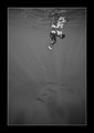
swimming with the nativesby rider808Comment: Lovely image - made me think of this one:
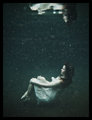
Makes me want to get an underwater housing.
The figure and reflection is interesting enough in its own right but with the dolphins below it is flat out amazing. Very bold choice to go monochrome too.
A 10 from me. |
 Photographer found comment helpful. Photographer found comment helpful. |
| 01/03/2011 12:17:34 PM |
Steve and Dange by the Hearthby banmornComment: I think this is a flat-out fantastic portrait (of man and dog). The fire in the background offers a lot of context and gives the whole image a warm feel.
10 from me. |
| Photographer found comment helpful. |
| 01/03/2011 11:02:30 AM |
'Tis The Season!by TommyMoe21Comment: OK - I'm going out on a limb here and letting you know that I scored this a '1'. Only fair to let you know why.
First of all I should say that I use the full scale and that I am but one voter with my own expectations and 'luggage'.
I should say I have a (fairly extreme) prejudice for images of ornaments - particularly figurines, so this was always going to be a hard sell to me.
Of all the things you could photograph for a Free Study I'm not sure why you would choose something like this...
Having said all that, it does have redeeming features - technically, it is a pretty pristine image and I can certainly respect that. Enough that I should bump it a little.... Bumping to a 2 for the technicals - I can't bring myself to bump it any more, the image itself leaves me too cold. Apologies. |
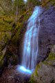
| 01/03/2011 10:41:15 AM |
Bridal Veilby daevansComment: OK - I'm going out on a limb here and letting you know that I scored this a '1'. Only fair to let you know why.
First of all I should say that I use the full scale and that I am but one voter with my own expectations and 'luggage'.
The subject matter is one that really doesn't excite me (it will be on the money for plenty of other people though).
Although I think the upward looking POV is interesting enough, the bottom right rock formation encroaches on the area of interest and detracts from the scene.
Most of all though, I'm afraid I've against your editing choices - the blown highlights and blue fringing to the water are to my eye very unattractive.
Having said all of that and having spent the time writing this comment I do wonder if a 1 is a bit harsh.... Bumping to a 2. |
| Photographer found comment helpful. |
| 01/03/2011 09:09:36 AM |
decantingby zeuszenComment: I'm going through the entries, stopping at those images I feel have had the benefit of an unconventional eye and dwelling a little longer to try to see and appreciate what you saw. This is one of those images.
Positives: Immediately makes me think  zeuszen zeuszen or  clive_patric_nolan clive_patric_nolan. If I had to bet on just one I'd go for the former. I like the mystery of this image - because we can't discern what it is we can't help but focus on the pure form and the light. I really like the toning and coloration too - perfect for this shot.
Critical stuff: The slightly 'cruddy' pixelated background - it pulls may away from the banded edge of the vessel(?).
Overall: Not for everyone and I do find these sorts of images tend to constrain rather than liberate my eye and brain but having said that, this is certainly very well made. |
| Photographer found comment helpful. |
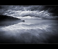
| 01/03/2011 09:08:53 AM |
River of Dreams by NeilComment: Landscapes normally leave me a little cold but this one is just soooo well done. I'd be astonished if this didn't ribbon. |
| Photographer found comment helpful. |
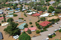
| 01/03/2011 08:50:46 AM |
Who left the tap on?by JudiComment: Highly journalistic. Indistinguishable from a news site image.
Very well made (Judi??)
On a non-photographic level, its horrific to think about the hardship associated with what we are seeing here. |
| Photographer found comment helpful. |
| 01/03/2011 08:49:52 AM |
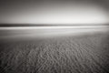
beachby bspurgeonComment: I'm going through the entries, stopping at those images I feel have had the benefit of an unconventional eye and dwelling a little longer to try to see and appreciate what you saw. This is one of those images.
Positives: There are a lot of ways to shoot and present a beach but not everybody would be as brave as this. I like that. Wow, does this image show up marks on screens - I've had to float this around until I've found an area that doesn't make it look like you need to clean your sensor. Once I did, the image really sings - smooth but sharp, still but dynamic. Excellent.
Critical stuff: Nothing at all.
Overall: Beautifully subtle image. |
| Photographer found comment helpful. |
| 01/03/2011 08:45:30 AM |
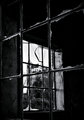
What once wasby Yo_SpiffComment: I'm going through the entries, stopping at those images I feel have had the benefit of an unconventional eye and dwelling a little longer to try to see and appreciate what you saw. This is one of those images.
Positives: This is a much stronger image than my first quick look through revealed - the interplay between the two orthogonal window frames is excellent - frames within frames within frames. It offers a wonderful sense of perspective.
The 'KTK' lettering in the middle jumps right out at you and the light, as it hits the residual glass, is lovely.
Critical stuff: Nothing at all.
Overal:: An image I've really gotten to like - a significant bump from 6 to 8. |
| Photographer found comment helpful. |
| 01/03/2011 08:39:34 AM |
Breaktimeby franktheyankComment: I'm going through the entries, stopping at those images I feel have had the benefit of an unconventional eye and dwelling a little longer to try to see and appreciate what you saw. This is one of those images.
Positives: I like how candid this image is, I could believe you were invisible. I like the high contrast treatment too. I particularly like the pipework to his left.
Critical stuff: The strange smoothness of the fabrics - looks like something you might get with Topaz. I'm afraid I'm not a fan of that look (though I do confess to having used it myself before.)
Overall: A very good candid capture. |
| Photographer found comment helpful. |
Home -
Challenges -
Community -
League -
Photos -
Cameras -
Lenses -
Learn -
Help -
Terms of Use -
Privacy -
Top ^
DPChallenge, and website content and design, Copyright © 2001-2026 Challenging Technologies, LLC.
All digital photo copyrights belong to the photographers and may not be used without permission.
Current Server Time: 07/23/2026 03:27:56 PM EDT.