| Author | Thread |
|
|
01/08/2011 12:25:58 AM |
|
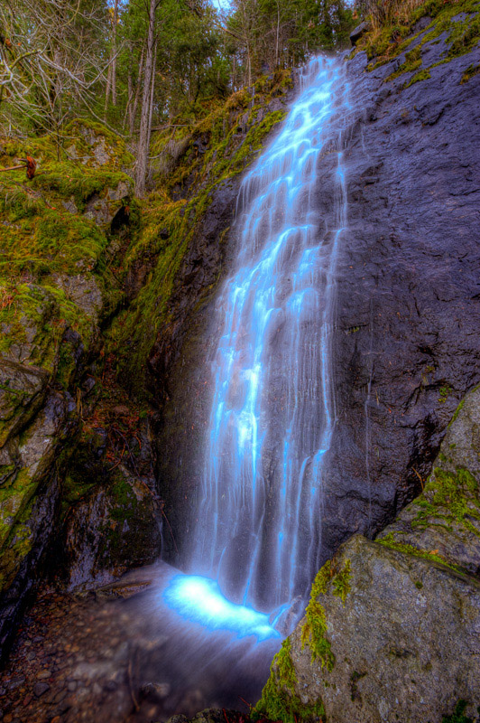
Ah, a bridal veil falls that really looks like a bridal veil. Interesting contrast between the psychedelic veil and the HDR type setting. Always wondering what processing can bring out, where it might lead. |
|
 Photographer found comment helpful. Photographer found comment helpful. |
Comments Made During the Challenge  |
|
|
01/07/2011 06:54:04 PM |
|
Like the image but the white of the water looks blown out. |
|
| Photographer found comment helpful. |
|
|
01/06/2011 11:48:22 PM |
|
looks like the blue saturation was pushed way too high |
|
| Photographer found comment helpful. |
|
|
01/04/2011 10:26:44 AM |
|
on my monitor your waterfall has a funny glow to it...to me it's very distracting |
|
| Photographer found comment helpful. |
|
|
01/03/2011 03:26:47 PM |
|
For me personally a bit overdone with the saturation of the water. |
|
| Photographer found comment helpful. |
|
|
01/03/2011 10:41:15 AM |
OK - I'm going out on a limb here and letting you know that I scored this a '1'. Only fair to let you know why.
First of all I should say that I use the full scale and that I am but one voter with my own expectations and 'luggage'.
The subject matter is one that really doesn't excite me (it will be on the money for plenty of other people though).
Although I think the upward looking POV is interesting enough, the bottom right rock formation encroaches on the area of interest and detracts from the scene.
Most of all though, I'm afraid I've against your editing choices - the blown highlights and blue fringing to the water are to my eye very unattractive.
Having said all of that and having spent the time writing this comment I do wonder if a 1 is a bit harsh.... Bumping to a 2. |
|
| Photographer found comment helpful. |
|
|
01/02/2011 07:05:14 PM |
|
The colour and highlights in the water make it look very unnatural compared to the rest of the scene. |
|
| Photographer found comment helpful. |
|
|
01/02/2011 05:02:27 PM |
|
looks like radiator fluid. |
|
| Photographer found comment helpful. |
|
|
01/02/2011 01:38:27 AM |
|
the processing has caused blue/white blown out highlights which spoils this |
|
| Photographer found comment helpful. |
|
|
01/01/2011 08:44:20 PM |
|
Not sure about the processing. It looks unnatural. |
|
| Photographer found comment helpful. |
|
|
01/01/2011 08:51:46 AM |
|
A nice subject, but I'm wondering what is going on with those blown highlights and blue in the water? |
|
| Photographer found comment helpful. |
|
|
01/01/2011 12:15:19 AM |
It appears you pushed the overall saturation to get some pretty nice colors on your mossy rocks, but unfortunately since you did the whole image the blue in the water was drug along for the ride. The blues are way oversaturated.
I myself am pretty lazy when it comes to making selections, and don't do them enough, but this is a case where it would have been a must. |
|
| Photographer found comment helpful. |
Home -
Challenges -
Community -
League -
Photos -
Cameras -
Lenses -
Learn -
Help -
Terms of Use -
Privacy -
Top ^
DPChallenge, and website content and design, Copyright © 2001-2026 Challenging Technologies, LLC.
All digital photo copyrights belong to the photographers and may not be used without permission.
Current Server Time: 06/30/2026 03:49:06 AM EDT.