| Image |
Comment |
| 12/03/2003 12:38:19 PM |
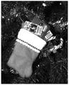
Holiday cash...I mean plastic.by NukktaComment: Another example of why I LOVE color. This image without it is extremely flat. It's a nice composition, but it has no depth. Also the focus is off.
TC |
 Photographer found comment helpful. Photographer found comment helpful. |
| 12/03/2003 12:34:15 PM |
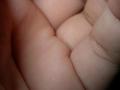
Or the lack of it ..by KhalidComment: IMHO there is not enough 'empty hand' to make your picture represent what I believe you are trying to represent...
TC |
| Photographer found comment helpful. |
| 12/03/2003 12:31:03 PM |
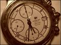
$Kaching$by justineComment: Nice composition and appears to fith the challenge well. However, it is very poorly exposed and the engraving is rather hard to see. Also I would like to see at least enough DOF to include the entire watch body including the knobs.
TC |
| Photographer found comment helpful. |
| 12/03/2003 12:05:30 AM |
Fragranced by sahkoComment: Congratulations on your second Blue and your best score ever. You deserved it. This was one of my favorites!
TC |
| Photographer found comment helpful. |
| 12/02/2003 10:16:24 PM |
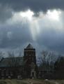
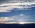
Follow the guiding light to your local House of Worshipby DrakeComment: From the Critique Club
This shot has a nice basic composition. I like how the light beams are coming out of the clouds. I also like how you have the church and what appears to be a church building (pastors house?) both in the image.
The yard does not have a very appealing appearance. If you cropped up to the very bottom of the buildings that would have a big impact on the appeal of the image. You also are suffering from a poor exposure. A longer exposure time would have helped to brighten up the image and help to bring out more of the buildings colors.
I'm not sure what you are trying to show as far as propaganda with this image however. This also may have had a negative impact on your score also.
TC |
| Photographer found comment helpful. |
| 12/02/2003 02:32:11 PM |
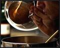
Feeding The Sensesby ToddhComment: I like what you are trying to do here but it's very grainy and in this instance I don't think it really helps. Love the reflection in the lid!
TC |
| Photographer found comment helpful. |
| 12/01/2003 12:00:01 AM |
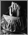
Handbagby ShelleyComment: From the Critique Club
This is an interesting take on the Literalism theme. Though not a common 'phrase' like many used it is common enough to get a reaction from most people.
The lighting is awesome on the purse itself. You managed to draw out the textures in the material. The reflection underneath the purse helps to give a different perspective too. You are a touch overexposed in a couple of spots on the hand but not so much as to be terribly distracting except maybe on the thumb.
The crop is IMHO a touch tight on the sides and maybe the top though. Also, I, being a HUGE fan of color, would have liked to see this in it's original colors.
One thing that immediately popped into my head when I saw this was that it would have been fun to see the purse straps in the hand so that the 'handbag' was holding itself. That would have been a truly original take on the wordplay!
Nice job,
TC |
| Photographer found comment helpful. |
| 11/28/2003 01:02:35 PM |
"Good Morning Sunshine"by ladpupmoeComment: From the Critique Club
Things I like: The DOF is nice here. There are some fun textures with the whispiness of the clouds. The sky colors are nice. The sun is not blown out like in some sunrise pictures.
Things I don't like: The utility pole in the foreground. The foreground itself (IMHO) needs more or less detail. I find myself trying to figure out what is in the foreground and am distracted away from the beautiful sky. I haven't tried any shots like this one so I have no suggestions on how to fix this except to say more, or less detail is needed. The clouds at the very top are not quite in focus and though not terribly distracting, the composition would be a bit stronger without them.
In general, this shot to me is not spectacular enough to keep my attention or make me go 'wow'. There is nothing really wrong with the shot, it's just that there are so many sunrise/sunset photos around that only the OUTSTANDING ones get and hold my attention. While this one is good, it's unfortunately not outstanding.
TC |
| Photographer found comment helpful. |
| 11/28/2003 10:49:47 AM |
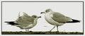
Birds of a Feather Flock Together (like DPC members)by TerryGeeComment: From the Critique Club
First of all let me say that I really like this image a lot! OK, I got that out of the way.
Your choice of B/W for this shot is perfect! I am a HUGE fan of color, but in this instance I believe that color would be an enormous distraction and totally take away from the impact.
Focus and DOF here are awesome! I love the way the feathers are ruffled on the left bird. It's a nice contrast between the smoothness of the feathers on the right bird!
The crop in this shot is excellent and I think that a lot of the pop of the shot is from the crop! You have eliminated (most of) the distractions this way (and with the lack of color.)
Things I don't like: There is some distracting elements in the white background behind the right bird. Now that challenge is over that is an easy fix in photoshop. Also (I'm sorry but...) I really don't like what you added to the end of your title. I (and this is just me, don't take it personal please) felt like it was sucking up and I don't like sucking up... I almost never take a title into consideration when voting and before this never voted down for title, but in this instance I did take a point off for it... |
| Photographer found comment helpful. |
| 11/26/2003 08:33:45 AM |
Stop and Smell the Rosesby SamaraComment: From the Critique Club
This is a great take on the challenge! I even like the little sign that you made. The roses are beautiful, and there the nice big ones, not the little ones you can get around me for 9 bucks a dozen.
The cropping in this shot is VERY tight at top and bottom. I could forgive the bottom, but at the top you cut a rose in half and that makes for a big distraction. If the shot itself was tight and you couldn't crop out farther, I would have tried cropping tighter at the sides for balance and made a small frame around the image. Don't know if it would help, but I would have tried it!
The colors here are a bit dull especially around the outside of the bouquet. The center of the arrangement is blown out. Also, the overall effect of the shot is very 'flat'. It has no depth or texture to it. This makes be believe that the flash fired giving to much light reflected but not good light for definition and color. I also have a point and shoot type camera like yours. When I do my still life pictures I find I get better results by turning the flash off and using a longer exposure and a tripod. Use as many lights as it takes to get a nice effect and don't be afraid to move the lights around and take many sample pictures. This will help to bring out the gorgeous textures that are naturally prevalent in roses. It will also help bring out the colors.
All in all this is a very fun compostion that with a little experimenting and practice could be a GREAT photograph! Keep shooting!
TC |
| Photographer found comment helpful. |
Home -
Challenges -
Community -
League -
Photos -
Cameras -
Lenses -
Learn -
Help -
Terms of Use -
Privacy -
Top ^
DPChallenge, and website content and design, Copyright © 2001-2025 Challenging Technologies, LLC.
All digital photo copyrights belong to the photographers and may not be used without permission.
Current Server Time: 08/06/2025 05:50:02 AM EDT.