| Image |
Comment |
| 07/04/2004 12:28:32 PM |
A Penny For Your Thoughtsby BooZonComment: Very nicely composed/posed and framed. Your lighting gives a nice sense of depth, but is a little dull. Colors also are a bit dull. Crop wise, I am a tad bit distracted by the watch dial being cut off at the bottom. Also I would have cloned out the tops of the letters on his shirt. Nice job overall!
TC
Edited to add: Could definately benefit from catch light in his eyes. |
 Photographer found comment helpful. Photographer found comment helpful. |
| 07/04/2004 12:25:14 PM |
Contemplationby waterliliesComment: Nicely posed/composed. Lighting is a tad bit flat (or maybe your levels). Could definatly benefit from catchlight in her eyes. Nice casual feel here. Are you getting negative feed back about the studio part of the challenge discription?
TC |
| Photographer found comment helpful. |
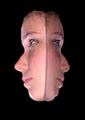
| 07/04/2004 12:17:53 PM |
Send in the Clownsby Prime_TimeComment: I like the feeling that you achieved here with the (painted) facial expression and the blue background and soft lighting. I do believe though that it is a little TOO dark and could benefit from cropping a tad bit off the right. The white part of your border is distracting and too high key for the rest of the shot.
TC |
| Photographer found comment helpful. |
| 07/04/2004 12:14:29 PM |
Portrait Doubleby ColeyComment: A bit gimmicky for my taste! This was taken underwater right? How did you light it and what kind of camera/case did you use? Just wondering...
TC |
| Photographer found comment helpful. |
| 07/04/2004 12:12:56 PM |
Mr. Mattby postoakinversionComment: Your spot on with your lighting and pose here. Very classic portrait if a bit unimaginitive. Not sure I like the grain in this instance. Great use of negative space.
TC |
| Photographer found comment helpful. |
| 07/04/2004 12:10:57 PM |
Funny Girl (my first portrait attempt)by BassieComment: A lovely young lady! Great expression. Pose is a little to centered and straight on. This makes the shot look a little flat. If you turned her a little and croopped off side a bit (probably the right since she is looking to the left) it would give a more potent composition.
TC |
| Photographer found comment helpful. |
| 07/04/2004 12:04:54 PM |
Carmela Violaby johnmComment: What a fun looking young lady! This is definately one of the more unique shots from this set. Not what I normally would look for in a portrait. Personally I don't care for a couple of elements. The yellow cast, the HARSH sidelighting and the blown out highlights in her shirt are just not to MY taste. Just my humble oppinion!
TC |
| Photographer found comment helpful. |
| 07/04/2004 12:02:01 PM |
1860's in technicolorby ladpupmoeComment: I can't tell if this is a modern portrait made to look old, or a snap of an old portrait. If it's the first, you did a dang good job of it. I don't personally care for the effect, but it IS well done. You got the framing down pat for an old school portrait, that's for sure. Placing the lady right up against the frame and putting the cat at the very bottom makes this feel un-ballanced and gives it a raw feeling also very reminiscent of shots from the early days of photography.
TC |
| Photographer found comment helpful. |
| 07/04/2004 11:59:14 AM |
Worried...by kevrobertsonComment: This is not what I usually think of when I see the word portrait. His expression is rather disheartening and makes me wonder what stress is going on in his world. Your lighting looks to be a tad bit harsh. If some of your light came more from the side, this would soften it up a touch and help even out the skin tones.
TC |
| Photographer found comment helpful. |
| 07/04/2004 11:54:52 AM |
Glowingby lizzyc3Comment: A very lovely young lady I'm sure! However, IMHO this shot doesn't do her justice. The harsh highlights combined with the soft focus give this an almost creepy feeling to it. THe bright red lipstick looks a tad bit oversaturated. Were these effects intentional? How much was done in post production? Questions that pop into my head...
TC |
| Photographer found comment helpful. |
Home -
Challenges -
Community -
League -
Photos -
Cameras -
Lenses -
Learn -
Help -
Terms of Use -
Privacy -
Top ^
DPChallenge, and website content and design, Copyright © 2001-2025 Challenging Technologies, LLC.
All digital photo copyrights belong to the photographers and may not be used without permission.
Current Server Time: 08/18/2025 06:23:33 PM EDT.