| Image |
Comment |
| 03/11/2005 11:54:49 PM |
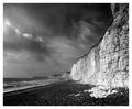
Seven Sistersby e301Comment: Nicely done. Your leading lines almost take the place of a subject. I say almost because I keep following the lines into the background to find...
TC |
 Photographer found comment helpful. Photographer found comment helpful. |
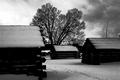
| 03/11/2005 11:53:08 PM |
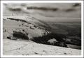
Devils Mount.by marboComment: Nicely processed if a touch soft. I can't seem to find a subject though...
TC |
| Photographer found comment helpful. |
| 03/11/2005 11:52:12 PM |
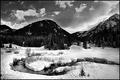
Rocky Mountain Winterby dwterryComment: IMHO this is overprocessed. You have lost your dark detail in the background and your highlites in the snow. Your sky doesn't look natural. Kinda like there was too much playing around with the levels...
TC |
| Photographer found comment helpful. |
| 03/11/2005 11:48:19 PM |
|
| Photographer found comment helpful. |
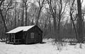
| 03/11/2005 11:47:41 PM |
Winter in Great Neckby eugeneComment: Compositionally it's a little busy and the house just doesn't seem like it's placed right. Maybe if the front door opened into the frame? Also looks like you lost some of your highlite detail.
TC |
| Photographer found comment helpful. |
| 03/11/2005 11:45:18 PM |
|
| Photographer found comment helpful. |
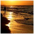
| 03/08/2005 03:24:40 AM |
Golden Evening.jpgby artvetComment: Cool would say somethin' like this... You got some fantastic leading lines that approach but never touch the true subject of this shot. Yes you have awesome colors, yes you have awesome lines, yes you have awesome textures, but they all lead your eye to that one person standin' on the beach at sunset and damn it, I wanna be there with 'em... Can ya hear it... the waves slurpin' up against the sand? Can ya smell it... The salt air with that slight hint of fish? Can ya feel it, that almost too warm squishiness between your toes? It's been too many years, but I can... |
| Photographer found comment helpful. |
| 03/05/2005 11:27:16 AM |
|
| Photographer found comment helpful. |
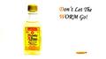
| 03/03/2005 12:09:28 AM |
Monte Alban Tequilaby cheekymunkyComment: Not a bad idea that with a little reworking could really be effective. I would suggest that you get much tighter on the bottle to bring out the brand name more. Since your in so much tighter, the worm itself would also be bigger helping to make the message come accross more effectively. Your bottle kind of dissappears into the background. A slightly different color background would help that issue too. IMHO worth a reshoot and possible marketing to the company...
TC |
| Photographer found comment helpful. |
| 03/03/2005 12:01:26 AM |
|
| Photographer found comment helpful. |
Home -
Challenges -
Community -
League -
Photos -
Cameras -
Lenses -
Learn -
Help -
Terms of Use -
Privacy -
Top ^
DPChallenge, and website content and design, Copyright © 2001-2025 Challenging Technologies, LLC.
All digital photo copyrights belong to the photographers and may not be used without permission.
Current Server Time: 08/21/2025 07:26:45 PM EDT.