| Image |
Comment |
| 04/06/2009 09:00:13 PM |
|
 Photographer found comment helpful. Photographer found comment helpful. |
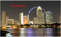
| 04/06/2009 08:55:57 PM |
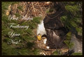
Visit The Metby PennyStreetComment: It would have been nice to have some negative space to place the text. It doesn't really stand out as it is. |
| Photographer found comment helpful. |
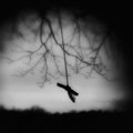
| 04/06/2009 08:53:31 PM |
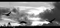
Norwayby BJokerudComment: I like the movement with the birds, but I don't see it as a postcard because of the black and white and the size. |
| Photographer found comment helpful. |
| 04/06/2009 08:42:05 PM |
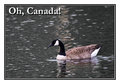
Oh Canada!by NobodyComment: I'm not a fan of big frames, but it works well here. It actually looks like a postcard. |
| Photographer found comment helpful. |
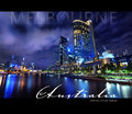
| 04/06/2009 08:40:13 PM |
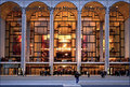
MY MELBOURNE by hotpastaComment: Love the blue and the fonts really work. Just wish the buildings were parallel to the edges. |
| Photographer found comment helpful. |
| 04/06/2009 08:35:31 PM |
|
| Photographer found comment helpful. |
| 04/06/2009 08:33:56 PM |
|
| Photographer found comment helpful. |
| 04/02/2009 09:19:38 PM |
|
| Photographer found comment helpful. |
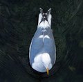
| 04/02/2009 09:16:18 PM |
calmeby tnunComment: The view from directly above doesn't quite work for me. |
| Photographer found comment helpful. |
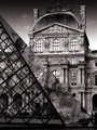
| 04/02/2009 09:13:32 PM |
Musée du Louvreby KonadorComment: The Louvre from a different perspective. Good seeing with regards to the contrast between the traditional and modern styles of architecture. |
| Photographer found comment helpful. |
Home -
Challenges -
Community -
League -
Photos -
Cameras -
Lenses -
Learn -
Help -
Terms of Use -
Privacy -
Top ^
DPChallenge, and website content and design, Copyright © 2001-2025 Challenging Technologies, LLC.
All digital photo copyrights belong to the photographers and may not be used without permission.
Current Server Time: 08/05/2025 12:12:57 AM EDT.